|
|
|
Mike Scuello
{K:6} 6/19/2006
|
Colour would be better.
|
|
|
|
|
Shane O'Neill
{K:3054} 5/23/2006
|
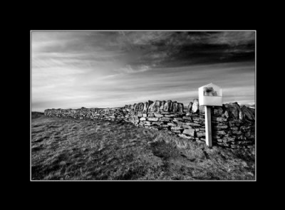
thanks for taking the time to discuss Hugo - in short I like the B&W version more because it has a nice soft contrast that is hard to achieve - i also like the way the red channel has turned the blue sky dark.
Just got the D200. Delighted with it so far. Expect some posts soon.
Rgds,
Shane
|
|
|
|
 Hugo de Wolf
{K:185110} 5/22/2006
Hugo de Wolf
{K:185110} 5/22/2006
|
Hi Shane, I agree, the colour version as well as the b&W one have merit; Instinctively, I prefer the colour version, but that's obviously subjective. I rather like the more pleasant atmosphere compared to the B&W one, as well as the contrast in colours. I think that contrast is high enough to make the colour version tick.
The B&W one has a stronger, more moody atmosphere, which I would usually quantify as "a bit forced", but that would be rather unfair in this case.
A very tough choice, IMO. I'm not so sure I see why you went for the B&W, but it's actually also your call...:)
I appreciate you posted the colour version too, it kinda takes my theory about B&W conversions apart, and I think I should reconsider.... (or be less strict...:)) Thanks!
Cheers,
Hugo
|
|
|
|
|
Shane O'Neill
{K:3054} 5/20/2006
|
Hi Hugo,
Here is the colour version - its has its merits but I'm sure you will see why I went with the B&W.
Rgds,
Shane
|

colour |
|
|
|
|
Hugo de Wolf
{K:185110} 5/19/2006
|
Hi Shane, Excellent feel and atmosphere. The tones in the B&W are also spot on. Not much to nitpick about without going into personal preferences (I'd say the colour version rocks too, and apart from the increased atmosphere due to the feel of the B&W (yes, close to IR) conversion, I 'm not sure there's a specific need for the gray scale version. - yet, it's also quite powerful.
Also nice to see the importance of the life bouy housing, it manages to grab and hold the viewers' attention - without it it would be "just" a barren and empty landscape, but the housing also adds a reference to the venue near t he coast. Very good touch, and a great photo...
Cheers,
Hugo
I like your presentation the black frame assists the appeal of the image nicely - simple, yet effective, also because of the thin white line separating image from frame.
|
|
|
|
 Roger Williams
 {K:86139} 5/18/2006
|
Sorry to hear about the damaged camera. My own newly purchased 6 x 6 SLR proved unusable... Red is just next to Infrared, so I suppose it's not so strange that this should look as it does. It certainly does bring up the contrast in the sky...
|
|
|
|
 Tamara Verbova
{K:492} 5/17/2006
Tamara Verbova
{K:492} 5/17/2006
|
Interesting composition in grafism! Very well seen!
|
|
|
|
|
Shane O'Neill
{K:3054} 5/16/2006
|
I was actually going to put on my remarks the fact that this image would appeal to you in particular! .. anyway, camera is ok now but I need a backup - looking for a D200 at the moment, feel free to suggest any UK shops.
|
|
|
|
|
Shane O'Neill
{K:3054} 5/16/2006
|
She was dropped! not by me though .. I went 6 weeks without her and it was sorely missed. Just goes to show you the need for a good backup camera, hence my search for a D200 has begun. Watch this space.
|
|
|
|
 Manu
{K:13082} 5/16/2006
Manu
{K:13082} 5/16/2006
|
Hi Shane...good to see you're back and posting again...sorry to hear about the camera...Good shot showing the variety of textures.
Cheers
Manu
|
|
|
|
|
John Finn
{K:1101} 5/16/2006
|
Excellent use of the channel mixer; very dramatic pic. Sorry to hear about the camera.
|
|
|
|
 Don Loseke
{K:32503} 5/16/2006
Don Loseke
{K:32503} 5/16/2006
|
The tones are beautiful Shane. I think maybe this would look a little better without that post. Don.
|
|
|
|
 Randee Armstrong
{K:-820} 5/16/2006
Randee Armstrong
{K:-820} 5/16/2006
|
Great photograph.. nice and dramatic!!
|
|
|
|
 John Segon-Fisher
{K:2580} 5/16/2006
John Segon-Fisher
{K:2580} 5/16/2006
|
Excellent B&W composition Shane. Great design, tonal range, detail, clarity and atmosphere
|
|