|
|
 Roger Skinner
 {K:81846} 4/18/2006
|
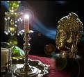
yeah its a combination really.. in PS First desaturate then add duplicate layer then adj that layer curves to about 178 then filter blur Gaussian blur round 10 is good for l/scape then in the light type drop down click overlay
it may be a bit strong.. so you can then reduce opacity
|
|
|
|
 Caterina Berimballi
{K:27299} 4/17/2006
|
I'm going for this one Rog. Haunting. Am picking it's either a subtle gaussian or diffused glow, but either way, this one rocks.
|
|
|
|
 Roger Skinner
 {K:81846} 4/17/2006
|
Thanks Selami
|
|
|
|
 Liz Wallis
 {K:26133} 4/16/2006
|
hi Rog...I'm going for this one, but that is because i love the trast..it is very hard for me to tell though, as I have a new monitor and it is wreaking havok on the way I see things...but if it looks like I think it does...then I pick this one:))))
|
|
|
|
|
selami Torun
{K:9397} 4/15/2006
|
Neat shot!! Fantastic light and shadows, good composition...
regards
|
|
|
|
 Paul Lara
 {K:88111} 4/15/2006
|
I prefer the higher contrast in this version, Rog.
|
|
|
|
 Roger Skinner
 {K:81846} 4/15/2006
|
Thanks for your feedback Ahmed
|
|
|
|
 Ahmed Effat
{K:228} 4/15/2006
|
good shot, this one is better Roger, the contrast made the picture looks more better
|
|
|
|
 Roger Skinner
 {K:81846} 4/15/2006
|
yeah I am a high trast man ..but sort of pulling back a bit lately.. doing the opposite to Ansel ..scary ehh
|
|
|
|
 Ms. Mel Brackstone
{K:5285} 4/15/2006
|
I would normally plumb for the higher contrast, but I think you might have taken this a little too far. The other version is more appealing to me, perhaps because I'm feeling that the darks are just a tiny bit too dark. I expect choice will come down to how a person's monitor is set up. sd
|
|
|
|
 Roger Skinner
 {K:81846} 4/15/2006
|
Thanks fabio
|
|
|
|
|
Fabio Keiner
{K:81109} 4/15/2006
|
this is one wonderrfil and because of the contrast more dramatic, imho
:))
happy easter, btw!
|
|


