|
|
 Ina Nicolae
{K:44481} 2/23/2006
|
Hi Ann, thanks for writing me here at the A-OK cafe. I didn't think my critique would last on the FP, I've appeared before for a brief moment, but I'm glad you came to visit :) Today it was sunny and warm(er) and I shot another bunch of still lifes. The 'rockmelon' is gone, it's been replaced by a mango :) Cheers, Ina
|
|
|
|
 Ann Nida
{K:45248} 2/23/2006
|
Sorry I missed this one Ina but I found it on the front page today so better late than never. I see you get the Miss Flappy Lips award today....well perhaps 15 minutes of fame as they do change fast but for however long it is I'm glad I didn't miss it cause this is an ingenious idea. Very creative of you Ina. Looks more than A-OK to me cause my imagination can stretch quite bit as you know. LOL I love all the diagonals and wonderful colour and textures here. Great work. A fantastic abstract.
Cheers from Ann :)
|
|
|
|
 Ina Nicolae
{K:44481} 2/10/2006
|
Thanks Aram for your comment, you seem to favor abstracts, by what I see :) I will pop one in now and then, when I get tired of lanscapes and still lifes :) Best regards, Ina
|
|
|
|
 Aram Gharib
{K:4656} 2/10/2006
|
Very nice abstract. The sharp cuts incite the imagination to continue the shapes beyond the hiding surfaces. Imaginative idea, Bravo!
|
|
|
|
 Ina Nicolae
{K:44481} 2/3/2006
|
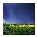
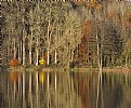
Thanks very much for your comment, Hugo! It's another way of using panoramas, for something other than they were intended :) The A-OK was an afterthought, it looked like a definite "K" but I tried to make the other two images say something, initially it was titled "Ice in the clouds" because each image has bits of ice in the water :) Cheers, Ina
|
|
|
|
 Ina Nicolae
{K:44481} 2/3/2006
|
Hi Andrzej, thanks for your comment! The title "A-Ok" is a slang expression meaning "everything is in perfect working order, perfectly OK" - it appeared in the 60's and was recorded as used by NASA during their Mercury program.
|
|
|
|
 Andrzej Pradzynski
{K:22541} 2/3/2006
|
Ina, it's a great triplet with a nice linking colors. It's an elegant abstract with a great relaxing composition, but the message is criptic and you likely only know the meaning of A-O-K. Cool abstract and geometry play. Regards, n.j
|
|
|
|
 Hugo de Wolf
{K:185110} 2/3/2006
|
Hi Ina, What I like most about this one is the naturally looking transition between the photos. The A-O-K is a nice touch, but I doubt if I would've made that connection if you hadn't hinted at it. I like this one a lot. Very good match of structures, , tones and elements. Very cool composition.
Cheers,
Hugo
|
|
|
|
 Ina Nicolae
{K:44481} 2/3/2006
|
Hi Eb, if you keep your height at 600 pixels, you can go beyond 1200 in length. Best regards, Ina
|
|
|
|
 Eb Mueller
 {K:24960} 2/3/2006
|
Very creative image, Ina! I was unaware you could upload a panorama over 1200 pixels - yours must be at least 1600 and difficult to view as an entity. The smaller view is remarkable in its ability to induce vertigo - at least for me. I think it is caused by the varying angles of perspective as the mind trys to sort it out and develop a singular point of view. It can't be done, however. And there is the surprise.
|
|
|
|
 Ina Nicolae
{K:44481} 2/3/2006
|
Or, it could be an M - K :)
|
|
|
|
 Michael Kanemoto
{K:22115} 2/2/2006
|
Yes. This is like a highly ranked alphabet photo. More abstracted, though, and in color. Really nice.
The A and the K are really distinct, but the O is a little harder to make out.
|
|
|
|
 Ina Nicolae
{K:44481} 2/2/2006
|
Thanks very much Rina, I wonder what this would look like with a bright red sunset :))))
|
|
|
|
 Ina Nicolae
{K:44481} 2/2/2006
|
Tracey, it doesn't matter, those pictures are so good!
|
|
|
|
 Ina Nicolae
{K:44481} 2/2/2006
|
Still on this theme, I'd love to go one day to Alberta (in Canada) to shoot the Calgary stampede, it's an awesome event :)
|
|
|
|
 Tracey Main
{K:7290} 2/2/2006
|
hehe...but they are pretty smelly,,,,,
|
|
|
|
 Ina Nicolae
{K:44481} 2/2/2006
|
He-he Tracey, I wish I was there too, so you can show me those sheep shearing farmers :)
|
|
|
|
 Ina Nicolae
{K:44481} 2/2/2006
|
Thank you very much Gabriela, I wanted to post the clouds as a separate panoramic, but then I decided against it, since there are so many on UF, different clouds and colors, mind you, but still the same idea. Here they serve as a break from the angular shots.
|
|
|
|
 Gabriela Tanaka
{K:16594} 2/2/2006
|
THIS is a PAINTING!!! I was stunned when I looked at it in panoramic. The quality of the water is just like a canvas with an oil painting! Hat off, my dear Friend! This one is AGAIN an "Ina Original"! Fabulous idea!
Gabriela
|
|
|
|
 Tracey Main
{K:7290} 2/2/2006
|
Wow love this I wish you was here to show me how to do this wonderful work that you do, this is really effective love it Ina Tracey..
|
|
|
|
 Caterina Berimballi
{K:27299} 2/2/2006
|
Definitely A-O-K! Love being able to see the detail in the pano. Great stuff Ina...
Cheers
Rina
|
|
|
|
 Ina Nicolae
{K:44481} 2/2/2006
|
Thanks Andre! This could be the faces of a rectangular box if you fold it along the edges :)
|
|
|
|
 Andre Denis
{K:66407} 2/2/2006
|
An interesting group for an abstract panarama Ina.
This one really gets your eyes moving around! I find myself jumping from image to image.
Andre
|
|
|
|
 Ina Nicolae
{K:44481} 2/1/2006
|
Thanks very much Mohamed :)
|
|
|
|
 Mohamed Banna
{K:34237} 2/1/2006
|
perfect composition and very nice colors
love the new daiagonal theme from you dear Ina
amazing blue
well done
|
|
|
|
 Ina Nicolae
{K:44481} 2/1/2006
|
Thank you very much my friend Roby :)
|
|
|
|
 Ina Nicolae
{K:44481} 2/1/2006
|
Thanks very much Joggie :)
|
|
|
|
 Roberto Arcari Farinetti
 {K:209486} 2/1/2006
|
fine crazy composition..
best regards
roby
|
|
|
|
 Joggie van Staden
{K:41700} 2/1/2006
|
Excellent combo with wonderful detail and saturated, crisp colours. Great work!
Joggie
|
|
|
|
 Ina Nicolae
{K:44481} 2/1/2006
|
Thank you very much John :)
|
|
|
|
 AJ Miller
 {K:49168} 2/1/2006
|
This is an inspired combination of images, and it looks superb in pano mode.
John
|
|
|
|
 Ina Nicolae
{K:44481} 2/1/2006
|
Hi Verena, in a couple of years, with all these technological advances, I'm sure 32" wide screens will be the norm :))))
|
|
|
|
 Ina Nicolae
{K:44481} 2/1/2006
|
Thank you very much Paolo :)
|
|
|
|
 Paolo Corradini
 {K:59552} 2/1/2006
|
another mocern image from your great creative mind! I love it also your abstract view :)
PAOLO
|
|
|
|
 Verena Rentrop
 {K:15233} 2/1/2006
|
I would love to tell you when I would own one :)
|
|
|
|
 Ina Nicolae
{K:44481} 2/1/2006
|
Thanks Verena, I think it looks fine in the large format only (without enlargement); in the pano the texture details are available to see, only one piece at a time, it's much bigger than a normal screen! I wonder what it might look like on a wide LCD, though? Best regards, Ina
|
|
|
|
 Verena Rentrop
 {K:15233} 2/1/2006
|
the combination works really great...
I tried the panoramic view...but there I have to scroll a lot to see the whole...mmmh...not sure if it is as you want it...
Cheers,
Verena
|
|
|
|
 Ina Nicolae
{K:44481} 2/1/2006
|
Thank you very much Elisa, this is all the ice we have so far, not much this winter :) Hugs, Ina
|
|
|
|
 NN
{K:26787} 2/1/2006
|
WOW! Love this work; it has such a modern touch to it. Gorgeous combination of shapes and colours!!! Fabulous & original stuff; congrats, Ina! *hugs*
|
|


