|
|
 Dhimant Vyas
{K:2509} 1/27/2009
Dhimant Vyas
{K:2509} 1/27/2009
|
nice capture!
gives very old photo look.
cheers
Dhimant
|
|
|
|
 Shiv Kumar Surya
{K:17362} 12/6/2003
Shiv Kumar Surya
{K:17362} 12/6/2003
|
Sorry, Michaelle! I am absent minded. I want to present my thanks for sending me helpful link regarding scanning.
Thanks.
|
|
|
|
|
Shiv Kumar Surya
{K:17362} 12/6/2003
|
Very nice work. Very effective. Nicely composed.
Michaelle! thanks for your comments on 'Union is strength'.
Regards.
|
|
|
|
|
Scott Jones
{K:1093} 2/4/2002
|
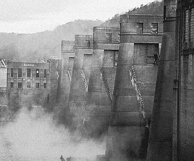
Hi Michaelle!
So nice to see someone using the interactive features of the site. I think both images are good. It is interesting to see how each crop emphasizes different lines in the photo. The first one the tall uprights of the dam towers and the second version the right to left spread of the whole dam. I guess it all boils down to what YOU want to emphasize. I do like the increased contrast in the second version and it is NOT too much. The sepia toning definitely gives it an historical feel.
Thanks for taking the time to share a reworking with us. It helps you, but also helps us know whether our critiques have merit or are just a lot of empty pontification!
Scott
|
|
|
|
 michaelle .
{K:3807} 2/3/2002
michaelle .
{K:3807} 2/3/2002
|
Ok... here's the fixes from the comments... let me know what you think :)
|

|
|
|
|
|
Scott Jones
{K:1093} 1/26/2002
|
I like this shot. After looking at the tones carefully, I wonder if a tad bit more contrast would give it just a little more punch. I don't think you would lose any of the mood with this...
Scott
|
|
|
|
|
Moises Levy
{K:782} 1/26/2002
|
Good Job, Nice Effect
|
|
|
|
|
Arthur John Grossman III
{K:1214} 1/15/2002
|
This image has an old-time quality to it for me. I would like to see this image with a slight sepia tone to it to enhance the aged-photograph feel. Cool leading lines!
|
|
|
|
|
Toni Martin
{K:5092} 1/14/2002
|
Very good image. I would go ahead and crop the part in the mist on the bottom edge off. See if you like it better.
|
|