|
|
 kouichi
 {K:701} 9/26/2009
|
Excellent !
|
|
|
|
 Roberto Arcari Farinetti
{K:209486} 8/10/2007
Roberto Arcari Farinetti
{K:209486} 8/10/2007
|
super congrats for your comment Elizabeth..!
have all the best..
roby
|
|
|
|
|
Roberto Arcari Farinetti
{K:209486} 8/10/2007
|
is not a problem Kim.. and have a nice week end
cheers
roby
;)
all the best back to you..
|
|
|
|
 Kim Flowers
{K:770} 8/10/2007
Kim Flowers
{K:770} 8/10/2007
|
Thank you sooo much for your kind comment, Roby - and I apologize for not responding sooner, but I've been experiencing "technical difficulties" with my computer for the last month or so! Sorry about that... I wish you all the best! :)
|
|
|
|
|
Roberto Arcari Farinetti
{K:209486} 7/27/2007
|
oh.. kim.. the really impressive silhouette!
best wsihes
roby
7
|
|
|
|
|
Kim Flowers
{K:770} 4/9/2007
|
Wow, thanks so much. I appreciate it. I hope you'll take a moment to check out some of the other images in my gallery if you ever have a moment.
|
|
|
|
 Paul's Photos
{K:35235} 4/7/2007
Paul's Photos
{K:35235} 4/7/2007
|
excellent.... love the image... great work
|
|
|
|
|
Kim Flowers
{K:770} 1/24/2007
|
Best critique EVER! And my first 'Featured Critique' so thank you VERY much. Okay, I'll stop with the caps now. Promise. Heehee.
|
|
|
|
 Elizabeth MVW
{K:25} 1/4/2007
Elizabeth MVW
{K:25} 1/4/2007
|
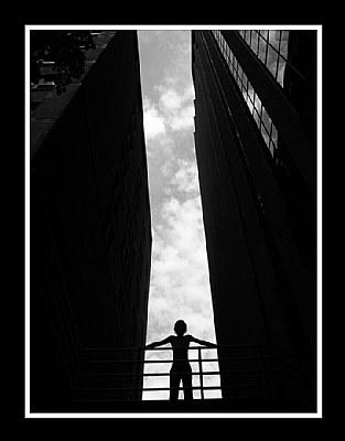
 Boom. Frozen clouds. A body poised betwixt buildings. The body mass is being held in place by impossible bookends. Falling in on her. She is aligned with the sky, unattached to the ground, unlike these grounded monuments of greed. Only the railing keeps her from dominating the composition. It holds her back, gently laying her dark form down upon the battlefield of the background, where a silent war rages between these dark edifices. A balance of power.
The enormous difference in hue between the sky and the architecture makes the clouds seem wonderfully distant, if we assume the clouds to be the background. Yet as our eyes wander about inside the image, our mind does battle over what is closer - a conflict that is constantly resolving - as it must remind itself repeatedly that the architecture is the primary graphic mass, not the vivid sky. This figure-ground conflict, brought about by heightened contrast, adds shades of complexity to an otherwise basic composition.
Powerful vertical lines demand contextual resolution through horizontal lines, and here the railing provides it. But it is slightly tilted up to the right, creating the subtle tension that underlies the theme. Without it, the image becomes conservative and ordered, as if it was a computer rendering of reality.
The conflict-resolving detail of the buildings in the top half of the composition contrasts nicely with the shadowy purpose-of-concept in the bottom half. The marriage of the two halves is a little off-center, though. This skews the balance away from the idea of the individual and into the idea of the threatening skyscrapers. Then, attacking the leaning threats by leveling the railing seems useful. But that only further defeats the individual by removing both the conceptual focus and the tension derived from the tilt of the all-important railing.
The slant of the whole image is not the problem; in fact, the buildings' respective tilts are appropriately proportioned to their apparent heights. However, the magnetism of the frame is balanced precisely at the included corner of the building on the left. To maximize the distribution of power in the composition (a.k.a. balance), that corner should be at the vertical center, but it is slightly below it. Also, the horizontal thickness of these two infinite bookends should be identical at that point. Yet, at that point, the building on the left is marginally thicker.
Cropping can solve these problems. The left side and the top side can be clipped, placing the corner at the vertical center and evening up the primary graphic masses at that point. Simple enough. But every bit of the building detail is essential for the healthy survival of the figure-ground illusion. So, a much better solution would be to add some blackness (or the original cropped image data, if it still exists) just below the frame and to the right of it. In that way, the problems with the corner and with the graphic masses becomes resolved, the amount of the building detail remains intact, and there's the added benefit of allowing the model's legs to not seem awkwardly truncated.
Such a stark image comments on the place of humans inside a world formed by their own ambitions of immortality. Things seem so much larger when trying to chart a course through them. The model here has found a balanced spot to rest her own overshadowed ambitions. But she cannot stay there long, for the looming buildings and the movement implied by their angles and the railing brings a smothering tension rocketing to the surface. She must be ready to move.
|
A Balance Of Power |
|
|
|
|
Kim Flowers
{K:770} 12/31/2006
|
Hi Mosawaraty... Thanks for your support. I'll definitely e-mail you when I get a chance...
|
|
|
|
|
Kim Flowers
{K:770} 12/31/2006
|
Thank you for such a thoughtful and articulate comment, Gary. Sorry it took me so long to respond to it. I must have missed it somehow.
|
|
|
|
|
Experimental
{K:-10} 12/31/2006
|
Hi Kim, this one is fantastic! I also like Philip's version. By the way, I've seen the work you're posting on this site and wondering if you are open to collaboration ideas with a non-pro? If so, email me on mosawaraty at yahoo.ca and i'll send you more details. Thanks
|
|
|
|
 Billy Bloggs
{K:51043} 11/23/2006
Billy Bloggs
{K:51043} 11/23/2006
|
Great composition and silhouette. The sky reflecting in the windows is a nice touch. I don't really mind the slight lean, it adds to the perspective for me. This image could be cropped in any number of ways. It also works for me as a panoramic, cropped just above the figure.
Regards, Gary
|
|
|
|
|
Kim Flowers
{K:770} 11/23/2006
|
Thanks very much, Giuseppe. Certainly not what I usually shoot but I enjoyed myself that day and am definitely happy with the results.
|
|
|
|
 Giuseppe Guadagno
{K:34002} 11/23/2006
Giuseppe Guadagno
{K:34002} 11/23/2006
|
Really striking, Kim! Clever idea and perfect work.
Take care.
Giuseppe
|
|
|
|
|
Kim Flowers
{K:770} 11/23/2006
|
Oh, wow! That's incredibly nice of you to say. That never even occurred to me but I thank you very much. I hope you'll check out the other images in my gallery... Thanks again for you comment. I really appreciate it.
|
|
|
|
|
cecilia tovini
{K:29423} 11/23/2006
|
I think this will gain an award. Molto bella Cecilia
|
|
|
|
|
Kim Flowers
{K:770} 11/23/2006
|
Oh, cool. I thought that's what you meant. Yeah, I like it this way too... Thanks again.
|
|
|
|
 Phillip Minnis
{K:13131} 11/23/2006
Phillip Minnis
{K:13131} 11/23/2006
|
Hi, again, Kim
I have attached the image showing what I meant. Let me know what you think. :)
Cheers
Phil
|

|
|
|
|
 Jason Elkins
{K:126} 11/23/2006
Jason Elkins
{K:126} 11/23/2006
|
Kim,
i think he meant that if the plat from to which the person stands was level to the eye it would be more to his liking. although i personaly like it the way it is and enjoy the contrast.... although i would like it either way. great shot.
~Jason
|
|
|
|
 Rashed Abdulla
{K:163889} 11/23/2006
Rashed Abdulla
{K:163889} 11/23/2006
|
Very impressive Silhouettes capture and of very powerful composition
Wishing you all of the best my friend
|
|
|
|
|
Kim Flowers
{K:770} 11/23/2006
|
Thank you very much, Christine. I appreciate your taking the time to leave a comment. I hope you'll check out the rest of my gallery if you get a chance.
|
|
|
|
|
Kim Flowers
{K:770} 11/23/2006
|
Thanks so much for your feedback, Phil. I'm not sure I understand what you mean by rotating it... I took quite a few shots at this location with my friend, but she was on a small bridge above a parking garage so all the shots I talk were with me below her. Also, I decided to post the original image but I did try several different cropped versions. Could you maybe clarify what you mean? Thanks again for your comment.
|
|
|
|
 C.A. Mikulice
{K:13300} 11/23/2006
C.A. Mikulice
{K:13300} 11/23/2006
|
nice POV here, Kim. it's a well composed and effective silhouette shot.
christine
|
|
|
|
|
Phillip Minnis
{K:13131} 11/23/2006
|
Kim, what a stunning image!
IMHO, it needs to be rotated slightly to the right. Then, it would be even better!
Cheers
Phil
PS Why not try rotating it? I'd love to see the ground that the person is standing on, level.
|
|