|
|
|
Miguel Lasa
{K:62} 12/30/2002
|
Thanks to Sue O'Shields. It is also one of my favorites also.
|
|
|
|
 Sue O'S
{K:12878} 12/29/2002
|
Wow! How did I miss this?
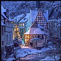
Gorgeous. Perfect saturation. I like the way the changing leaf color picks up the color of the building shingles, and of course, the building itself has so much character. I would like to see just a little more foreground so that I had a sense that I could approach this building but that's such a minor nitpick.
Very, very nice. I'm putting it in my favorites.
|
|
|
|
|
César Matamoros II
{K:270} 12/29/2002
|
Seems like a painting. The exposure is right on the mark!
Very pleasing to look at. Well done.
|
|
|
|
|
Steven B. Poitinger
{K:1757} 11/24/2002
|
Nicely composed and great exposure which really brings out the colors nicely. well done.
|
|
|
|
|
Chris Whaley
{K:3847} 11/24/2002
|
Beautiful shot.
|
|
|
|
|
Elangovan S
{K:10675} 11/24/2002
|
Beautiful composition, the colors and lightings makes it like a painting. Ver nice.
|
|
|
|
|
Travis Donovan
{K:259} 11/24/2002
|
I really love the colors that the velvia is bringing out in this. Very nice shot.
|
|
|
|
|
Keith Naylor
{K:13064} 11/24/2002
|
Very nice, Makes me feel that I want to look inside !
|
|


