|
|
 Jose Ignacio (Nacho) Garcia Barcia
{K:96391} 12/17/2007
|
simply gorgeous. marvelous tones. 7++++++++++++++++++++
|
|
|
|
|
cecilia tovini
{K:29423} 1/23/2004
|
Thank you Bill for your postcard. I have preferred to open the e-mail from the agency and now I am able to see your beautifull sailing boats. Have a good week end. Kisses Cecilia
|
|
|
|
|
Karen Siebert
{K:12076} 8/4/2003
|
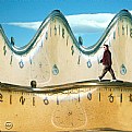
Striking image. Great light, great composition and angle. A very strong image. Bravo at your hard work.
|
|
|
|
Bill Krul
 {K:5597} 5/5/2002
|
Ian: This photo was taken out doors and the figures are a combination of wire and sheet metal. The blue cast and white light were added with the aid of photoshop. Thanks for the kind words.
|
|
|
|
|
ian
{K:354} 5/3/2002
|
i think this image is perfect. was thus taken outside or indside? alos, the figures look like wire...
|
|
|
|
 José Lins
{K:1544} 3/25/2002
|
Hi Bill, I'm not much for Photoshop. So, all that I can say is that this image is very impressive. Very nice light. I Think If you had gotten more detail at the botton, It would not worked so well. It's perfect for me.
|
|
|
|
Bill Krul
 {K:5597} 3/25/2002
|
Kevin: I think you are correct. I tried to get the light from further above but then lost light on the subjects below and they became as dark as those in the image that was unacceptable to some of our members. I'm a beginner with Pshop and maybe there will be a way around this. The project will continue.
|
|
|
|
 Kevin Lanthier
{K:3477} 3/25/2002
|
I think this depiction works far better, the addition of the bright light contributes to your interpretation as you mentioned. I would be tempted to take it one step further, actually, create a more direct light from above. Hmmm...
|
|
|
|
|
Samuel Downs
{K:7290} 3/24/2002
|
Bill, I agree with you that the lighting helps bring out the near-death feeling. I find it to be an unavoidable, striking image. Sam
|
|


