|
|
Critique By:
Mary Sue Hayward (K:17558)

3/21/2006 7:46:20 PM
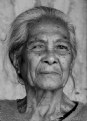
Wow! This portrait really illustrates a noble spirit. This woman, despite her difficulty with her eye, appears distinguished and proud. I like how her hair falls softly around her face, like a natural frame. I also like the position of her head...not quite a direct gaze, but still very connected with the viewer.
My only small nits are these: I would like just a bit more space on the bottom so that the entire neckline of her sweater was visible. It would help complete the compositional frame around her face. Additionally, I would suggest you try to increase the contrast just a bit and see if it makes a stronger photograph. Here, and perhaps it is just on my monitor, it seems too low in contrast.
Overall this is very strong. I'm so glad you posted this image!
|
| Photo By: Ray Vann
(K:3093)
|
|
|
Critique By:
Mary Sue Hayward (K:17558)
3/21/2006 7:37:21 PM
I do like this because it shows something about a bird that cannot be observed as easily when the entire bird is included in the frame. Softness does not bother me so much, except around the eyes where sharpness would make the image stronger.
I'm in agreement with Hugo that the beak is too close to the left edge of your frame. Even if the PS border was removed, it would still be a bit close. Maybe there is more space in the original image?
Your soft green background works nicely with the subject, as does the separation of the main subject from the background.
I look forward to perusing your portfolio! You have a knack with this kind of subject.
|
| Photo By: Doyle D. Chastain
(K:101119)
|
|
|
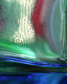
Critique By:
Mary Sue Hayward (K:17558)
3/20/2006 11:16:59 PM
I like the composition here. The frosted glass provides a blur that mimics minimum DOF. The leaf that touches the glass, and is somewhat more in focus is nice.
I realize you have only posted two images here, but I find them very pleasing. I especially like how you keep your compositions uncluttered.
Please keep posting!
|
| Photo By: Michel Boulé
(K:45)
|
|
|
Critique By:
Mary Sue Hayward (K:17558)
3/20/2006 11:13:25 PM
This is a striking image. The vivid colors and strong angular composition make this a bold image. The moon is so bright white that it doesn't look real, but it adds nicely to the composition.
Welcome to Usefilm!
|
| Photo By: Michel Boulé
(K:45)
|
|
|
Critique By:
Mary Sue Hayward (K:17558)
3/19/2006 5:26:27 PM
You did a great job capturing her mood. I like the connection you established with your subject. Her direct gaze pulls the viewer right into her world.
I also like the contrast of her colorful headscarf with the drab and simple background. It hints to me that there may be more to her personality than the somber expression she has at the moment.
In contrast, the overall muddiness of the image is bothersome to me. Perhaps this was intentional, in which case my comments are not that helpful. I hope you do not mind, but I wanted to illustrate what I mean by offering a different view. On this small attachment, I only did a quick PS levels adjustment, plus I cropped it a bit so that she really was the focus. Otherwise she might get a little lost in her environment. After the crop, I removed a fraction of the structure on the right.
I seriously hope you are not offended that I worked on your image. I just wanted you to have a visual of what I meant.
|
| Photo By: ray riley
(K:570)
|
|
|
Critique By:
Mary Sue Hayward (K:17558)
3/16/2006 12:59:09 PM
I like this very much. There is an interesting shadow/light effect that works nicely, giving the image a moodiness. Personally, I like how the dark mood contrasts with the flowers, which are sometimes cheerful. No idea how you did this (would love to see the original image) but it works.
|
| Photo By: Gayle's Eclectic Photos
(K:91109)
|
|
|
Critique By:
Mary Sue Hayward (K:17558)
3/16/2006 3:32:28 AM
Thanks for the detailed info, Tom! After seeing the original, I completely agree with you about the choice of blue toning. Not that the amber was a huge distraction, but once you pointed it out my eyes went right there!
Two things I've learned from this image 1) to consider adding color tones in certain circumstances, and 2) to keep my eyes peeled for very tiny spider webs. Sometimes I look for something the size Charlotte might weave, and miss the smaller beauties.
And a BIG congrats for Photo of the Day!! Well deserved!
|
| Photo By: Tom Landon
(K:92)
|
|
|
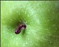
Critique By:
Mary Sue Hayward (K:17558)
3/15/2006 3:11:33 PM
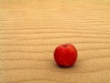
I'm intrigued by the concept that led you to place an apple on sand ripples! The key elements seem incongruent, but in a way that makes me linger and wonder. The sand texture is nice, especially in comparison to the smooth apple.
One question: how did you achieve the velvet-like texture and even lighting on the apple? The even tones and absence of hot spots look like it was shot in a studio. In contrast, the sand looks like it was shot on a nice day at the beach.
I guess I'm using too many words to say that I really like the lighting. You used it to emphasize the best of both elements (apple and sand). I'm intrigued!
|
| Photo By: hermin abramovitch
(K:1915)
|
|
|
Critique By:
Mary Sue Hayward (K:17558)
3/15/2006 1:17:08 PM
Some of the previous critiques suggest that the background could be more interesting, but I like it just as you have it. The blue is a good choice. I'm curious, though...what was the background's original tone? These spider web images can get a little 'seen-one-before', yet the structure and sharpness (and probably the blue tone) make this one dynamic.
I must admit that I've tried this before and have not achieved anything so interesting. Good job!
|
| Photo By: Tom Landon
(K:92)
|
|
|
Critique By:
Mary Sue Hayward (K:17558)
3/15/2006 1:01:15 PM
I am glad you posted this image because it led me to your portfolio. It is interesting because it seems to be a departure from the style of photography you have posted so far.
I like the simplicity of this image. The diagonal line formed by the insect's body and antennae in addition to the monochrome color makes me think of a minimalist painting.
To my eye, the image would be strengthened if the whole face was visible, and perhaps if the face was sharper. Although I LOVE using shallow DOF, I want just a bit more sharpness somewhere. Just a bit.
Please post more macros. You have a good eye for it.
|
| Photo By: COLKID Tokyo
(K:347)
|
|
|
Critique By:
Mary Sue Hayward (K:17558)
3/15/2006 12:48:44 PM
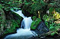
Bill, I knew this was Velvia from the thumbnail! Was it really this intensely green, or did you bump up the saturation any?
I like the placement of the waterfall within the frame. This does capture movement quite well. It almost makes me feel dizzy!!
|
| Photo By: Bill Morgenstern
(K:7157)
|
|
|
Critique By:
Mary Sue Hayward (K:17558)
3/14/2006 12:55:24 PM
Congratulations, Sheila!!
I just knew that that beguiling girl smiling at the camera would be noticed!
I'm glad to see your image on the front page.
|
| Photo By: Sheila Carson
(K:5924)
|
|
|
Critique By:
Mary Sue Hayward (K:17558)
3/13/2006 10:32:20 PM
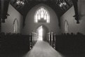
DC!! (I am glad to see this one from you. The view is nice, although I had to wonder what drew you to the altar...but never mind on that one!
I like the framing and the light...how nice that you also captured some dappled spots of light on the aisle.
I notice some grain...is that from the ProIlford?
|
| Photo By: David Chang-Sang
(K:680)
|
|
|
Critique By:
Mary Sue Hayward (K:17558)
3/12/2006 9:06:17 PM
Good question, Sheila. I'll try to be more clear about what I meant. My impression is that the focus was probably ok in your original image. Looking at the hair it is easy to see a lot of sharp detail and texture...even some individual hairs catch the light and are nicely in focus. On the face, however, there is a softness that reminds me of a slight gaussian blur or something. I'm not saying at all that you altered the softness, I'm just trying to use that to illustrate what I see on this monitor. Even her eyes are soft.
I don't think it is a DOF problem. You used f8.0 agt 1/125, which I think would get pretty much everything in focus.
Maybe it is the contrast between the detailed texture in her hair and the lack of texture on her skin that is disconcerting to me. I'd prefer just a bit more texture detail in the skin. While the tones and lighting are pretty perfect, it is the absence of skin detail that bothers me. Some children can have porcelain-like skin, so maybe this is not achievable after all.
One additional thing: your non-standard crop for a portrait works very well here. It focuses the viewer on her smile and eyes, which makes this image rock!
I notice that no one else seems to be bothered about the softness I mentioned. So, maybe it is just me 
|
| Photo By: Sheila Carson
(K:5924)
|
|
|
Critique By:
Mary Sue Hayward (K:17558)
3/12/2006 7:20:45 PM
This charming girl's smile just jumps off the page, even in the thumbnail images. The colors are terrific with the hat fur echoing the natural auburn of her hair.
I like the sharp texture in her hair very much. I'm a bit bothered by some softness in her face, particularly her nose. Softness on the face is welcome to a degree, but somehow it seems too much. I would imagine that her skin has a natural glow and even tones, so allowing a bit more of it to be visible in the photo might be nice.
I am guessing she is your daughter? If so, she is really a beautiful child. I'll bet you already knew that!!
|
| Photo By: Sheila Carson
(K:5924)
|
|
|
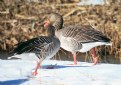
Critique By:
Mary Sue Hayward (K:17558)
3/12/2006 7:10:30 PM
Great title!! I only wish the bill of the left duck was visible. That extra orange splash would be nice.
I had no idea ducks would venture out in snow. The texture of the snow is nice, not blown out at all.
|
| Photo By: Jeroen Wenting
(K:25317)
|
|
|
Critique By:
Mary Sue Hayward (K:17558)
3/12/2006 6:55:17 PM
John, thanks for your detailed analysis. The stem was my biggest challenge. I was working with an old file, and wanted to crop it so that the stem pointed into the image, but was placed at the 'rule of 3rds' intersection in the lower left, with the stem pointing toward the image center. I was limited by the file itself (or actually by poor planning on my part back when I shot it). I'll keep your remarks and the remarks of the other commenters in mind for the next shoot. THANKS!
|
| Photo By: Mary Sue Hayward
(K:17558)
|
|
|
Critique By:
Mary Sue Hayward (K:17558)
3/12/2006 2:12:00 PM
I'm so glad this made it on the front page because I might have missed it otherwise. What a terrific photo. I love the magical fairy-light that just makes it all glow, especially the 'star' at the center.
|
| Photo By: Kessia & Morgan UVA
(K:7265)
|
|
|
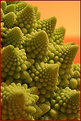
Critique By:
Mary Sue Hayward (K:17558)
3/11/2006 3:58:04 PM
I'm glad you posted this because it pointed me to your portfolio. I spent time looking at the Kaleidoscope part of your portfolio. Of the images in that group, Apple is the most appealing to me. Perhaps it is because while there is an abstract form (by the way, incredible rich colors on that one), my mind can anchor in something familiar.
This image is more challenging to me. I like it, but find that it does not have the power of some of the other Kaleidoscope images. While I enjoy the colors seen in this one, the blurred (OOF) edges on the left seem too unresolved for me. The only place on the image that has any sharpness at all is in the upper right.
To me, it isn't a requirement that all images have sharpness somewhere...but in this abstract I want to reach up and focus the screen a bit.
The composition is a little odd to me, like two separate images subjects placed into one image. In a way I want the camera to pull back a bit so that more of the field is included, and I can get a better understanding of the relationship of these two forms.
All that said, let me say again that I like this image. The Kaleidoscope images are strongest as a collection rather than as individual images, although there are certainly some very strong images within the portfolio.
I am fascinated by what you have achieved, and only wish I knew what you were actually shooting. Is it water drops on a frosted glass?
|
| Photo By: Anna A
(K:315)
|
|
|
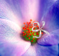
Critique By:
Mary Sue Hayward (K:17558)
3/11/2006 3:37:01 PM
Really a great photo, every thing about it captures my attention. Please, though, someone tell me what this is?? I assume it is some kind of plant material, but that is all I can guess.
|
| Photo By: Anna A
(K:315)
|
|
|
Critique By:
Mary Sue Hayward (K:17558)
3/8/2006 4:40:56 PM
Tight shooting situtations like you described are such a challenge. This composition works nicely. Even though there are a lot of colors and textures, somehow it all holds together and allows the viewer's eye to travel through the image in an organized way.
The creaminess of the flowers makes it look like you got the balanced, even lighting to work in your favor.
Of the two you posted, this is my fave!
|
| Photo By: Chelsea Burke
(K:5750)
|
|
|
Critique By:
Mary Sue Hayward (K:17558)
3/8/2006 4:28:37 PM
You know, I was just looking at an ad for lensbaby yesterday, and then I saw this today! My first impression mirrors what has already been written, that the effect is so overwhelming that it is confusing. So much effort is required to resolve (or ignore) the distortion on the right that seeing the man on the left is frustrating...I can't really appreciate that critical element because of the other issues.
I'm also a bit bothered that the man is leaving the frame, but I'm not sure if this would still bother me if the confusion on the right was not so pronounced.
I'm glad you posted this image, especially that you posted it in the CC section. Mostly, I appreciate the courage to experiment and push your creative boundaries!
p.s. I still might get a lensbaby!
|
| Photo By: Hugo de Wolf
(K:185110)
|
|
|
Critique By:
Mary Sue Hayward (K:17558)
2/27/2006 9:18:24 PM
This is awesome impressive.
I like this with the chosen shutter speed rather than a longer one. Even though streams of car lights have appeal, something about the sharp points of light in this image really works well. The rich colors are terrific, as is the composition.
Good job!
|
| Photo By: Christopher Jamison
(K:1230)
|
|
|
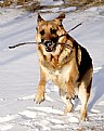
Critique By:
Mary Sue Hayward (K:17558)
2/27/2006 4:30:25 PM
That's one handsome pup!
I like how active he is - you caught him just at the right moment.
Now, put down that camera and THROW THE STICK!!
|
| Photo By: Chelsea Burke
(K:5750)
|
|
|
Critique By:
Mary Sue Hayward (K:17558)
2/27/2006 3:32:57 PM
I'm not sure what technique you used to achieve this look, but it appears you backlit a rose with a point source of light? The layered look of the petals is nice.
The image would be stronger if more of the rose was illuminated. The negative space to the right and the upper left dominates the image and distracts from the beautiful rose.
How do you like the 50mm with the 10d? I've considered that lens before (I also shoot with the 10d), but haven't justified it yet. How does it work for portraits?
|
| Photo By: Bjorn Beheydt
(K:12096)
|
|
|
Critique By:
Mary Sue Hayward (K:17558)
2/27/2006 2:02:04 PM
Beautiful shot, John. The last bit of evening light makes this dreamy and almosot mysterious. The 3-second exposure contributed to the overall light glow across the image, as well as the milky texture on the water.
One small suggestion: The rocks that are so critical to the composition are verrrry close to the bottom edge of the frame. Consider giving them a bit more breathing space. Panning the camera down just a smidge would prevent the rocks from crowding the bottom edge. You might lose an equivalent amount from the top, but that wouldn't be a huge sacrifice since the best part of the sky is right at the horizon.
I like what you have shown us here. Hope the suggestion makes sense.
|
| Photo By: John Pitman
(K:8473)
|
|
|
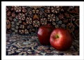
Critique By:
Mary Sue Hayward (K:17558)
2/27/2006 1:48:11 PM
Kevin beat me to it! The background really is the culprit here. While I like the view with increased saturation, the increased saturation might not be as critical if the background was neutral. As long as you are thinking about shooting with a different backdrop, choose one that contrasts nicely with the apples.
This is a good choice for a Critiquers Corner upload. Can't wait to see what you upload next!
|
| Photo By: Mark Longo
(K:12760)
|
|
|
Critique By:
Mary Sue Hayward (K:17558)
2/26/2006 4:44:02 AM
One small bit of genius in this image was using food coloring in the straw. In particular, you chose a yellow that would contrast nicely with the blue plate. The DOF is not such a problem for me, although agree that it would be even stronger if you used a smaller aperture to get it sharp all the way across the crown.
I tried something similar but with must less impressive results. Thanks for your clear description of the set up, it will help anyone who tries to do this in the future.
Great job!
|
| Photo By: Patrick Ziegler
(K:21797)
|
|
|
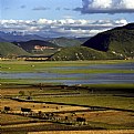
Critique By:
Mary Sue Hayward (K:17558)
2/26/2006 4:23:56 AM
Tom, I like the repeated angles formed by shadows, the shore, the hill, and even those structures in the bottom part of the image. The details in this image hold the viewer's attention. The warm light looks like it was shot at mid- or late afternoon, but maybe early morning?
I, too, think that your image would be stronger at a larger size. There is so much detail that it is a struggle to make sense of some of it at this small size.
I'll bet it prints up beautifully!
|
| Photo By: Tom Chang
(K:101)
|
|
|
Critique By:
Mary Sue Hayward (K:17558)
2/26/2006 1:59:56 AM
Thanks, John. I was thinking of this image when I commented on your image earlier. This one has nearly the same compositional element as yours - a dominant swash of color leading right off the edge of the image!
I need to rethink this one too.
|
| Photo By: Mary Sue Hayward
(K:17558)
|
|