|
|
Critique By:
Andrea Harris (K:2496)
5/28/2005 3:01:56 AM
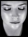
I love the complimentary orange and violet colors - and it's lovely with her skin tone and the glitter look she has. I think the orchids are so bright on the top left that they lack some depth and maybe that's why they are distracting? Just too bright and almost one-dimensional. One thing you might try would be to add a soft focus. Then paste that layer on top of this original. Then "erase" her eyes and lips so the crisp version underneath comes through and you have details where it counts, but softness everywhere else. She's such a lovely girl - the photo has a pretty, tropical feel with the colors and orchids!
|
| Photo By: Monique Harris
(K:235)
|
|
|
Critique By:
Andrea Harris (K:2496)
5/28/2005 2:50:01 AM
Thanks! This photo cracks me up. We had guests over and I had just said to make sure your on your best behavior. The next thing I know my son yells, "Look! I'm Spiderman!" and jumps off the slide. <>
|
| Photo By: Andrea Harris
(K:2496)
|
|
|
Critique By:
Andrea Harris (K:2496)
5/28/2005 2:45:40 AM
You know, the whole time I'm watching this I'm thinking how different their lives are from mine. How this is such a part of who they are and a lifestyle that my suburban children will only know as "shows" we watch when going to the Town Square. But for this people, it's entrenched into their culture, their ancestors, their blood. The songs they were singing were so reminescent of mountain music - old, old church songs, love songs, sad songs about a girl who died and the way their voices quivered at times gave me chills.
If anything, I just wish this man's face was more in focus but his whole body was in motion from the moment he got there. My light was very limited here too.
Here's a photo of him playing, very blurred obviously:
|
| Photo By: Andrea Harris
(K:2496)
|
|
|
Critique By:
Andrea Harris (K:2496)
5/28/2005 2:21:38 AM
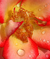
Very pretty and creative angle. This flower's petals seem so thick, almost like wood carved like a flower.
|
| Photo By: todd o
(K:180)
|
|
|
Critique By:
Andrea Harris (K:2496)
5/26/2005 2:38:30 PM
That's beautiful and such a difficult shot with the white on white, but you bring out the details perfectly. Very pretty picture.
|
Photo By: Giuliano Guarnieri
(K:36622)

|
|
|
Critique By:
Andrea Harris (K:2496)
5/26/2005 1:06:50 PM
Thanks Monique for your honest comments. I really wasn't pleased with the outcome of the Memphis Home series. I really liked the Kentucky Home series, but I was having trouble getting everything I wanted in the photo and seeing enough detail (my lens is from an SLR so it doesn't work the same on my dSLR and I have to back up a lot for my photos)- ex: in this photo I wanted more of the leather chair but when I backed up you couldn't see the William Faulkner print on the wall. That all contributes to the "memphis" theme, but no matter which angle I tried it just didn't have the feel to me I was going for. The music room is actually a dining room and has super lighting at sunset - apparently I missed it by about 30 minutes because the sunlight had already drifted over to one of the walls. Maybe in the next month or so I can get a chance to re-shoot this home. There were some interesting, modern aspects to this home - a contrast to the Kentucky series, but still a Southern aspect and definitely the Memphis feel. Thanks again!
|
| Photo By: Andrea Harris
(K:2496)
|
|
|
Critique By:
Andrea Harris (K:2496)
5/25/2005 5:50:37 PM
One of my favorite from you, for sure! 7+
|
| Photo By: Melanie Reynolds
(K:9096)
|
|
|
Critique By:
Andrea Harris (K:2496)
5/25/2005 5:49:05 PM
Very sweet - love the last one esp.
|
| Photo By: Stace Walker
(K:4175)
|
|
|
Critique By:
Andrea Harris (K:2496)
5/25/2005 5:47:50 PM
Nice use of light and shade. I've been doing some shots of thoroughbreds and polo horses lately as well. Looks great!
|
| Photo By: James McGinnis
(K:6045)
|
|
|
Critique By:
Andrea Harris (K:2496)
5/21/2005 2:31:03 AM
Great call changing the direction, you're very right! We used to live in some apartments over there and we always called that area Wal-Mart park - which I don't even think that Wal-mart is over there anymore but the trail led through there and it had some good biking areas. How did you get the darkness around the corners? I've noticed other people doing that where there is a feathered darkness framing the entire shot or two corners of a shot, I didn't know if this was a digital thing they were doing like some effect or natually occuring with a special lens? Again, great job!
|
| Photo By: steven carter
(K:2140)
|
|
|
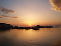
Critique By:
Andrea Harris (K:2496)
5/21/2005 12:08:32 AM
WOW! Steven, congrats! A BIG congrats!!! You deserve this - glad someone spotted you here because you have some different photos that deserve recognition! This is great and I love the tone you've done, getting the water and sky lined joined must have been difficult. The spacing is perfect the duck is in just the right place - this photo's composition is no coincidence - well done!
|
| Photo By: steven carter
(K:2140)
|
|
|
Critique By:
Andrea Harris (K:2496)
5/20/2005 11:57:57 PM
Oh! What a beautiful and sincere photo! Many of your pictures just seem to "pop" out, this is one of them - also your "Classic" photo. I love the moment here.
Also, thanks so much for your kind comment on my photos. I hope I can capture the mood of life in the South to share it with others. There's plenty good and interesting about this area, unfortunately it's not always depicted that way - lol.
|
| Photo By: Mark Kresl
(K:9434)
|
|
|
Critique By:
Andrea Harris (K:2496)
5/18/2005 6:15:04 PM
I love how the velvet texture is so obvious!
|
| Photo By: steven carter
(K:2140)
|
|
|
Critique By:
Andrea Harris (K:2496)
5/18/2005 6:14:14 PM
W O W
|
| Photo By: steven carter
(K:2140)
|
|
|
Critique By:
Andrea Harris (K:2496)
5/18/2005 6:09:25 PM
You know what? This photo would even look good with the entire top half cropped off - I'd say about where the 3rd button from the bottom on their coats are. If you look at it on the computer screen, just the lower half it has a strong image with the two men walking side by side holding their weapons.
I love the soft effect you have on this - the photo is really well done!
|
| Photo By: nathan combs
(K:2242)
|
|
|
Critique By:
Andrea Harris (K:2496)
5/18/2005 6:07:27 PM
Oh! So sorry about deleting that other photo - it wasn't showing that there were comments or views and I had just posted it less than a minute ago by accident. I had meant to post this one instead. Thanks for those comments, I will repost that photo later (after my hours are used up - lol!)
|
| Photo By: Andrea Harris
(K:2496)
|
|
|
Critique By:
Andrea Harris (K:2496)
5/18/2005 4:25:51 AM
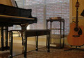
Was it the Ken Burn's Documentary with Shelby Foote? That is really good, gotta love PBS. We have Foote's trilogy on the Civil War and a couple others, but my hubby is the big reader.
Thanks for the nice comments. I was trying to focus more on the center but it came in closer towards me than I wanted. Of course, other people don't know that I guess.
No Pat, I don't play. When I was growing up little girls either took piano lessons or ballet. I chose ballet and danced for 7 years. This is a relative of husband's house - seems everyone in Memphis plays something though  We've got guitars and keyboards at our house (husband plays) and I think about every neighbor, friend or inlaw of mine has instruments in their homes too. We've got guitars and keyboards at our house (husband plays) and I think about every neighbor, friend or inlaw of mine has instruments in their homes too.
|
| Photo By: Andrea Harris
(K:2496)
|
|
|
Critique By:
Andrea Harris (K:2496)
5/13/2005 1:49:39 PM
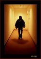
Great colors, lines and use of a silhoutte. The colors convey a warm, serene mood but the blur adds just a touch of action - well done!
|
| Photo By: carlo raingini
(K:11977)
|
|
|
Critique By:
Andrea Harris (K:2496)
5/13/2005 1:22:32 PM
I like this one best only because it lends to that metallic feel by being in bw. Also cropping out the cleavege keeps our eyes focused on the face and overall look of coolness. Very interesting!
|
| Photo By: Melanie Reynolds
(K:9096)
|
|
|
Critique By:
Andrea Harris (K:2496)
5/13/2005 1:19:46 PM
Thanks Melanie - you are right on about this. I've been having trouble using this lens (made for an SLR) and using it on the DSLR. I really have to back up a lot to get things in focus or to get more of the image in the photo - it's very annoying. I hope I can get a new lens for Christmas. I was being cheap and using dh's old one BUT, I think I could have achieved the same effect you are mentioning if I had just angled inwards a little more towards the wall. Thanks for your suggestion and all the nice comments - you have a great portfolio!
|
| Photo By: Andrea Harris
(K:2496)
|
|
|
Critique By:
Andrea Harris (K:2496)
5/13/2005 3:23:44 AM
Wow! I love how the dark green just envelopes the iris - adds so much mystique, like it's hidden away. Very pretty and creative way to showcase a flower portrait!
|
| Photo By: steven carter
(K:2140)
|
|
|
Critique By:
Andrea Harris (K:2496)
5/13/2005 2:53:10 AM
Thanks Gabriella and Steven!
|
| Photo By: Andrea Harris
(K:2496)
|
|
|
Critique By:
Andrea Harris (K:2496)
5/13/2005 2:46:10 AM
Thanks for the comment! Ian, I guess if you aren't familiar with rural farm life or the hymn (title of this photo) then it wouldn't make sense. And I suppose a photo should be understandable on some level to all, so in that regards I missed out on this one.
This is planting season across the South, so most gardens look like this right now - tilled, loose soil. My view point or focus is on the second tomato plant with the farm house and shed out of focus in the background. Imo, this doesn't create conflicting detail, rather enhances the purpose behind the composition. But, I appreciate your input. Also, would like to see more of your photos! Thanks again, I am learning a lot from the people here and all the great suggestions!
|
| Photo By: Andrea Harris
(K:2496)
|
|
|
Critique By:
Andrea Harris (K:2496)
5/12/2005 6:21:04 PM
Very beautiful!
|
| Photo By: Vasso Stamoulis
(K:1072)
|
|
|
Critique By:
Andrea Harris (K:2496)
5/12/2005 1:00:31 PM
I love this lady bug series - every one of them is so cute and with sweet detail!
|
| Photo By: Gabriella Carta
(K:22879)
|
|
|
Critique By:
Andrea Harris (K:2496)
5/11/2005 1:10:51 PM
Hi Margaret! Thanks. I didn't use a a flash for this series. Also, didn't set anything up - everything taken is as is and as natural to this home as possible - seeing it hasn't changed in 40 years - lol. The two lamps on the end tables have shades that contribute to that orange glow. All colors in the original photo are true to life. Your photo looks much cleaner though and definitely more modern with white lighting Thanks again for your comments!
|
| Photo By: Andrea Harris
(K:2496)
|
|
|
Critique By:
Andrea Harris (K:2496)
5/10/2005 9:02:54 PM
Is this the original color or did you tone it - like Mike said, it's very cool! Love the angle at which you shot it!
|
| Photo By: steven carter
(K:2140)
|
|
|
Critique By:
Andrea Harris (K:2496)
5/10/2005 9:00:17 PM
I didn't have my tripod with me, but did put it on a flat surface. That's not to say that it didn't shake some when I pressed the button though. I have read where this can be minimized even more by setting the self timer so you don't actually move the camera at all while pressing or releasing the button. Wonder if that would have helped?
|
| Photo By: Andrea Harris
(K:2496)
|
|
|
Critique By:
Andrea Harris (K:2496)
5/10/2005 8:53:40 PM
Thanks Pat and Tiff. This home's decor has not changed since it was built in the early 60's. Same everything - carpet, window treatments, furniture, paint. It's like it's frozen in time. I think many old Southerners don't like change and this is an example of how set in their ways they can be. Not always a bad thing, as modern decor might not have made for interesting pictures
|
| Photo By: Andrea Harris
(K:2496)
|
|
|
Critique By:
Andrea Harris (K:2496)
5/10/2005 8:36:48 PM
Good use of minimal depth of field!
|
| Photo By: Tiffany Hix
(K:5012)
|
|