|
|
Critique By:
John Doe (K:170)
3/3/2003 8:23:25 PM
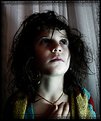
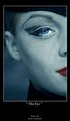
Really well done. I don't find the image too dark at all. Shadow play is terrific and the watch adds a bit of interest that is surprisingly not too distracting. Perfect facial expression.
|
| Photo By: Ricky Hirshfield
(K:832)
|
|
|
Critique By:
John Doe (K:170)
3/3/2003 8:17:30 PM
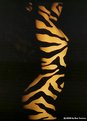
Very interesting. I like the blown out highlights. I think I might like it a bit more if there was a little more hint of the nose.
|
| Photo By: Ricky Hirshfield
(K:832)
|
|
|
Critique By:
John Doe (K:170)
3/3/2003 8:03:29 PM
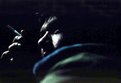
WOW, I can't believe this is a self-portrait. I too thought it was water from the thumbnail. Only critique (and it's minor) - black out the light line on the right.
|
| Photo By: Rebecca Ann Bunsick
(K:52)
|
|
|
Critique By:
John Doe (K:170)
2/18/2003 11:05:09 AM
That's really funny. Would be better without the basketball hoop in the background.
|
| Photo By: dave jones
(K:608)
|
|
|
Critique By:
John Doe (K:170)
2/18/2003 10:53:35 AM
Great angle, composition, lighting.
|
| Photo By: Fahredin Spahija
(K:98)
|
|
|
Critique By:
John Doe (K:170)
2/18/2003 10:51:53 AM
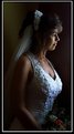
Terrific capture, I'm sure the bride is very happy with this one.
|
| Photo By: Verna Absolutestockphoto
(K:2836)
|
|
|
Critique By:
John Doe (K:170)
2/17/2003 12:55:08 PM
Great use of a projector. IMO the positioning of the arms and hands looks akward/distracting. The image also appears quite pixelated/jagged-lines.
|
| Photo By: Dan Scenna
(K:1661)
|
|
|
Critique By:
John Doe (K:170)
2/17/2003 12:48:19 PM
Wow, very emotive. Well done!
|
| Photo By: Martin Wagner
(K:-19)
|
|
|
Critique By:
John Doe (K:170)
2/17/2003 12:44:25 PM
Terrific fashion shot. Love the composition and angle(s).
|
| Photo By: Kristupa Saragih
(K:1031)
|
|
|
Critique By:
John Doe (K:170)
2/2/2003 2:43:16 PM
Well done, I personally like the dof and point of focus you chose. I think this is great but I think it could be even better had the lee button been covered by the flower, just a thought. Irregardless, it's terrific as is.
|
| Photo By: Candida Pais
(K:53)
|
|
|
Critique By:
John Doe (K:170)
1/27/2003 3:11:50 PM
Wonderful example of a beautiful head portrait! Love the color and dof.
|
| Photo By: Verna Absolutestockphoto
(K:2836)
|
|
|
Critique By:
John Doe (K:170)
1/27/2003 3:08:37 PM
Wow, fantastic! Love the composition and makeup/contacts.
|
| Photo By: Verna Absolutestockphoto
(K:2836)
|
|
|
Critique By:
John Doe (K:170)
1/20/2003 3:47:17 PM
Very nice dramatic lighting. Great pose and composition.
|
| Photo By: Verna Absolutestockphoto
(K:2836)
|
|
|
Critique By:
John Doe (K:170)
1/19/2003 4:43:27 PM
Very, very cool. Well done!
|
| Photo By: Jacek Jedrzejczak Konrad
(K:13)
|
|
|
Critique By:
John Doe (K:170)
12/27/2002 3:29:12 PM
Wow, very beautiful. I too would like a bit more dof to bring the eyes into more sharp focus, but think it's great as it is too.
|
| Photo By: Thomas Paul
(K:111)
|
|
|
Critique By:
John Doe (K:170)
12/23/2002 6:52:54 AM
Wonderful! The composition, tone, subtle color, everything!
|
| Photo By: Jacek Jedrzejczak Konrad
(K:13)
|
|
|
Critique By:
John Doe (K:170)
12/23/2002 6:51:11 AM
Very elegant. I too would like to see a very slight fill on the left.
|
| Photo By: Wallace Rollins
(K:149)
|
|
|
Critique By:
John Doe (K:170)
12/23/2002 6:49:03 AM
Nice perspective and framing. I feel the light may be a bit hard. Very nice portrait.
|
| Photo By: Kristupa Saragih
(K:1031)
|
|
|
Critique By:
John Doe (K:170)
12/23/2002 6:44:50 AM
I like the composition and the subject has a very happy expression. Nice shot. Is it just me or does her skin look a little odd, sort of blotchy?
|
| Photo By: Sandra Engman
(K:1231)
|
|
|
Critique By:
John Doe (K:170)
12/17/2002 7:55:34 AM
I would suggest a cropping like the one attached including removing the black object from the background.
|
| Photo By: Pawel
(K:26)
|
|
|
Critique By:
John Doe (K:170)
12/17/2002 7:47:19 AM
Fantastic lighting and capture! 
|
| Photo By: Keld Nielsen
(K:48)
|
|
|
Critique By:
John Doe (K:170)
12/17/2002 7:43:41 AM
Quite nice Reynaldo. Good lighting. Might be better without the arm cropped out.
|
| Photo By: Reynaldo Guimaraes
(K:2422)
|
|
|
Critique By:
John Doe (K:170)
12/16/2002 2:24:44 PM
I agree with Kyle, the lighting is well done along with the pose. I'd like a little more room at the top as to not cut of any of her head.
|
| Photo By: martin david brown
(K:25)
|
|
|
Critique By:
John Doe (K:170)
12/14/2002 5:33:10 PM
Andrew, as always all I can say is I absolutely love it. You are quite the artist!
|
| Photo By: Andrew Polushkin
(K:311)
|
|
|
Critique By:
John Doe (K:170)
12/14/2002 5:32:25 PM
Rene, as always you are an inspiration to me. I love the tone of this image as well as the composition.
|
| Photo By: Rene Asmussen
(K:138)
|
|
|
Critique By:
John Doe (K:170)
12/14/2002 5:31:04 PM
Hi Emily, Your skin tones always seem sepia toned, is that your goal? Your eyes on this one are "too uninvolved". Does that make sense? There is a bit of flash glare on the sunglasses. Keep shooting and I'll keep trying to help as best I can.
|
| Photo By: Emily Enderes
(K:192)
|
|
|
Critique By:
John Doe (K:170)
12/14/2002 11:49:25 AM
Very creative, I really like what you've done with the background.
|
| Photo By: Jonelle Cetin
(K:116)
|
|
|
Critique By:
John Doe (K:170)
12/14/2002 11:31:53 AM
Very nice portrait Phillip. Minor suggestion: try photoshoping out her hair under her arm. She looks a bit european. 
|
Photo By: Phillip Cohen
(K:10561)

|
|
|
Critique By:
John Doe (K:170)
12/2/2002 7:19:34 AM
Hi Emily, I love seeing what you're going to come up with next. This is an interesting image but as Marc and Barry have mentioned the blur doesn't seem quite right. I would also suggest some more fill light.
You mention you don't have a tripod yet may I suggest, if money is an issue, you can get a pretty cheap one at Wal-Mart that will do just fine until you can afford a better one. That's what I started with. However, depending on the length of the exposure subject movement will be a problem as well as camera movement. If you post the details of your shots (specifically: aperture, shutter speed, iso speed, and lighting info in the about) we might be able to add more specific suggestions. If you camera doesn't store that info then create a spreadsheet and write it down.
Hope this is helpful. Keep shooting and keep posting!
|
| Photo By: Emily Enderes
(K:192)
|
|
|
Critique By:
John Doe (K:170)
11/30/2002 6:29:22 PM
Very cool statement. The framing choice also works well with the image.
|
| Photo By: Jason Ness
(K:88)
|
|