|
|
Critique By:
John Doe (K:170)
9/5/2002 10:12:30 AM
Great use of hard light/shadows. I think the angle of the image works really well with the angle of the shadow, sort of makes it look like the shadow is not actually hers.
|
| Photo By: Greg Suvino
(K:57)
|
|
|
Critique By:
John Doe (K:170)
9/4/2002 9:44:07 PM
Fantastic lighting and model expression. The background is a bit distracting, but of course when you're on location there's only so much you can do. Great job.
|
| Photo By: Rachel Radcliffe
(K:17)
|
|
|
Critique By:
John Doe (K:170)
9/4/2002 9:34:29 PM
Technically flawless head shot. Great job Arthur.
|
| Photo By: Arthur John Grossman III
(K:1214)
|
|
|
Critique By:
John Doe (K:170)
9/4/2002 9:26:06 PM
Hi Sewen, I've really enjoyed your work. This one seems a bit too "white".
|
| Photo By: sewen
(K:0)
|
|
|
Critique By:
John Doe (K:170)
9/4/2002 9:22:14 PM
Amazing job Phillip!
|
Photo By: Phillip Filtz
(K:1792)

|
|
|
Critique By:
John Doe (K:170)
9/4/2002 9:20:59 PM
Nice shot. Could use a little bit more light on the lower section. I would also suggest doing the rotate crop so the lines of the windows are straight and get rid of the wall on the left. Hope these suggestions help. 
|
| Photo By: Rachel Radcliffe
(K:17)
|
|
|
Critique By:
John Doe (K:170)
8/23/2002 10:50:53 AM
Very nice Richard. I like the sepia tone you've used. IMHO I personally don't think the wall is a distraction, rather adds some interest to the photo.
|
| Photo By: richard trager
(K:111)
|
|
|
Critique By:
John Doe (K:170)
8/23/2002 10:48:09 AM
Hi Lyza, great capture. The lighting looks really great, especially since I'm guessing you had no control over it. I like the cropping a lot on this as well.
|
| Photo By: Lyza Perrenoud
(K:111)
|
|
|
Critique By:
John Doe (K:170)
8/23/2002 10:44:53 AM
Nice shot Yvon. Very interesting composition.
|
| Photo By: Yvon Loyer
(K:1449)
|
|
|
Critique By:
John Doe (K:170)
8/21/2002 11:32:52 AM
Excellent lighting and pose. Only thing I might do would be to crop just a bit off the top, but (pun intended) don't touch the bottom (pun intended). ;-)
Thank you for the kind words Vincent.
|
| Photo By: matt fruge
(K:83)
|
|
|
Critique By:
John Doe (K:170)
8/21/2002 11:26:21 AM
Very nice, I love the tight cropping with her arms framing her face. Great job!
|
| Photo By: vivek dhar
(K:25)
|
|
|
Critique By:
John Doe (K:170)
8/20/2002 9:30:57 AM
Nice portfolio image. Could be better without the line in the background.
|
| Photo By: vivek dhar
(K:25)
|
|
|
Critique By:
John Doe (K:170)
8/20/2002 9:28:24 AM
Great job. Love the mood.
|
| Photo By: Ken Alexander
(K:3905)
|
|
|
Critique By:
John Doe (K:170)
8/19/2002 3:44:24 PM
Very nice, I bet she really likes this one!
|
| Photo By: vivek dhar
(K:25)
|
|
|
Critique By:
John Doe (K:170)
8/19/2002 3:43:17 PM
Head tilt doesn't bother me at all. I think it adds a bit of interest to the shot. Very beautiful.
|
| Photo By: matt fruge
(K:83)
|
|
|
Critique By:
John Doe (K:170)
8/19/2002 7:58:07 AM
Very nice. Great angle and great lighting.
|
| Photo By: vivek dhar
(K:25)
|
|
|
Critique By:
John Doe (K:170)
8/16/2002 8:58:47 PM
Absolutely fantastic! Wouldn't change a thing. Also, very beautiful model.
|
| Photo By: Quentin Shih
(K:0)
|
|
|
Critique By:
John Doe (K:170)
8/16/2002 8:54:40 PM
Excellent, very cool. Abstracts/Still Lifes rarely catch my eye and this one very much did.
|
| Photo By: Kristupa Saragih
(K:1031)
|
|
|
Critique By:
John Doe (K:170)
8/16/2002 8:51:57 PM
Great job, just beautiful. I would also suggest rubber stamping out that blade of grass in front of her eye.
|
| Photo By: Ingret & A. Maltcev
(K:0)
|
|
|
Critique By:
John Doe (K:170)
8/16/2002 8:50:49 PM
WOW, that's all I can say!
|
| Photo By: Deborah Seitz
(K:85)
|
|
|
Critique By:
John Doe (K:170)
8/16/2002 8:49:53 PM
Very beautiful. LOVE it!
|
| Photo By: sewen
(K:0)
|
|
|
Critique By:
John Doe (K:170)
8/16/2002 8:49:22 PM
Great photo, but the object in the left corner is quite distracting. Try cropping it out in PhotoShop.
|
| Photo By: Andy R.
(K:74)
|
|
|
Critique By:
John Doe (K:170)
8/16/2002 8:48:14 PM
Great job Kristupa. I don't think the shoulder is a problem but I do agree that the shadowed eye needs a bit more light.
|
| Photo By: Kristupa Saragih
(K:1031)
|
|
|
Critique By:
John Doe (K:170)
8/16/2002 8:46:47 PM
Great job Dario! I really like this. I wonder if a bit of reflective light on the side may look nice, but I also think the dark shadow creates a nice mood to this image. Well done.
|
| Photo By: Dario Diament
(K:83)
|
|
|
Critique By:
John Doe (K:170)
8/16/2002 8:45:14 PM
I really like this too Christopher. My only critique is that the fungus/weed/whatever that is on the ground looks strange and is somewhat distracting.
|
| Photo By: Christopher Kokonas
(K:62)
|
|
|
Critique By:
John Doe (K:170)
8/16/2002 8:43:54 PM
Nice candid shot. I'm not sure but his face seems a bit out of focus and a tad bit too much shadow on the right side of his face. Of course if this is a "candid" shot, not much you can do about that. Good job.
|
| Photo By: Deborah Seitz
(K:85)
|
|
|
Critique By:
John Doe (K:170)
8/16/2002 8:41:40 PM
Fantastic head shot Sorin. I respectfully disagree with Autumn, the very slight shadow on the side of her face gives this image depth.
|
| Photo By: Sorin Varzaru
(K:17)
|
|
|
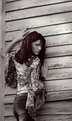
Critique By:
John Doe (K:170)
8/16/2002 8:39:36 PM
Hi Andy, actually I like the cropping. I think the image as a whole is very nice. I do find the model to be a bit soft and I don't care for the wood paneling in the background (it's a bit distracting).
|
| Photo By: Andy R.
(K:74)
|
|
|
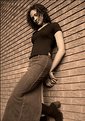
Critique By:
John Doe (K:170)
8/16/2002 8:37:48 PM
In the spirit of a second (actually 3rd) opinion, I like everything about the shot and model. However, I find the brick wall she is leaning on very distracting. I find my self drawn to the horizontal lines of the wall rather than the model.
|
| Photo By: vivek dhar
(K:25)
|
|
|
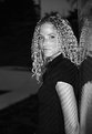
Critique By:
John Doe (K:170)
8/16/2002 8:34:34 PM
I think this is a tremendous shot. Fantastic reflection in the water. With all do respect to David, I don't see a disturbing tilt of the horizon.
|
| Photo By: Pete Kinser
(K:106)
|
|


")