|
|
Critique By:
Justin Roberts (K:382)
12/13/2004 10:17:03 PM
I must confess to being unfamilier with a holgaroid but I suspect it is not an all singing all dancing super dooper digi thing and boy does this picture make the most of that.
Gulls are often portrayed as simple scroungers but here we have an insight that is far more sinister. The whole grouping reaks of menace and aggresion from the posture of the two birds in the foreground to the attitude of the three flying, especially the one on the left whose look suggests an arrogance and assumed superiority worthy of any resevoir dog.
The villinous characterisation of these beasts is tremendous and it is a picture that may be returned to many times to appreciate anew just what has been caught here. It just goes to show that great photography is dependent upon far more than the price tag on ones equipment.
Justin.
|
Photo By: Bea Friedli
(K:10189)

|
|
|
Critique By:
Justin Roberts (K:382)
12/13/2004 10:02:33 PM
The suggestion of industry or settlement in the background mists reminds us that this is not a picture of the rural ideal, rather it is a representation of the horse as a reminder of ones background or roots whether real or fondly imagined. One thinks of the owners attempting to cling to some part of their history and refute any suggestion of their succumbing to city life whatever the appearence to the contrary. It is a denial of sorts and one that is as common in the UK as it is in any other part of the developed world.
As for the actual picture I agree that the animals need some features, they may as well be their own shadows. I would also cut out some of the sky and crop the three horses on the left leaving the tree to fill and frame that side of the photograph.
An interesting and thought provoking contribution.
Justin.
|
| Photo By: Jindrich Nemec
(K:70)
|
|
|
Critique By:
Justin Roberts (K:382)
12/11/2004 10:04:58 PM
I like the choice of focal point
hazel
|
| Photo By: barbara
(K:95)
|
|
|
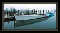
Critique By:
Justin Roberts (K:382)
12/11/2004 9:36:29 PM
Tom. Try cropping off the mountains and hills in the background. Makes a different picture altogether. The patterns in the sand become far more prominant and the boat takes on extra signifigance.
I much prefer it that way and it becomes a great shot.
Justin.
|
| Photo By: Tom Last
(K:0)
|
|
|
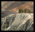
Critique By:
Justin Roberts (K:382)
12/11/2004 9:30:44 PM
What a weird and wonderful landscape! The trees look totally out of place amongst the dry slopes and ravines yet they seem at home there. Quite strange yet fascinating. The pattern on the brown slope in the middle ground suggests agriculture but everything else seems so barren.
Lovely colours set off by the verdency of the trees.
Justin.
|
| Photo By: Paolo Pagnini
(K:828)
|
|
|
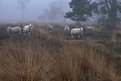
Critique By:
Justin Roberts (K:382)
12/11/2004 9:24:51 PM
Lovely muted colours. Sheep and farm animals in the field can be very difficult to make good pictures out of but this really is an excellent shot with plenty of interest in the subjects themselves. If they had all been looking away from the camera then it would have been hopeless.
Rather an excess of rushes in the foreground though. May benefit from cropping them out.
Justin.
|
| Photo By: Hermen Pen
(K:9168)
|
|
|
Critique By:
Justin Roberts (K:382)
12/11/2004 6:00:00 PM
Jo, thanks for the interest. The camera itself originates from the 50's so I felt it best to leave it as it was. I have a couple more from the old beast that I may yet post.
It's that old fashioned look, the disjuction between a modern plastic chair and the timelesness of a garden emphasised by the retro 'feel' that makes the picture, or so I had hoped anyway.
Another title I thought of for the picture was 'Absence imposed'. But that's been done I believe.
Justin.
|
| Photo By: Justin Roberts
(K:382)
|
|
|
Critique By:
Justin Roberts (K:382)
12/7/2004 10:56:57 PM
Clean, fresh, fanatastic. if only I had more time to view it.
|
| Photo By: Melanie Reynolds
(K:9096)
|
|
|
Critique By:
Justin Roberts (K:382)
12/7/2004 8:22:31 PM
Fair comment. Its bugging me now you've pointed it out!
Justin :-)
|
| Photo By: Justin Roberts
(K:382)
|
|
|
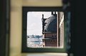
Critique By:
Justin Roberts (K:382)
12/7/2004 7:44:21 PM
Alas it needs to be the other way around, frame in focus, building blurred. Having the foreground blurred like this always seems unnatural to me and the immediate question arises why bother with a frame if you can't see it?
However it does want me to go to the window and look beyond so it works in that way.
Sorry for being so negative!
Justin.
|
| Photo By: Kathy Hwang
(K:142)
|
|
|
Critique By:
Justin Roberts (K:382)
12/7/2004 7:39:36 PM
Just goes to show you that you don't need the sunshine to produce beautiful results. The quality of light is as important as its quantity and here is a classic example.
With this headlong rush into all things digital it is worth remembering the basics, triopd and long exposures in this case.
Loveit.
p.s. Have you tried very long exposures, 4 seconds plus, in the rain? Worth giving it a go.
|
| Photo By: James Bambery
(K:13421)
|
|
|
Critique By:
Justin Roberts (K:382)
12/5/2004 9:54:59 PM
Lovely composition with the red line on the third. Classic stuff but you have gone beyond simply employing the rule book and produced an image that tells us so much of the vessel by only showing so little of it.
|
| Photo By: Alain Boccard
(K:100)
|
|
|
Critique By:
Justin Roberts (K:382)
12/5/2004 9:44:52 PM
Very clean and very strong. That jetty end is absoloutly essential to making the image and its existence is so well indicated by the angle and power of the fence, it tells of activity to the right and declares that there is more to interest us than is shown here. But what? We can only wonder and hope some day to go there and find out for ourselves.
|
| Photo By: Heath Bennett
(K:4429)
|
|
|
Critique By:
Justin Roberts (K:382)
12/5/2004 9:38:23 PM
Indeed, thats a lot better!
Good work, keep at it.
Justin.
|
| Photo By: Asli Karabulut
(K:2304)
|
|
|
Critique By:
Justin Roberts (K:382)
12/5/2004 9:24:39 PM
Speaks volumes. Crop out half the curtains to bring the lady into greater prominence along with the empty area of bed and you have a masterpiiece.
Justin.
|
| Photo By: Asli Karabulut
(K:2304)
|
|
|
Critique By:
Justin Roberts (K:382)
12/5/2004 9:20:46 PM
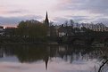
Ahh Dave!
You have plucked at the heart strings here. in my youth I used to work on Bithels Boats which are, or were, based just about 100 yds to the left of where you were standing. Many a story from those days including how me and a mate tried to ride the Dee bore up and over the that very weir in a rowing boat one dark night. Happy days.
Anyway, a cold morning, an univiting stretch of water under a chill sky. All these elements are nicely portraid and it simply makes you yearn for the warmth of home. Those bare trees in the background and rather plain achitecture just add to the uninvitng and unromantic environment.
The boat to the right has an abandoned air underlying the the thought that others too have fled the scene for a warm hearth.
Justin.
|
| Photo By: dave green
(K:2396)
|
|
|
Critique By:
Justin Roberts (K:382)
12/5/2004 9:08:24 PM
Toni
Thankyou for taking the comments in the way they were meant.
Justin.
|
| Photo By: Antonia BauerleinSehnert
(K:30599)
|
|
|
Critique By:
Justin Roberts (K:382)
12/5/2004 6:27:03 PM
The curve of the bow fits in with the shape of the arch particuarly well, it almost looks as if it is a crooked finger beckoning something out of a cave.
Perhaps some of the stonework on the right could have been cropped out, this would have taken the boat out of the centre of the picture.
|
| Photo By: david george
(K:481)
|
|
|
Critique By:
Justin Roberts (K:382)
12/5/2004 1:04:02 PM
It would indeed make a great illustration for something like Alice in Wonderland and the skill that has gone into producing it is worth noting, but again I keep looking at it and I keep finding things I don't like. The girls arms strike me as being to long, her small hands would not be able to grip a large branch in the manner shown and she is too far off the ground. How did she get there? Alice In Wonderland stuff indeed.
It's details like this that let down an otherwise delightful image.
There is a thread in the Philosophy forum which touches on the validity or otherwise of considering such pictures photographs. This one, though quite lovely has in my view gone beyond the line.
Yours
Justin (Miserable git) :-)
|
| Photo By: Antonia BauerleinSehnert
(K:30599)
|
|
|
Critique By:
Justin Roberts (K:382)
12/5/2004 10:21:29 AM
My first thoughts were WOW what a picture but then I came to look at it agin and I feel that it is perhaps a little to contrived. To much sun on the foreground trunks and boughs but far too glum in the background. The balance is all wrong. One wonders what it looked liked pre photoshop?
Just not naturalistic enough for me I'm afraid.
Justin.
|
| Photo By: Antonia BauerleinSehnert
(K:30599)
|
|