|
|
Critique By:
Lester Tradelbloom (K:3291)
12/26/2004 4:22:32 PM
A very powerful image, well done. I love the feeling of solitude you have created here, it is inspirational. However, I think a straight monochrome image would be more powerful. Applying a sepia tone always reduces image contrast marginally, and I think you need a stronger impact for this to work as well as your imagination deserves.
- Justin
|
Photo By: Robert Gaither
(K:34128)

|
|
|
Critique By:
Lester Tradelbloom (K:3291)
12/26/2004 3:53:55 PM
Hi Brian, this is a fantastic image, I love it, but unfortunately, I cannot comment on the technical aspects of this macro shot. I love images like this, and I have a lot to learn from photographers like you.
Well done!
- Justin
|
| Photo By: Bryan Jarmain
(K:11941)
|
|
|
Critique By:
Lester Tradelbloom (K:3291)
12/26/2004 3:40:13 PM
So now, you not only have a flawlsee image and perfect title, you made me look a little silly too - sneaky, sneaky you... =P
hope you had a great Christmas,
- Justin
|
| Photo By: Mark Sherman
(K:15669)
|
|
|
Critique By:
Lester Tradelbloom (K:3291)
12/26/2004 3:31:32 PM
I could never have thought of a better fitting title. Those five letters sum this image up so well. I noticed a frowning face in your image description - I hope this is a typo. I love this image, it has a very humbling mood about it. Paece... indeed.
Well done Mark.
- Justin
|
| Photo By: Mark Sherman
(K:15669)
|
|
|
Critique By:
Lester Tradelbloom (K:3291)
12/26/2004 3:25:39 PM
I apologise in advance for defacing your image, but the title was simply too tempting as I uploaded my last image.
I love the simplicity and detail (even if it is minimal) in this image, it is very nice indeed. - and such a classic keyhole too, well done!
|
| Photo By: Tom Ziegler
(K:585)
|
|
|
Critique By:
Lester Tradelbloom (K:3291)
12/26/2004 12:20:22 PM
Doesn't it feel wonderful when you spend so much time on producing a perfect image and then no one even comments on your work? This is a wonderful piece of work, and I can appreciate the time you took here. well done Shane.
- Justin
|
| Photo By: Shane O'Neill
(K:3054)
|
|
|
Critique By:
Lester Tradelbloom (K:3291)
12/26/2004 12:08:18 PM
Yes Yes yes!
Very nice indeed. A shot like this takes meticulous preparation (or a nice stroke of luck). Studio photography like this is said to be the easiest, but it is far from it – especially when it comes to photographing glass. I uploaded a series of martini glasses a few weeks ago, which also took a lot of work.
The only thing that stops this image scoring a 7 is that the extreme left rim of the glass is off the frame, otherwise a great, and very impressive shot.
Well done
- Justin
|
| Photo By: Hussam Abdul Nour
(K:3799)
|
|
|
Critique By:
Lester Tradelbloom (K:3291)
12/26/2004 11:28:30 AM
You know what; I really don't think you need me to tell you you've done a great job here. You know what you are doing. Well done.
- Justin
|
| Photo By: Michael Holm
(K:7931)
|
|
|
Critique By:
Lester Tradelbloom (K:3291)
12/26/2004 1:46:55 AM
I apologise Antonio, here is the image
|
| Photo By: Antonio Trincone
(K:23167)
|
|
|
Critique By:
Lester Tradelbloom (K:3291)
12/25/2004 2:47:44 PM
I like your idea here, it is a beautiful setting and a fabulous part of the world, but in terms of imagery, it doesn't feel quite so striking. Your composition is slightly off, and from a distance, it looks almost as if there is just a line of black across the top and bottom of the photo. I have uploaded a more correctly composed shot to show you what I mean, and also, a link to a similarly shot image in my portfolio http://www.usefilm.com/image/644804.html. With that said, you have taken the most critical step in creating interest in an otherwise boring sea-scape. Some cloud and sky formations are incredibly majestic, but lack the foreground interest you have given here.
well done
- Justin
Merry Christmas
|
| Photo By: Antonio Trincone
(K:23167)
|
|
|
Critique By:
Lester Tradelbloom (K:3291)
12/22/2004 1:13:40 PM
Oh yes, good ol' Tassie. I lived there for about a year when I was a little fella. Who would have thought that an island so small has no fuel stations for 184kms? But anyway, to your photo; I like it, I like it a lot, but I think it may be just a little too busy for the effect you seem to be trying to achieve.
I love the whispy clouds, they are a beautiful characteristic of that part of the world. I think the one thing that may have made this photo much more successful woule have been to park the car on the other side of the road. This would have allowed for the same basic idea (to go, or not to go) but in addition to that, you would have has a winding black road, getting lost in the distance. Doing this would have made your audience look at the image and then get sucked into its every aspect - and *that* is what photography is all about.
I have looked over your portfolio (your wonderful portfolio), and by no means am i suggesting you did this wrong, I love this photograph, I think it is wonderful, but we are here to critique each other afterall =)
Great work
- Justin
|
| Photo By: Mistral Vortex
(K:627)
|
|
|
Critique By:
Lester Tradelbloom (K:3291)
12/21/2004 4:36:56 PM
Sharp and soft indeed - a great contrast and wonderful composition! and a perfect frame =)
Great work!
- Justin
|
| Photo By: Dino F
(K:627)
|
|
|
Critique By:
Lester Tradelbloom (K:3291)
12/20/2004 3:46:58 PM
Poor little fella... Baygon strikes again
- Justin
|
| Photo By: Rich Swanner
(K:-3732)
|
|
|
Critique By:
Lester Tradelbloom (K:3291)
12/20/2004 12:55:52 PM
This, now this is something special. When I saw the thumbnail of this I had no idea what it was, but up close all secrets are revealed. You know, in my eyes, this image almost steps out of the world of photography and into that of 3D illustration. You have created a seemingly surreal effect here, I like it.
Thanks for your comments - I am honoured to have my image on your desktop wallpaper =D
- Justin
|
| Photo By: YeeLin
(K:322)
|
|
|
Critique By:
Lester Tradelbloom (K:3291)
12/20/2004 7:59:31 AM
This is magical, a really wonderful composition here. I get a great feeling of freedom when I look at this; sailing the seven seas wityh a gorgeous girl. But Dino, I look at this great monochrome piece of work, and then I see those bright colours in the bottom left corner, and I forget I am looking at a photograph.
I think I have said this to you in reference to another work of yours. Your photography is good enough, you don't need to sign it off like that. But if you so feel the need, remember that in the digital world, the frame is part of the photograph.
Keep up the good work!
- Justin
|
| Photo By: Dino F
(K:627)
|
|
|
Critique By:
Lester Tradelbloom (K:3291)
12/19/2004 2:30:21 PM
This, this is creepy, this is frightning. I love it! So straightforward and seemingly accidental.
A great shot!
- Justin
|
| Photo By: Kinta Olia
(K:48)
|
|
|
Critique By:
Lester Tradelbloom (K:3291)
12/19/2004 2:23:37 PM
This is cool. This is very, very cool. Such wonderful simplicity.
It is good to see that in our digitally rn world , there is still a sense of history in the air. It would have been very easy for you to take this image overboard and play with it too much.
But I love the almost uncanny feeling I get when I look at this.
I get the feeling here that although our world is run by industry and technology, when we compare the world we have created next to the beauty of the natural world, our creation is dull and lifeless, yet in nature, it is vibrant and wonderous.
well done!
- Justin
|
| Photo By: kaan tatli
(K:628)
|
|
|
Critique By:
Lester Tradelbloom (K:3291)
12/19/2004 7:55:05 AM
Fantastic perspective Stephen! This is something to be proud of, it is such a simple, subtle photograph, but the perspective you have captured is wonderful. Personally, I think the bar in the background detracts from the strength of the image - see repost.
Congrats.
- Justin
|
| Photo By: stephen evans
(K:-104)
|
|
|
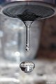
Critique By:
Lester Tradelbloom (K:3291)
12/19/2004 1:39:41 AM
This is a fantastic shot! you certainly hav an eye for ths - or you just got very lucky! Unfortunately, there are a few flaws that prevent this photo from being 100% successful, the first being the obvious camera shake, inly a little, but it is there, and as we all know, it only takes that likkle bit of movement to destroy an image. Secondly, it looks as you have just shot this at your kitchen sink or bathroom hand basin - fine for now, but if you want to correct this photograph, set up a white board behind the tap, plave a black reflector on one ot both sides of the falling water, and get some more powerful lighting to speed up your shutter speed. You will see the difference, the image will become crystal clear and sharp as a tac. I like your idea, it just needs some time to perfect.
- Justin
|
| Photo By: Herbert Kajiura
(K:944)
|
|
|
Critique By:
Lester Tradelbloom (K:3291)
12/18/2004 1:18:49 AM
This may come as a shock, but I thin the reason people are not commenting on this image is that in the thumbnail image, this looks like a bad photoshop of a burning US flag - people don't comment because maybe they don't know whether you have done it intentionally or not...
Just a thought. Nice Idea though, and nice portfolio also.
- Justin
|
| Photo By: Tiffany .
(K:343)
|
|
|
Critique By:
Lester Tradelbloom (K:3291)
12/18/2004 12:59:46 AM
One of the things I love most about this network is the ability we all possess to see the other side of the world through a window or vision that other photographers'capture for us. This is simply magical; Len said it very well, looking into this image, it feels almost dream-like, congradulations on a great eye.
- Justin
|
| Photo By: Anurag Sahay
(K:1043)
|
|
|
Critique By:
Lester Tradelbloom (K:3291)
12/16/2004 4:41:36 AM
Creepy, very creepy indeed, but magically successful. I love the vibrancy in the colours and the eerie look in the fish.
Well done
- Justin
|
| Photo By: Wallapha Prakanrat
(K:4)
|
|
|
Critique By:
Lester Tradelbloom (K:3291)
12/15/2004 9:35:11 AM
There should be more comments on a photograph like this, it is so perfect it almost seems uncanny. I don't know whether it was just like this or whether you have had a field-day in photoshop, but the result is wonderful. Usually, I would say that the white area in the top left corner is distracting, and to tone it down a little to restore some detail to that area, but not here, it is too appealing, and it fits in wonderfully with that pure, uncanny feeling I get here.
I love it, and thank you for your comments on my portfolio =)
- Justin
|
| Photo By: Lisa B
(K:1011)
|
|
|
Critique By:
Lester Tradelbloom (K:3291)
12/15/2004 4:44:25 AM
This is an interesting and very subtle photograph, with immaculate composition. You say in your profile that you are just learning, but in an image like this, it is evident that you have a magic eye for composition - though, like many great photographers, I doubt you are even aware of it.
One of the most important aspects of an aesthetic photograph is how it 'flows'. We read from left to right, and from top to bottom, so our eyes are naturally more comfortable looking at a photograph that encorperates this, than one which, for example, flows from right to left. I am referring to the line created by the crest of the wings and over the head (see attached example - red dotted line).
I like this a lot, well done.
- Justin
|
| Photo By: Chris Bonfiglioli
(K:29)
|
|
|
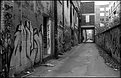
Critique By:
Lester Tradelbloom (K:3291)
12/14/2004 6:02:03 AM
Wonderful perspective and perfectly composed. I love the Graffiti on the wall, it adds that real 'city alley' touch to your work. Just one thing - the top right corner is very overexposed (unaviodably, I know) but you could have burned this in to keep your eye from being drawn to that part of the frame. But I love it nonetheless!
- Justin
|
| Photo By: Suzi Q.
(K:426)
|
|
|
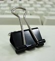
Critique By:
Lester Tradelbloom (K:3291)
12/14/2004 5:13:43 AM
Ok, I have looked at your portfolio, and I see you do understand what this is all about. This is an interesting idea, and I like your composition with the keyboard in the background, but what has really taken your photo to the dogs are two things; lighting, and subject.
When photographing in macro situations, the primary thing you must consider is your use of lighting because the smallest, and seemingly insignificant impurities in lighting are emphasised when you get this close. It looks here as is you have simply photographed this spontaneously without any real subject thought. I and the image has a subtle green tinge which suggests you have used only available flourescent lighting - thus the slow shutter.
The second thing is subject matter; in any situation (particularly in macro) your subject must be immaculately prepared. I have done a lot of studio photography at late and this is always a primary concern with me. your subject has metallic areas on it (the silver handles), these are scratched and seem 'grubby'. The best way to correct this is to use a new clip altogether, straight from the box.
Ok, now to put these together. Lighting is the pivotal aspect of photography, whether it is portraiture or still life, but when it comes to studio work, your subject must almost blend with your lighting to create a perfect image. Matte surfaces are easy but here, where you are shooting a reflective surface, you have made life quite difficult for yourself. To light a surface like this, you need to go a lot further; you need a softbox to create constand, and unbroken lighting along the subjects' reflective surfaces, and you need to photograph it in such a way that you are not part of the reflection.
I thrive on perfecting difficult images like yours and love the feeling of overcoming barriers people told me could not be overcome. http://www.usefilm.com/image/634677.html - this is one image of mine, of spoons which I was told was impossible to light without shadow, evenly, and without reflection (by professionals). Anything is possible with persistance, so stick with it.
- Justin
|
| Photo By: Glen Subroto
(K:14)
|
|
|
Critique By:
Lester Tradelbloom (K:3291)
12/14/2004 12:27:53 AM
Flawlessly lit!
|
| Photo By: Eduardo Bernardes
(K:8999)
|
|
|
Critique By:
Lester Tradelbloom (K:3291)
12/13/2004 3:31:38 AM
Oh yes, the infamous light house. I love your composition here, it is very striking, though I feel the levels in this shot aren't up to speed with your creativity. I have imported it into photoshop and played around with the levels (which increased your saturation also). I think that was the only flaw in this image, you have done a wonderful job.
- Justin
|
| Photo By: Greg Hawes
(K:866)
|
|
|
Critique By:
Lester Tradelbloom (K:3291)
12/13/2004 3:22:03 AM
Very nicely done! i like the subtle simplicity of this photograph. Your composition is not by the book, and I like that in a photograph(er). I think what makes this such a strong photo is also your framing - most framing id a simple black/white line (which works well) but this shot needed more than that. Well done!
- Justin
|
| Photo By: Eric Simpson
(K:2348)
|
|
|
Critique By:
Lester Tradelbloom (K:3291)
12/13/2004 3:06:10 AM
Picture this;
***
A child enters a toy store with his mother by his side. He wonders around the aisles looking at the toys, picking one up every so often and examining it with naieve interest. Half an hour passes and the boys mother has been following him around, glancing at her wrist watch constantly hoping the boy will not find anything he likes. Then, like a sudden burst of an erupting volcano, the boy grabs his mothers hand, radiating elation, and jumping up and down, pointing to something at the end of the aisle, screaming "Mummy, Mummy, I want that one! I want that one!
***
That boy is me, and this is what I want! I love this, it is a wonderfully captured piece of work - epitomised by the movement in the clouds.
- Justin
|
| Photo By: Rick Page
(K:5242)
|
|