|
|
Critique By:
Warren Tang (K:413)
1/11/2007 12:59:50 AM
Thanks for the comment, Peter. I did this family portrait session as a favor to my friend. I'm still doing the post processing of all the shots before I present the whole package of proofs. I pulled this one from the bunch because I liked it. I showed it to the mother, who thought it was a cute shot, but she prefers not to be photographed like that next to the tall folks in her family :).
|
| Photo By: Warren Tang
(K:413)
|
|
|
Critique By:
Warren Tang (K:413)
3/22/2006 2:39:51 PM
Guys, thanks for the great feedback. This new CC feature is great!
During post-processing, I did experiment with darkening of the bright yellow band in the background. After trying a few different looks, I decided to leave the background as-is because IMO, the bold yellow band of color in the background is an integral part of the picture, and actually contributes to the overall "impact" (color and contrast).
--Warren
|
| Photo By: Warren Tang
(K:413)
|
|
|
Critique By:
Warren Tang (K:413)
1/9/2006 3:06:23 PM
oops, I forgot to add that I also like the square format in the color version, it makes the composition feel more "balanced".
Warren
|
| Photo By: Louise Vessey
(K:13862)
|
|
|
Critique By:
Warren Tang (K:413)
1/9/2006 3:04:01 PM
Hi, both versions are nice, but I prefer the color one because I think the rosy color of the bouquet adds to the "love" and "happiness" theme of the picture. Also, the skin tones and sand color adds some seperation to the compositional elements.
Regards,
Warren
|
| Photo By: Louise Vessey
(K:13862)
|
|
|
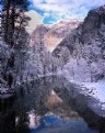
Critique By:
Warren Tang (K:413)
1/9/2006 11:54:15 AM
Hello, this is a very nice and unique reflection shot. There are many examples of this type of shot, but in my opinion, this one really stands out. Nice use of color in the reflection to make it stand out against the monochromatic tones of the ground.
Regards,
Warren
|
| Photo By: Tunç KUTLU
(K:198)
|
|
|
Critique By:
Warren Tang (K:413)
1/9/2006 11:42:47 AM
Beautiful picture! I love the "feeling" and atmosphere of this shot. This is a very unique view of a very well known landmark. I also like how you caught that little patch of light just above and to the right of the castle, it really adds something special to the composition.
Regards,
Warren
|
| Photo By: Mattia L.
(K:7625)
|
|
|
Critique By:
Warren Tang (K:413)
1/9/2006 10:44:39 AM
I love the composition and concept of this picture. You really have a nice touch with children photos!
I also noticed the oversharpening around the eyes, but you've already explained why it happened.
Regards,
Warren
|
| Photo By: Susie OConnor
(K:34798)
|
|
|
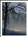
Critique By:
Warren Tang (K:413)
1/9/2006 10:29:05 AM
Hi Dave, great capture! I like the positioning of the jumper at "tree top level"  , and also the relative positioning of the bystanders. Very nice! , and also the relative positioning of the bystanders. Very nice!
--Warren
|
Photo By: Dave Stacey
(K:150877)

|
|
|
Critique By:
Warren Tang (K:413)
12/27/2005 3:56:07 PM
Hi Stephen, nice composition. This image also looks a bit flat on my screen, and a bit soft overall, especially towards the far end of the image where the s-curve naturally leads my eye. Maybe the raw scan needs a little work in PS to restore its original color and clarity?
Regards,
Warren
|
| Photo By: Stephen Rogers
(K:3370)
|
|
|
Critique By:
Warren Tang (K:413)
12/27/2005 3:31:43 PM
Thanks for posting the original. I see what you did now, great job on the restoration.
My personal preference is for the B&W look of the original picture vs. the toned version. Also, some of the original reflection from the side of the car was lost due to the increased contrast/darkening of the restored version. It might have been interesting to see (more clearly) the surrounding area from the reflection off the car. The cleaner look of the restored version is less distracting though.
Regards,
Warren
|
| Photo By: Chuck Freeman
(K:13616)
|
|
|
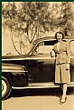
Critique By:
Warren Tang (K:413)
12/27/2005 2:33:33 PM
Hi Chuck, without the original, unrestored version, it's a little hard to comment on whatever influence that you had on this image. Can you post the original in a reply comment? Other than that, it looks like a nice, sepia toned vintage snapshot. Was the picture originally pure B&W?
I often like to take pictures of my wife standing next to one of our vehicles while out on a road trip. This picture makes me think of all those photos of this type that have been taken over the years by countless photographers .
regards,
Warren
|
| Photo By: Chuck Freeman
(K:13616)
|
|
|
Critique By:
Warren Tang (K:413)
12/21/2005 5:41:22 PM
Beautiful lighting on the boy, contrasted with the muted surroundings, he's glowing! And you captured a nice expression of curiosity too.
Regards,
Warren
|
| Photo By: Susie OConnor
(K:34798)
|
|
|
Critique By:
Warren Tang (K:413)
12/21/2005 5:36:35 PM
Thanks Paul (and the others) for your kind words. I really appreciate your comments.
Regards,
Warren
|
| Photo By: Warren Tang
(K:413)
|
|
|
Critique By:
Warren Tang (K:413)
12/21/2005 4:08:52 PM
Great capture! I like the splash of orange color from the girl's top. It contrasts nicely with the "cool" wall of water. I also like the subtle diagonal of the fountain cutting across the frame. Very nice!
Regards,
Warren
|
| Photo By: Pim de Ruijter
(K:2170)
|
|
|
Critique By:
Warren Tang (K:413)
12/21/2005 11:37:38 AM
I really like the tones and composition of this picture. I like the positions of the group of people working on the net, and how you captured the lone person silhouetted right under the setting sun. The reflections and shadows also add a lot to the overall effect.
Regards,
Warren
|
| Photo By: Partha Pal
(K:11619)
|
|
|
Critique By:
Warren Tang (K:413)
12/21/2005 11:20:38 AM
Hello Diego, this is a nice, classic perspective, well aligned and composed. I like the fact that you included that person in the far end of the scene. It gives a feeling of the relative size of the place. I do notice that the tonality of the image is a bit flat. I'm not sure if you intended it that way, but that's how it apperas to me.
Regards,
Warren
|
| Photo By: Diego Bullita
(K:17017)
|
|
|
Critique By:
Warren Tang (K:413)
12/21/2005 10:59:16 AM
Very nice, I like the appearance of the flowing water. I couldn't help but wonder how this scene would look as a vertical composition because it might accentuate the feeling of the water flowing down the falls.
Regards,
Warren
|
| Photo By: Aleksandr Kaplun
(K:77)
|
|
|
Critique By:
Warren Tang (K:413)
12/21/2005 10:54:52 AM
I was wondering how you did that! Now I know. It really does look like another planet...very creative.
Regards,
Warren
|
| Photo By: Aleksandr Kaplun
(K:77)
|
|
|
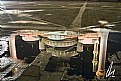
Critique By:
Warren Tang (K:413)
9/24/2005 10:54:25 PM
Hello, this is an interesting subject.
Unfortunately, the lighting was very difficult. Most of the main subject (the shepherd and the head of the grazing sheep) are in the shadow.
The use of a fill flash would have helped even out the exposure a bit.
Regards,
Warren
|
| Photo By: Mehmet Mermutlu
(K:148)
|
|
|
Critique By:
Warren Tang (K:413)
9/24/2005 9:42:59 PM
A very excellent composition. The B&W, edge vignetting, and the various Venician elements all work very well together. I also like the way the reflection in the sphere gives another glimpse into the surroundings.
--Warren
|
| Photo By: Elsa Mota Gomes
(K:1565)
|
|
|
Critique By:
Warren Tang (K:413)
9/24/2005 3:45:48 AM
Koray, this is a stunning shot. You captured a beautiful moment. I like the light rays emanating from the clouds, and positioning of the foreground silhouette of the person on the bench.
--Warren
|
| Photo By: Koray Türker
(K:471)
|
|
|
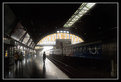
Critique By:
Warren Tang (K:413)
9/24/2005 3:38:57 AM
Hi Lisa, this is a great wide angle composition. Everything seems to be in the proper place. I like the way the arched opening, along with the highlight of the platform create a nice semi-circle. The walking person is perfectly positioned within that circle. I also like how the colored panels in the opening add color to an otherwise monochromatic scene.
|
| Photo By: lisa rose
(K:567)
|
|
|
Critique By:
Warren Tang (K:413)
9/24/2005 12:29:41 AM
Nicely seen, and very original. Congratulations on a great capture!
|
| Photo By: Alan Orr
(K:9671)
|
|
|
Critique By:
Warren Tang (K:413)
9/24/2005 12:07:29 AM
Another great concept, Diego. The person walking by really looks "ghostly", and the background subject addes to the eerie atmosphere.
--Warren
|
| Photo By: Diego Ruggiero
(K:10659)
|
|
|
Critique By:
Warren Tang (K:413)
9/24/2005 12:05:05 AM
Everyone, thanks for all your comments, I really appreciate it.
--Warren
|
| Photo By: Warren Tang
(K:413)
|
|
|
Critique By:
Warren Tang (K:413)
9/24/2005 12:02:56 AM
Nice concept and composition, Diego. The highlights on the left are a little too bright, perhaps burning that area a little would make it less obvious. I understand why you gave the man the red color, it goes with the theme of the shot.
--Warren
|
| Photo By: Diego Ruggiero
(K:10659)
|
|
|
Critique By:
Warren Tang (K:413)
9/23/2005 11:58:35 PM
Thanks Roland, I appreciate hearing from you.
--Warren
|
| Photo By: Warren Tang
(K:413)
|
|
|
Critique By:
Warren Tang (K:413)
9/23/2005 11:50:10 PM
Roland, this is a beautiful composition with excellent color. I like how the meandering road leads me to the mountain in the background. I get a real sense of what that location is like. I feel like I'm right there with you. Very nice!
--Warren
|
| Photo By: Roland Lacson
(K:12214)
|
|
|
Critique By:
Warren Tang (K:413)
9/4/2005 5:44:03 PM
Hi Renzo,
Thanks for the kind words! I'm glad you found my picture, and enjoyed it. I did not use a filter, but instead, I adjusted the contrast in Photoshop after scanning of the negative.
Regards,
Warren
|
| Photo By: Warren Tang
(K:413)
|
|
|
Critique By:
Warren Tang (K:413)
6/26/2005 2:32:30 PM
Thanks for the comment, Don. I took a peek at your portfolio. You have a very impressive body of work.
Regards,
Warren
|
| Photo By: Warren Tang
(K:413)
|
|