|
|
Critique By:
Inder Gopal (K:367)
11/6/2004 6:37:01 AM
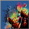
The picture lacks saturation of colors and looks to be grainy, but the grainy part can be coolly ignored. I think if you could add some saturation and sharpness by using Overlay option in layers, slide down to midway where ur image looks good visually. Trust me it should get more punch, maybe some Unsharp Mask to throw in between 60 - 75%, 1 n 1.
|
| Photo By: Shawn McCammon
(K:172)
|
|
|
Critique By:
Shawn McCammon (K:172)
11/6/2004 3:35:23 AM
It has happened enough that she knows very well when she's in trouble.
|
| Photo By: Shawn McCammon
(K:172)
|
|
|
Critique By:
Evelyn Nilsen (K:3756)
11/6/2004 2:59:12 AM
Yep - I think she did it, too. Is this the first time, or the first of many...?
|
| Photo By: Shawn McCammon
(K:172)
|
|
|
Critique By:
Shawn McCammon (K:172)
11/5/2004 10:23:50 PM
Hi, Thanks for looking and posting your comment. You are right about too much grain. I am having some software problems and the heavy grain was used to mask some other defects. New software is on the way and I hope to be posting much better images soon.
|
| Photo By: Shawn McCammon
(K:172)
|
|
|
Critique By:
Shawn McCammon (K:172)
11/5/2004 10:18:45 PM
The seagulls seemed willing to pose. Of about 8 rolls of film, these are the only ones worth posting, even by my low rooky standards. The actual prints are much nicer. The transition from paper to internet is not going very well. I'm in the process of upgrading software and hope to have a lot better images soon. Thanks for looking and the kind words.
|
| Photo By: Shawn McCammon
(K:172)
|
|
|
Critique By:
delete my account (K:3679)
11/5/2004 1:55:21 PM
Good that your breaking rules!
Thats important!
:P
Greetings Abel
|
| Photo By: Shawn McCammon
(K:172)
|
|
|
Critique By:
Marcus Armani (K:36599)

11/5/2004 8:06:10 AM
Wow was your vacation a seagull sighting trip, you seem to have many shots of them, although very nice.......
|
| Photo By: Shawn McCammon
(K:172)
|
|
|
Critique By:
Marcus Armani (K:36599)

11/5/2004 8:04:53 AM
very intresting use of colors here, I like it.....
|
| Photo By: Shawn McCammon
(K:172)
|
|
|
Critique By:
Marcus Armani (K:36599)

11/5/2004 7:43:07 AM
Very cute shot.....
|
| Photo By: Shawn McCammon
(K:172)
|
|
|
Critique By:
Henk-Jan Kooiman (K:-129)
11/5/2004 12:10:38 AM
Great idea. A complete bike in one photo! (Perhaps a little to much grain effect?)
|
| Photo By: Shawn McCammon
(K:172)
|
|
|
Critique By:
Robin Dunham (K:1851)
11/4/2004 11:47:45 PM
Shawn, Check your admin email on your website. We can cover this more over Thanksgiving. Robin
|
| Photo By: Shawn McCammon
(K:172)
|
|
|
Critique By:
Shawn McCammon (K:172)
11/4/2004 11:23:47 PM
I ordered Photoshop 5.0 and hope to have it in a few days. I may update to a newer version later on.
|
| Photo By: Shawn McCammon
(K:172)
|
|
|
Critique By:
mehmet saraç (K:631)
11/4/2004 5:59:45 PM
well
|
| Photo By: Shawn McCammon
(K:172)
|
|
|
Critique By:
Monir El.Shazly (K:2218)
11/4/2004 12:20:23 PM
good compositon ..but the technique and clarity falls very short...
|
| Photo By: Shawn McCammon
(K:172)
|
|
|
Critique By:
Miguel Jimenez (K:688)
11/4/2004 9:12:08 AM
Provocative. I wish I was there.
|
| Photo By: Shawn McCammon
(K:172)
|
|
|
Critique By:
Patrick Ziegler (K:21797)
11/4/2004 3:47:18 AM
Great capture. A bit under exposed and some camera jitter.
|
| Photo By: Shawn McCammon
(K:172)
|
|
|
Critique By:
Shawn McCammon (K:172)
11/4/2004 1:40:53 AM
I'm using a several different softwares. I have a VERY limited version of photoshop with my scanner but I don't like it. I am mostly using IrfanView for basic editing, Polaroid Photomax SE for special effects, and MS Paint for artwork and heavy editing. This combination does ok for artistc abstracts, but is coming up way short on crisp clean images.
|
| Photo By: Shawn McCammon
(K:172)
|
|
|
Critique By:
Robin Dunham (K:1851)
11/3/2004 10:40:55 PM
Shawn, Cool photos. What type of image software are you using? If you are using Adobe Photoshop or Paintshop look at how to adjust the "Levels". In photoshop elements it is in the Enhance dropdown menu. You want to move the sliders so that they are covering only the areas of the Histogram (graph) that have information. this will help clean up a lot of the noise that you are seeing. Call me and I'll help you out if you need more info. Robin
|
| Photo By: Shawn McCammon
(K:172)
|
|
|
Critique By:
Shawn McCammon (K:172)
11/3/2004 10:17:18 PM
I increased the contrast and played with the color a little bit.
|
| Photo By: Shawn McCammon
(K:172)
|
|
|
Critique By:
Shawn McCammon (K:172)
11/3/2004 10:04:44 PM
Hi Laura, Thanks for taking the time to comment on this photo. I'm pretty new at this and have a lot to learn. Every bit of advice is appreciated.
|
| Photo By: Shawn McCammon
(K:172)
|
|
|
Critique By:
Laura Spell (K:24080)
11/3/2004 2:23:36 PM
Well composed. The colors are a bit flat, I would increase contrast. That might give the image a sharper look also.
|
| Photo By: Shawn McCammon
(K:172)
|
|
|
Critique By:
Predrag Sudar (K:5075)
11/3/2004 1:53:29 PM
Nice photo, nice experiment!
Congrats
Pedja
|
| Photo By: Shawn McCammon
(K:172)
|
|
|
Critique By:
Heather Forsythe (K:21)
11/3/2004 2:20:35 AM
The toning is nice for such a timeless image.
|
| Photo By: Shawn McCammon
(K:172)
|
|
|
Critique By:
Gabriella Carta (K:22879)
11/2/2004 1:36:47 PM
lovely!!! very sweet cat! Regards by Gabry
|
| Photo By: Shawn McCammon
(K:172)
|
|
|
Critique By:
Gabriella Carta (K:22879)
11/2/2004 1:32:22 PM
sweet portrait ehehehehh, good! Regards by Gabry
|
| Photo By: Shawn McCammon
(K:172)
|
|
|
Critique By:
Dave Stacey (K:150877)

11/2/2004 3:46:59 AM
That helped some Shawn!
Dave.
|
| Photo By: Shawn McCammon
(K:172)
|
|
|
Critique By:
Kevin H (K:22502)
11/2/2004 3:26:36 AM
You were at the right place at the right time. It's too bad that the picture isn't focus and the colors look very dull. Keep up the good work.
|
| Photo By: Shawn McCammon
(K:172)
|
|
|
Critique By:
Dave Stacey (K:150877)

11/2/2004 3:22:11 AM
Hi Shawn, I guess I can't help much there, but there are devices available to calibrate your monitor as well, for fairly reasonable prices. Maybe it's time to invest in a new scanner, or even a digital camera!
Good luck, Dave.
|
| Photo By: Shawn McCammon
(K:172)
|
|
|
Critique By:
Shawn McCammon (K:172)
11/2/2004 3:21:38 AM
I tried adding contrast, a little darker, and a touch of saturation with IrfanView.
|
| Photo By: Shawn McCammon
(K:172)
|
|
|
Critique By:
Shawn McCammon (K:172)
11/2/2004 3:09:59 AM
Better software would be a good start but I think I'm running into more than software problems. I think my biggest problem is my scanner. If my images looked as good on the computer as they do in the original prints, I would be thrilled. Also I'm having trouble with computer monitor settings. I have 3 computers at home and 1 at work, The images look completely different on each machine. Last but not least is the lack of skill to make it all work.
|
| Photo By: Shawn McCammon
(K:172)
|
|


