|
|
Critique By:
Dennis Hendricksen (K:4817)

4/20/2006 7:17:32 AM
Tricky work - well done. It took me a moment to realise that all (or most) of the people are you! Skillfully conceived and executed. Great job.
Dennis
|
| Photo By: Ryan McMillen
(K:1218)
|
|
|
Critique By:
Dennis Hendricksen (K:4817)
4/20/2006 7:15:17 AM
Nice job of a tough shot. Good lighting and detail.
Dennis
|
| Photo By: Eb Mueller
(K:24960)
|
|
|
Critique By:
Dennis Hendricksen (K:4817)
4/20/2006 7:14:01 AM
I really like the strong lines and perspective of this image. Being in black and white gives emphasis to the converging lines. The reflection in the one window is a nice touch as well. Well seen, well taken.
Dennis
|
| Photo By: Nelson Moore [Kes] -
(K:20241)
|
|
|
Critique By:
Dennis Hendricksen (K:4817)
4/20/2006 7:11:12 AM
A lovely photo with beautiful colours. I only wish there was a darker background behind the tree in blossom - it would make the tree stand out more. Nice composition and a dreamy feel.
Dennis
|
| Photo By: selami Torun
(K:9397)
|
|
|
Critique By:
Dennis Hendricksen (K:4817)
4/18/2006 5:19:52 PM
Hi Fabio,
Thanks for your comment and your revised version. I did increase the contrast from the original image, but I can see from your version that the picture would have benefitted from even more contrast. Thanks for taking the time to touch this image up... I may make the changes and re-post this some day.
Dennis
|
| Photo By: Dennis Hendricksen
(K:4817)
|
|
|
Critique By:
Dennis Hendricksen (K:4817)
4/18/2006 5:14:23 PM
Hi Debasish,
This was simply a candid photo taken during a recreation time at a summer camp. He was actually hitting (or more like throwing) the huge ball over a volleyball net where others waiting on the other side would hit it back. It was so big and heavy that the volleys often didn't last long... but they all had fun and that's what I was trying to capture with my camera - the sense of enjoyment they were having. Thanks for your comments.
Dennis
|
| Photo By: Dennis Hendricksen
(K:4817)
|
|
|
Critique By:
Dennis Hendricksen (K:4817)
4/18/2006 8:11:13 AM
Hi Ahmad,
You sure have some creative images just using forks and lighting - this one is my favourite so far!
Dennis
|
| Photo By: AHMAD BORHAM
(K:1362)
|
|
|
Critique By:
Dennis Hendricksen (K:4817)
4/18/2006 8:08:45 AM
Nice mood to this picture. The colour of the wall provides a nice background for the girl. The lace curtains and older style windows are contrasted with the young girl wearing modern clothing - an interesting combination. The girl looks both relaxed and ready to move at the same time - also an interesting combination. Nicely balanced, nicely lit. A great photo!
Dennis
|
| Photo By: özcan çeltikli
(K:3575)
|
|
|
Critique By:
Dennis Hendricksen (K:4817)
4/18/2006 4:28:28 AM
Great expressions, on both their faces. Lovely tone in this black and white image - makes it look timeless. Beautiful and joyous picture!
Dennis
|
| Photo By: Debasish Ghosh
(K:5526)
|
|
|
Critique By:
Dennis Hendricksen (K:4817)
4/17/2006 10:42:15 PM
Hi Maurizio,
Thanks for your comment on my picture. You thought there might be a river or lake at the bottom of the picture, but actually it is just grass and dirt - flat prairie only. The only water is IN the aqueduct, which is simply a raised canal. If you check out my picture "Aqueduct #2" you can see what is below the aqueduct.
|
| Photo By: Dennis Hendricksen
(K:4817)
|
|
|
Critique By:
Dennis Hendricksen (K:4817)
4/17/2006 10:33:29 PM
Thanks for your kind words Steve. The problem with thumbnails is that they don't always tell the whole story very well. I sometimes specifically look at the images where the thumbnails don't stand out... because I figure I'm probably missing something. Case in point is your lovely photo "Flight Across Heaven". In the thumbnail you can hardly see the sun rays, and for sure the bird is missed - when viewed in the large format all the wonderful details come out. Thanks for taking a closer look at this image.
Dennis
|
| Photo By: Dennis Hendricksen
(K:4817)
|
|
|
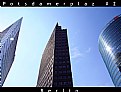
Critique By:
Dennis Hendricksen (K:4817)
4/17/2006 7:53:54 PM
Hi Maurizio,
This is a great cityscape! In one image you have captured three buildings with very distinctive personalities. The angular shapes of the two on the left balance nicely with the curved nature of the building on the right. The sky is just right, not oversaturated - but a nice, realistic sky blue. The reflection of the sun in the windows of the curved building is balanced by a sun flare to the left side of the image. Strong lines, strong light, strong image! Well done!
Thanks for your comment on my picture "Waiting for a Teetor-Totter Partner". Much appreciated.
Dennis
|
| Photo By: Maurizio Massetti
(K:30463)
|
|
|
Critique By:
Dennis Hendricksen (K:4817)
4/17/2006 7:48:28 PM
You've captured the colour of these birds really well, and their placement in the frame is very pleasing (they make a nice oval which leads the eye around the picture). Too bad about the ground and background, the muddy hues and messy look distract from rather than enhance the beauty of the birds. But you couldn't do much about where the birds were standing, so good job producing a decent image inspite of this difficulty.
Dennis
|
| Photo By: Maurizio Massetti
(K:30463)
|
|
|
Critique By:
Dennis Hendricksen (K:4817)
4/17/2006 7:39:38 PM
Hello Stanisa,
You have a very creative way with florals. This one really grabbed my eye. An interesting use of colour reversal. Nice composition and beautiful colours.
Thanks for your comment on my picture "Birds of the Morning Fog". Much appreciated.
Dennis
|
| Photo By: Stanisa Martinovic
(K:1478)
|
|
|
Critique By:
Dennis Hendricksen (K:4817)
4/17/2006 7:10:44 PM
An interesting use of a negative image - brings out some interesting colours. I also like the angle of the picture which creates some energy to the composition.
Dennis
|
| Photo By: AHMAD BORHAM
(K:1362)
|
|
|
Critique By:
Dennis Hendricksen (K:4817)
4/17/2006 7:08:02 PM
Hello Ahmad,
I also wished the detail was more sharp but the bluriness was the result of two things - first the low level of light (and the slower ISO film) meant the shutter speed was too slow to freeze the wings motion. Second, the fog was enough to blur the detail of the distant coastline. So I had to put up with the bluriness in order to capture the mood of this early morning photo. Thanks for your comments, much appreciated.
|
| Photo By: Dennis Hendricksen
(K:4817)
|
|
|
Critique By:
Dennis Hendricksen (K:4817)
4/16/2006 7:51:20 PM
You figured it out - this picture is actually one taken many years ago, pre-playstation. Another clue of its age is that I'm not sure how many kids today would be interested in World War I bi-planes. Thanks for the comment.
|
| Photo By: Dennis Hendricksen
(K:4817)
|
|
|
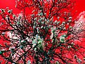
Critique By:
Dennis Hendricksen (K:4817)
4/16/2006 9:05:21 AM
Wow, what a way to make a "boring" image stand out! Nothing like putting a vibrant green together with a florescent red to create some visual energy. Creative PS work - nicely done!
Thanks for your comment on my photo "Sidewalk Air Battle". Much appreciated.
Dennis
|
| Photo By: Kambiz K
(K:37420)
|
|
|
Critique By:
Dennis Hendricksen (K:4817)
4/16/2006 9:00:09 AM
Now here's a lovely photo to comment on early on an Easter Sunday! Nice blues in the sky, and the light on the mountain in the distance suggests excellent things to come. I thought that this picture could benefit from a bit of a counter-clockwise rotation, but then I realize the steeple would look like it was leaning backwards - so probably best the way it is.
Thanks for your comments on my photos - much appreciated, as always.
Dennis
|
| Photo By: Gary Dyck
(K:12834)
|
|
|
Critique By:
Dennis Hendricksen (K:4817)
4/16/2006 8:54:59 AM
This is a very interesting flower, captured beautifully by your camera. Lovely colours and composition.
Thanks for your comment on my flower photo - coming from such a master of floral photography I am quite honored.
Dennis
|
| Photo By: Alicia Popp
(K:87532)
|
|
|
Critique By:
Dennis Hendricksen (K:4817)
4/16/2006 8:50:00 AM
Hi Debasish,
I don't like the wires much and have thought about trying to remove them with some digital touch-up. I may try that some day though I'm not sure the photo is strong enough to warrant the time and effort to do it right.
|
| Photo By: Dennis Hendricksen
(K:4817)
|
|
|
Critique By:
Dennis Hendricksen (K:4817)
4/16/2006 8:37:43 AM
This is an eye grabber! Simple concept executed well resulting in a great image. Congratulations!
Dennis
|
| Photo By: Adam Botner
(K:82)
|
|
|
Critique By:
Dennis Hendricksen (K:4817)
4/15/2006 9:26:27 PM
Hi Paul,
Thanks for your comments and the adjusting version. I am still getting used to my scanner and probably don't have the colour balance settings optimum. I thought raising the contrast a little would darken her face too much, but I can see from your version that the face is still fine. I appreciate your attention to detail... that's how we all learn from each other.
Dennis
|
| Photo By: Dennis Hendricksen
(K:4817)
|
|
|
Critique By:
Dennis Hendricksen (K:4817)
4/15/2006 7:16:09 AM
Hi Debasish,
You use the camera and the computer like an artist uses the canvas and brush. A skillfully created piece of photoart - nicely done.
Dennis
|
| Photo By: Debasish Ghosh
(K:5526)
|
|
|
Critique By:
Dennis Hendricksen (K:4817)
4/15/2006 7:10:48 AM
Gorgeous colours and interesting composition. Water without a hint of vegetation - you have captured the irony of a flood in a barren place. Well done!
Dennis
|
| Photo By: Tjaart van Staden
(K:979)
|
|
|
Critique By:
Dennis Hendricksen (K:4817)
4/15/2006 2:21:01 AM
Thanks - I had thought about calling this picture 2001 Revisited but didn't think people would catch the reference. You obviously did - I appreciate your comment.
Dennis
|
| Photo By: Dennis Hendricksen
(K:4817)
|
|
|
Critique By:
Dennis Hendricksen (K:4817)
4/13/2006 12:10:44 AM
This is a gorgeous night skyline shot. Great colours and reflections in the water. I like the hint of sunset behind the buildings giving them shape (beyond just the lit windows). Nicely done!
Dennis
|
| Photo By: Jason Mckeown
(K:22200)
|
|
|
Critique By:
Dennis Hendricksen (K:4817)
4/13/2006 12:08:04 AM
You know Jason, I never thought about the people in the shot giving it a sense of proportion - to tell you the truth at the time I wished they would all leave the beach! Now because of your comment I realize that would have made things better, and maybe even had the opposite effect. Thanks for pointing this out.
Dennis
|
| Photo By: Dennis Hendricksen
(K:4817)
|
|
|
Critique By:
Dennis Hendricksen (K:4817)
4/12/2006 11:56:17 PM
This sure doesn't look like disco to me!! An amazing image of grass (or grain) against the sunset. The whole image makes me think of a harvest time celebration.
Dennis
|
| Photo By: Ace Star
(K:21040)
|
|
|
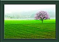
Critique By:
Dennis Hendricksen (K:4817)
4/12/2006 11:53:52 PM
A great shot given the tricky back-lighting. You got the exposure just right as far as I'm concerned - enough to give the tree an aura, but not too much to lose the colour in the tree. The mist in the background adds to the magic of the scene. This looks like it came from the Garden of Eden.
Thanks for your comments on my photos - much appreciated, as always.
Dennis
|
| Photo By: Ace Star
(K:21040)
|
|