|
|
Critique By:
james mickelson (K:7344)
12/31/2001 4:15:13 PM
Cute chick. I like the girl but this pose doesn't do much for me. Did she hurt herself or something? Is she hiding from someone? I don't know. Just not really appealing to me. And the colors here aren't very harmonious. The pants lack detail. they are just empty. The angle of her against the brickwall is hard on the eyes. This is a goodlooking gal. I could see her in much better poses than this. The lighting is really flat here too. But she is a cutey alright. James
|
| Photo By: marc glass
(K:0)
|
|
|
Critique By:
james mickelson (K:7344)
12/31/2001 4:10:23 PM
This is cool. I like it. Lots of action and good flow to the story. Great toning too. I can feel the water and hear the splash. James
|
| Photo By: Lachlan Rex
(K:159)
|
|
|
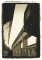
Critique By:
james mickelson (K:7344)
12/31/2001 3:45:06 PM
Lots of interesting lines here. Great texture. Reminiscent of old time cyanotypes. Like the frame edges here too. Is this part of a series? James
|
| Photo By: Ted Williams
(K:324)
|
|
|
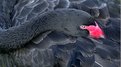
Critique By:
james mickelson (K:7344)
12/30/2001 7:24:47 AM
Nice image. Great sharpness throughout and the sheen of the feathers really is nice here. The coloration of the face contrasts nicely and the curve of the neck really flows well. Good balance. Wish I could pet it. James
|
| Photo By: Bonnie Shedd
(K:174)
|
|
|
Critique By:
james mickelson (K:7344)
12/29/2001 2:31:10 PM
I just saw this. Let me add my voice to the chorus......what a beautiful image. World class.
|
Photo By: Tony Smallman
(K:23858)

|
|
|
Critique By:
james mickelson (K:7344)
12/29/2001 7:34:47 AM
Yeah, sometimes simple is best.
|
| Photo By: Tony Smallman
(K:23858)
|
|
|
Critique By:
james mickelson (K:7344)
12/29/2001 7:25:02 AM
Kari, Don't listen to these amateurs. You do it your way. And take lots of pictures. Glad to have a face to go with the name. Welcome to our club. 3021 right? Nice camera too.
|
| Photo By: Kari Reed
(K:5)
|
|
|
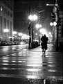
Critique By:
james mickelson (K:7344)
12/29/2001 6:56:32 AM
Ever listen to "Night Beat" on the radio? It was a cool old radio show with a gravelly voiced newspaper reporter relating all the sordid life happening after hours in New York. And at the end of the story he would yell, "copy boy". And then walk away. This is great. Love the story going on here.
|
| Photo By: Chris Blaszczyk
(K:610)
|
|
|
Critique By:
james mickelson (K:7344)
12/27/2001 11:51:16 PM
What a great idea. Good eye. And I love the hue here. Very warm. This should hang on the wall. Great job.
|
| Photo By: Maarten Venter
(K:885)
|
|
|
Critique By:
james mickelson (K:7344)
12/27/2001 11:42:16 PM
Hello Larry, Interesting angle here. Nice place to shoot too. Do you live in San Diego? There are some of us out here. Come to chat once in a while. If you live around San Diego get in touch.
|
| Photo By: Larry Edwards
(K:843)
|
|
|
Critique By:
james mickelson (K:7344)
12/25/2001 7:26:23 PM
Jimmy, I would like you to post a little about the method used in this image. It is intriguing me. James
|
| Photo By: Jimmy Estimada
(K:-7)
|
|
|
Critique By:
james mickelson (K:7344)
12/25/2001 7:21:47 PM
The idea here was great.The depth of the image is nice. The balance is ok too. The only change I would try and make here is the contrast levels here are a little flat. The tonal spread needs to be greater. There is no separation between the tree and the building and the rest of the elements in the image. The large amount of blank sky is distracting too. And the image appears unsharp throughout. Take another crack at this before it is gone. The idea is great but the execution falls short. James
|
| Photo By: Jacob Iskandar
(K:84)
|
|
|
Critique By:
james mickelson (K:7344)
12/25/2001 7:17:18 PM
This is interesting to say the least. I'm a fan of more vivid color but this works for me too. Good job. James
|
| Photo By: Fernando Gomez Viñaras
(K:0)
|
|
|
Critique By:
james mickelson (K:7344)
12/25/2001 7:15:14 PM
Very nice soft quiet image. Nice model and pose. Color is a bit unusual and I like it. Good creative use of your time and materials. Keep em coming. James
|
| Photo By: Kristupa Saragih
(K:1031)
|
|
|
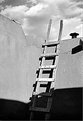
Critique By:
james mickelson (K:7344)
12/25/2001 7:08:32 PM
Hello Anne, nice rendition of "the" ladder. I keep wondering if you live in San Diego. Sai and I and some other usefilmers like to travel so do you want to tag along with us? I like your images. Very nice. james
|
| Photo By: Anne Brown
(K:833)
|
|
|
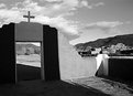
Critique By:
james mickelson (K:7344)
12/25/2001 7:05:40 PM
Thankyou Tom and welcome to usefilm.com. I hope you will feel at home here and post your heart out. I love this image. Very nice manger scene. Lighting is nice and warm which is what I feel every time I see a display like this. James
|
| Photo By: Tom Landon
(K:92)
|
|
|
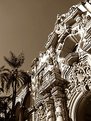
Critique By:
james mickelson (K:7344)
12/24/2001 8:03:46 PM
Yeah, this is superb. Nice vision. Old time buildings are what I love to shoot the most. All the texture and detail. The color here is great. Very warm and old. Makes me want to walk in and have a soda and sit by the fire and talk about old times with the gents. james
|
| Photo By: Chuck Freeman
(K:13616)
|
|
|
Critique By:
james mickelson (K:7344)
12/24/2001 6:49:22 PM
Very interesting how everything else here is out of focus except for the girl. Including everything before and after her including that which should be in focus at her feet. Nice technique here. PS? I love it. James
|
| Photo By: Jimmy Estimada
(K:-7)
|
|
|
Critique By:
james mickelson (K:7344)
12/24/2001 6:44:06 PM
You really captured the essence of body boarding here. Great sponger shot. Do you boogie board? Nice wave and nicer action shot.. James
|
| Photo By: R Pires
(K:445)
|
|
|
Critique By:
james mickelson (K:7344)
12/24/2001 6:40:35 PM
Very nice image here Ann. Very nice indeed. I lioke the framing and the tonal range. Even the shadows which I don't usually like are nice. Great vision . James
|
| Photo By: Anne Brown
(K:833)
|
|
|
Critique By:
james mickelson (K:7344)
12/23/2001 6:52:47 AM
I'm a sucker for flower images and this is a nice one. I love the colors. Good balance to the image in the frame. james
|
| Photo By: Eric Goldwasser
(K:4294)
|
|
|
Critique By:
james mickelson (K:7344)
12/22/2001 11:40:42 AM
Oh. O wasn't going to comment. I'm just wiping the drool from my lips. "I wanna go now". I need a redrock vacation. Let's go! james
|
| Photo By: Lisa Brainard
(K:743)
|
|
|
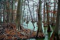
Critique By:
james mickelson (K:7344)
12/18/2001 7:14:59 PM
Bridgette, this is awesome to say the least. I love this image. Very good eye for balance and depth of view. Colors are very nice. I love the muted quaility of the light. I can smell the swamp and feel the coolness. Very wintery feel too. Love it. Encore, encore. james
|
| Photo By: Brigitte R.
(K:25989)
|
|
|
Critique By:
james mickelson (K:7344)
12/18/2001 2:53:06 PM
I love this image. Very sensual pose and balnced very well. The green cast and the washed out highlights distract me though. I like the texture. She is a very good looking kid. james
|
| Photo By: Terry Stevenson
(K:154)
|
|
|
Critique By:
james mickelson (K:7344)
12/18/2001 2:47:34 PM
I agree with the thought of taking out the out of focus post on the left. Very distracting here. Otherwise I love the idea here.
|
| Photo By: Carlos Cravo
(K:6)
|
|
|
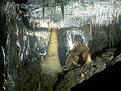
Critique By:
james mickelson (K:7344)
12/18/2001 2:44:42 PM
This gives me the creeps. Ican imagine the place dark and quiet for centuries just slowly evolving to this magnificent grotto. And all the delicate stalactites. Sorry I have to leave. Claustrophobic. james
|
| Photo By: Andy Whitney
(K:45)
|
|
|
Critique By:
james mickelson (K:7344)
12/18/2001 2:41:56 PM
Nice image. Great serrendipity. A little tiny bit less sky for me and a little less yellow in the image would bring out the blue more and their habits would be white. Feels warm and windy to me. Smells clean. Good eye. James
|
| Photo By: Dmitriy Sinyagin
(K:0)
|
|
|
Critique By:
james mickelson (K:7344)
12/18/2001 2:35:04 PM
This is very nicely balanced. Very nice tonal range here also. I like it. A little more exposure and a little less development would have yeilded better shadow detail while preserving the beautiful light here. James
|
| Photo By: Mark Bridgeman
(K:0)
|
|
|
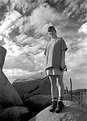
Critique By:
james mickelson (K:7344)
12/18/2001 2:04:42 PM
My sentiments too. Different pose too. This is pretty static. Tell Susan she has an admirer. She's cute. And if you are going to shoot up like this, I always try and pose them in some interesting pose for more action and exagerate the effect by shooting from even lower. Can't hurt. This looks like the eastern section of the Saguarro Natl Monument. Lots of photo ops out there. Great sky. James
|
| Photo By: Anne Brown
(K:833)
|
|
|
Critique By:
james mickelson (K:7344)
12/18/2001 1:59:18 PM
Holly is very pretty. Nice pose. Maybe the hand could have been more balanced with her chin but that is picky. It just seems that moving it a little more to her right(our left) would have made for more balance or curling her fingers just a touch more. And reflecting a little more light into the shadowed side of her face. Not a lot, just a tad more. Beautiful woman. James
|
| Photo By: Phillip Filtz
(K:1792)
|
|