|
|
Critique By:
james mickelson (K:7344)
4/5/2003 2:21:15 PM
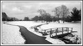
Oh if this were only sharp! Tell me it's sharp on the print or wherever you store this. But it looks like the shutter speed was not fast enough. Nice try.
|
| Photo By: Dave Atwood
(K:253)
|
|
|
Critique By:
james mickelson (K:7344)
4/5/2003 2:01:49 PM
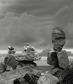
I love landscape pictures. this is done very well. My only pick, which is simply what would appeal to me and nothing else, would be a little more room on the left. Just a taste. Simply personal preferrence. this is a good image. James
|
| Photo By: John Cuniberti
(K:0)
|
|
|
Critique By:
james mickelson (K:7344)
4/5/2003 1:55:25 PM
There is so much more to be done here to make this a good photograph. One of the first things I would do is darken all the foliage in the background. All of it. Dark. Separate the backgrouns from the not so strong foreground. take it from there.
|
| Photo By: Rafael Muller
(K:26)
|
|
|
Critique By:
james mickelson (K:7344)
4/5/2003 1:48:10 PM
Very nice image Michael. I love the contrast here. You used it very well. Not overdone. Nice vantage point too. Love the sky here and the not so dark blue sky. Well seen and great finish to it. Music would go well with this.
|
| Photo By: Michael Klemmer
(K:725)
|
|
|
Critique By:
james mickelson (K:7344)
4/5/2003 1:43:59 PM
Thankyou Cheryl. That brought tears to my eyes as I am facing the same thing. Where does the time go? And go so rapidly? I have yet to photograph my father. I am afraid. So many things to say but not having the courage to revisit some of them. nice work. Do more. Don't miss the opportunity. Thankyou, James
|
| Photo By: Cheryl Jacobs
(K:122)
|
|
|
Critique By:
james mickelson (K:7344)
4/5/2003 1:40:15 PM
I don't comment much anymore because I don't see much to comment on but I have to comment on this image. Very well seen Rene. Very well captured. Great imagination. I like seeing people create and not just record what is in front of them. this is excellent work. This is what I am striving for in my new work. Well done and I hope to see much more from you in the future.
|
| Photo By: Rene Asmussen
(K:138)
|
|
|
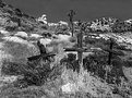
Critique By:
james mickelson (K:7344)
1/3/2003 11:05:48 PM
Well being as this is about some pioneer crosses in the landscape, I think it meets the criteria of a landscape. And, well, landscapes tend to be busy and sharp throughout. At 16x20 this is sharp enough to cut your eyes out. Few know of this place. It's 80 miles from LA. Had I chose to, and I did in another version, the crosses are more prominent but there is little else in the scene making it rather boring. And if you study the classic landscape, you will find that many are about the "entire" scene and not about a subject within the scene. Subject dominated images are generally portraits, still life, and photojournalism. Landscapes are about the landscape. Whatever it holds.
|
| Photo By: james mickelson
(K:7344)
|
|
|
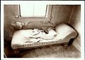
Critique By:
james mickelson (K:7344)
1/3/2003 10:56:45 PM
Marc, I guess you didn't read my explaination carefully. There were no other angles due to the fact that this room is barricaded with heavy wire. To the left is a trashpile and to the right is a jumble of other junk. Shot vertically the window dominates the scene and it is filthy. So with careful camera movements with a 90mm lens and amx movements, this is the best there was available in this building. Wre it 20 years ago I could have truned the bed, or stood it on it's head. The print is sumptuos with all kinds of detail in the window. My lack of computer skills doesn't allow me to bring out the detail that is here. I am a printer not a photoshop wiz. This print is so detailed, you can see the dead bed bugs.
|
| Photo By: james mickelson
(K:7344)
|
|
|
Critique By:
james mickelson (K:7344)
1/3/2003 9:10:09 PM
Hey, good to meet you Mike. Nice looking guy. Even with the beard. Good lighting. Nice DoF too.
|
| Photo By: Mike Scott
(K:1817)
|
|
|
Critique By:
james mickelson (K:7344)
1/3/2003 9:04:29 PM
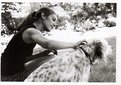
God, I just want to reach out and pet her for all she's worth. She is lovely. My two brutes are laying right here being lazy as usual. What a gorgeous dog. Love her bunches and bunches.
|
| Photo By: Thomas Paul
(K:111)
|
|
|
Critique By:
james mickelson (K:7344)
1/3/2003 9:01:13 PM
I agree with this assessment. Unfortunately there are no other angles here. I have the lens thrust through the wire mesh that is prevalent in this ghost town. In the print there is all kinds of detail visible. Again the limitations of my abilities regarding posting to the net doesn't tell the tale of this print at all.
|
| Photo By: james mickelson
(K:7344)
|
|
|
Critique By:
james mickelson (K:7344)
1/3/2003 8:50:09 PM
Very nice Phil. Love the colors here and the composition is excellent. Very warm and peaceful. Love to just sit there for a couple hours reading.
|
Photo By: Phillip Cohen
(K:10561)

|
|
|
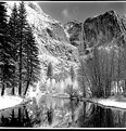
Critique By:
james mickelson (K:7344)
1/2/2003 8:23:19 PM
This image was shot on Tri X with a Kowa Six and 55mm lens with no filter. I metered the trees on the left and the snow on the cliff behind them. Because there was an 8 stop range I developed the film at N-3 praying all the time that I would be able to pull the detail out of the shadows and still have printable highlights. A red or orange filter would have boosted the contrast even more so that is why I chose not to use a filter. a minuet after this was taken, the sun broke over Half Dome and the white snow was gone on the cliff behind the left hand trees. I had on shorts, t-shirt, and walking sandles for this shot. When I saw it and knew how much time I had before it was gone, I felt like AA when he shot Moonrise. So no this is not IR and the only tricks used were normal photographic skills and darkroom work.
|
| Photo By: james mickelson
(K:7344)
|
|
|
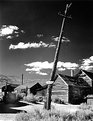
Critique By:
james mickelson (K:7344)
1/2/2003 7:54:36 PM
Hi Sean. In the art of Japan and China, painters and landscapers have long used a foreground fence, gate, hedge, or even a mountain to make what's beyond more intersting than what's visible. They create tension and you want to look around, over, or even under the foreground to what is hidden beyond. Playboy used this quite effectively in their spicey nudes for years. "Just what is between her legs." As did the famous illustrator Vargas. Yes I could have set up the camera on the porch, thereby risking the wrath of the Ranger, and taken the shot from a higher vantage point. I chose to shoot from this low angle so that you would have to look over or through to the background buildings. It creates tension in the scene. Glad to see you at lunch and I hope to see you again soon. What happened to chat? Haven't been able to get in today.
|
| Photo By: james mickelson
(K:7344)
|
|
|
Critique By:
james mickelson (K:7344)
1/2/2003 2:30:02 PM
Not all images are of a singular subject surrounded by a frame such as sky or trees or old buildings or such. This is an example of a place being the subject. How all the elements in the scene work together to form a mood. A higher viewpoint would have rendered the near/far perspective less dramatic. The intent was to force the viewer to look through and over the fence. I am not very good at scanning and posting my images to the web. Believe me, there is sharp detail up the wazoo in the deepest shadows, details in the highest highlights, and nothing in this print is unsharp. When I make a print such as this the elements are sharp enough to cut your eyeballs. What I don't like here is the clutter in the foreground but it may add an aire of desolation to some viewers. This is about a shabby old abandoned ghost town slowly disintegrating. Had I wanted to I could have done much to isolate the fence so that it would be the focus of the image. I'm not good at titleing images so maybe the title misled you.
|
| Photo By: james mickelson
(K:7344)
|
|
|
Critique By:
james mickelson (K:7344)
1/2/2003 2:17:58 PM
Thanks Anne. Here's part of the story. It took me about 45 mins to set this up and carry all the DoF that is here. Used the max swings and tilts on the view camera I used. Just as I was ready to shoot, my buddy steps right in the middle of the snow drift. He and I were the only people in Bodie that day. We're lucky to have been able to get out of there the snow was coming down so hard. I almost shot him for stepping on my fresh snow.
|
| Photo By: james mickelson
(K:7344)
|
|
|
Critique By:
james mickelson (K:7344)
1/2/2003 2:12:08 PM
Yes. Most of these images are from Bodie. I go there 5 or 6 times a year. Sometimes more. I've been going there since the mid 60's. A lot of the charm is gone now. I like old buildings and old southwest subject matter.
|
| Photo By: james mickelson
(K:7344)
|
|
|
Critique By:
james mickelson (K:7344)
12/26/2002 1:41:26 AM
very nice image. Nice and peaceful.
|
| Photo By: Alex Ruiz
(K:234)
|
|
|
Critique By:
james mickelson (K:7344)
10/20/2002 10:42:23 AM
Sebastian, if I may make a suggestion. This is a very wonderful image. An emotional moment in time. The feeling here is wonderful. But to make it even more wonderful I feel you could isolate the mothers face, upper body, and the baby better by darkening all the rest of the image. Leave just the mothers gazing at the baby light and darken the rest of the scene thereby isolating the mothers gaze at her precious new baby. The reason i would do this is that when I first looked at the image, I couldn't readily see the imfant and had to work at "seeing" the mothers gaze and the infant. If you darkened the area around the mother, focussing the viewers attention on the mothers gaze then I think this image would be much stronger. This has prize winner all over it. Good image.
|
| Photo By: Sebastian Skoczypiec
(K:0)
|
|
|
Critique By:
james mickelson (K:7344)
10/4/2002 1:14:13 PM
Boy! Imagine what you could do with this if it were film. Hey Larry. Did the pics come out that were taken in the restaurant? Haven't seen them. That was a nice picture of the three of us though. Thanks for putting on the slimming and handsome filters when you took it.
|
| Photo By: Larry Edwards
(K:843)
|
|
|
Critique By:
james mickelson (K:7344)
9/30/2002 3:56:19 PM
Balls to the walls.
|
| Photo By: Eric Goldwasser
(K:4294)
|
|
|
Critique By:
james mickelson (K:7344)
9/29/2002 7:02:09 AM
Nice lighting phil. great shapes to work with too.
|
| Photo By: Phillip Cohen
(K:10561)
|
|
|
Critique By:
james mickelson (K:7344)
9/29/2002 6:46:05 AM
This is very nice. I like the composition a lot. Nice color too.
|
| Photo By: Teresa Wilkinson
(K:259)
|
|
|
Critique By:
james mickelson (K:7344)
9/21/2002 6:07:19 AM
This is a very nice shot. Printing wise it could be handled a little better. Is this a scan?
If so it is why I prefer to print. Thwe leaves could be selectively printed so that there was more differentiation between them and then the entire leaf area printed down to set off the flower by itself and it would become more prominent. The light area top left is a little distracting. But I like the overall framing and the flower itself is beautiful. Nice job.
|
| Photo By: Katia Cutrone
(K:12940)
|
|
|
Critique By:
james mickelson (K:7344)
9/3/2002 6:51:14 PM
Yes. I agree, the lighting is nice. I love the skin color and tone here. Nice job of makeup. She's a really good looking model. You guys share her?
|
| Photo By: Greg Suvino
(K:57)
|
|
|
Critique By:
james mickelson (K:7344)
9/3/2002 6:45:28 PM
Where do all you guys find such gorgeous women to photograph>? She is a beauty. Well lit and intriguing with the face half hidden behind an interesting fan. Love the hair color.
|
| Photo By: Phillip Filtz
(K:1792)
|
|
|
Critique By:
james mickelson (K:7344)
9/2/2002 11:06:07 PM
LISA!!!!!!!!!!! You are so lucky to be so young that you can go hiking all the time while us old farts have to work and pay the bank so much to live at the beach. I'm jealous! I want to go hiking with you. I miss hiking. nice place you found there. Warm?
|
| Photo By: Lisa Brainard
(K:743)
|
|
|
Critique By:
james mickelson (K:7344)
9/2/2002 9:38:55 PM
I like this. It's interesting. I like the softness whichgoes with what the object is to me.
|
| Photo By: r oZ
(K:29)
|
|
|
Critique By:
james mickelson (K:7344)
9/2/2002 9:23:11 PM
I think it is a nice image. It has a pictorial kind of feeling. The softness and the burning artifacts are interesting
is this a scanned print? I don't mind the black tree truncks here though most of the time I like some detail in areas like this. But here it is interestying
|
| Photo By: matt fruge
(K:83)
|
|
|
Critique By:
james mickelson (K:7344)
8/19/2002 1:19:35 PM
Hi Sean. Who's the cutey? Nice image though a little too hot in the background. Your babe?
|
| Photo By: Sean Fitzgerald
(K:310)
|
|