|
|
Critique By:
james mickelson (K:7344)
6/25/2009 12:53:29 AM
Hey Sai. I email Chelsea all the time. You still at MIT? Email me at james_mickelson@hotmail.com or email Chelsea with your e-dress and I'll put you on my safe list. Let me know how you have been doing.
|
| Photo By: james mickelson
(K:7344)
|
|
|
Critique By:
james mickelson (K:7344)
5/1/2009 3:01:54 AM
are u still around? I just got back on usefilm after a long hiatus. New life and starting up a darkroom. Let me know if you get this. james_mickelson@hotmail.com
|
| Photo By: james mickelson
(K:7344)
|
|
|
Critique By:
james mickelson (K:7344)
11/4/2003 10:30:39 PM
Beverly, this is just beautiful. Absolutely breath taking. I applaude the effort here and the vision. Many people may think this would be an easy image to make, but let them try. The emotional impact is superb. The light was perfect for this image. Congrats on a fine image and on your editors choice. James
|
| Photo By: Beverly Gustafson
(K:1572)
|
|
|
Critique By:
james mickelson (K:7344)
7/30/2003 12:57:31 PM
Now this is a great example of a piece of junk. Why waste the electricity? Please do something with a little value and not just a waste of our time.
|
| Photo By: David Willis
(K:127)
|
|
|
Critique By:
james mickelson (K:7344)
6/4/2003 3:21:12 PM
Beautiful. Simply beautiful my sweet. Hi. How have you been? I have missed everyone in chat especially you. I hope all is well with you and yours. I have been trying to get mirc on my pc but haven't had any luck and don't know why it won't load. Sai is busy so I don't even ask him. Tell everyone in chat hello for me as I can no longer get into chat from work. Keep up the wonderful work and hopefully we will see each other some time. Come out here and stay any time you want. Plenty of room. Love, James
|
| Photo By: michaelle .
(K:3807)
|
|
|
Critique By:
james mickelson (K:7344)
5/2/2003 9:45:16 PM
Nice. Very nice. Not much more to say. This is excellent. Great idea. I hope it was thought out and not just a happy accident. Accidents are nice but if you have the vision, it is better.
|
| Photo By: thomas
(K:717)
|
|
|
Critique By:
james mickelson (K:7344)
5/2/2003 9:21:41 PM
Had you taken the back left petal off, and if it had been sharp throughout, I would have rated this much higher.
|
| Photo By: Luis Costa - Lucaz
(K:9205)
|
|
|
Critique By:
james mickelson (K:7344)
5/2/2003 8:53:58 PM
I love this image. So peaceful and subtle. I love the colors. And the trees are so well balanced. Just a very well seen beautiful image.
|
| Photo By: Miguel Lasa
(K:62)
|
|
|
Critique By:
james mickelson (K:7344)
4/29/2003 8:42:03 PM
I like this image. And I like the idea here and feel it is very creative. I would like to see just a tad more contrast to it. To crisp up the petals. I like the use of color here too. The wire is nice and shiny. Looks like wire. That may sound dumb but I see a lot of images using metal where the metal doesn't look like metal. It is handled very well here. I like to see creative images. Congrats.
|
| Photo By: anna wolf
(K:2366)
|
|
|
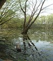
Critique By:
james mickelson (K:7344)
4/28/2003 5:48:37 PM
This is one of those scenes that is best captured as black and white. The color isn't appealing and the faded sky just makes this scene flatter. The upper right hand corner intrusive needs to be gone too. Shame on you. You lnow better than that{;-) Try this as a B&W and reverse the pos to neg and take a look. Bump up the contrast especially in the water.
|
| Photo By: Gary Cardinal
(K:1500)
|
|
|
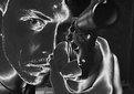
Critique By:
james mickelson (K:7344)
4/28/2003 5:45:10 PM
I'm afeared.
|
| Photo By: Jean-François Dupuis
(K:70)
|
|
|
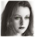
Critique By:
james mickelson (K:7344)
4/28/2003 5:44:38 PM
Very nice looking young lady. I hope to see more of her in the future. But how about a little more life to her. She has a somewhat blank emotionless expression here. She has the face that should be able to slay mens hearts. Use it.
|
| Photo By: Karen Johnson
(K:2951)
|
|
|
Critique By:
james mickelson (K:7344)
4/28/2003 5:07:37 PM
This is a nice macro..............of what? The flower? Bugs mating? If it is of bugs having a tryst, then put the bugs in the center. They are much too high. The flower's color dominates this scene. Lower the flowers brightness and contrast a bit so that the fucking bugs are lit better. That will make them more the center of attention. The yellow color because of it's contrast dominates the scene. And therefore the bugs are just part of it.
|
| Photo By: Estevao Jose
(K:6115)
|
|
|
Critique By:
james mickelson (K:7344)
4/28/2003 5:03:58 PM
Why is it out of focus?
|
| Photo By: Kevin Salter
(K:649)
|
|
|
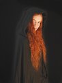
Critique By:
james mickelson (K:7344)
4/28/2003 5:03:03 PM
Great idea. Just doesn't work on a few levels. The cloak disappears into the background. Why? The background for this style of shot should be crisp and black. Otherwise it just lays there. Her hair should be "shining" at me. It is the only color there. Her hair needs to be dramatic. Her face is hidden. Why? Is she ashamed of her face? Bring it out or give me a reason for her to be hiding. If she's hiding, make me believe it. Great potential here. Just needs more work. And contrast is the attention grabber here. Make it so.
|
| Photo By: Jyri Floyd
(K:127)
|
|
|
Critique By:
james mickelson (K:7344)
4/28/2003 4:58:02 PM
This has a lot of potential. Just not enough contrast. Not the best angle. The lighting is flat. The color is flat. Needs something else to draw our attention from the starting point out to the horizon. Needs something to engage us. Think man think. You have a p[otentially interesting image here. Needs more work though. Good start. Try it early in the morining for a better light. Better color.
|
| Photo By: Flavio Trindade
(K:1023)
|
|
|
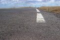
Critique By:
james mickelson (K:7344)
4/28/2003 4:54:02 PM
Why is this bridge out of focus? Why is it poorly lit? Is there a reason the people ar half hidden? Work this image. Work the scene.
|
| Photo By: amy douglas
(K:425)
|
|
|
Critique By:
james mickelson (K:7344)
4/28/2003 4:51:38 PM
This could be a great image. But it isn't. A diferent angle, better lighting, diferent focusing, many things could make this a better image. It is too static here. Comes right at you. No emotion to it. Could you have taken it from the right side (it's keft) so it wasn't coming right at us? Having it looking at us would have given it some emotional attachment. If you can shoot it again, please do. And shoot the hell out of it. Move that camera. Tip that camera. Change that lens. Go man go.
|
Photo By: Peter De Rycke
(K:41212)

|
|
|
Critique By:
james mickelson (K:7344)
4/28/2003 4:47:01 PM
There is some real potential here. Just didn't hit it right. Needs contrast and color. Lighting is flat and boring. Don't take this as negative criticism. There is something here and if Steven Spielburg saw this he would use it in a movie. Now it's your task to find out how to make this potential a great image. Perspective, lighting, filtering, lenses, design? Get to it.
|
| Photo By: Patrice Deramaix
(K:272)
|
|
|
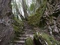
Critique By:
james mickelson (K:7344)
4/28/2003 4:41:09 PM
This is nice. I've seen a lot of the same work like this but I will say that this is nice. I'd like a little more done with this though in lighting. I know that is hard with slide material but the lighting isn't as good as I know it could be. I like the arrangment of the branches. Not too crowded. And I like the green bark. I would like to see this in black and white as a high high contrast image and also as a very soft high key image.
|
| Photo By: Dick van Breda
(K:4655)
|
|
|
Critique By:
james mickelson (K:7344)
4/5/2003 2:39:32 PM
I like the whole series. Very creative. Are you going to put this series in a book? Hand made images in a hand bound book. Might make a great present to me. ;-)
|
| Photo By: Beth Lasoff
(K:539)
|
|
|
Critique By:
james mickelson (K:7344)
4/5/2003 2:34:35 PM
Oy!!! Very nice. I love the expression. She has a quality that I like,. Besides beautiful breasts.
|
| Photo By: Karen Johnson
(K:2951)
|
|
|
Critique By:
james mickelson (K:7344)
4/5/2003 2:21:15 PM
Oh if this were only sharp! Tell me it's sharp on the print or wherever you store this. But it looks like the shutter speed was not fast enough. Nice try.
|
| Photo By: Dave Atwood
(K:253)
|
|
|
Critique By:
james mickelson (K:7344)
4/5/2003 2:01:49 PM
I love landscape pictures. this is done very well. My only pick, which is simply what would appeal to me and nothing else, would be a little more room on the left. Just a taste. Simply personal preferrence. this is a good image. James
|
| Photo By: John Cuniberti
(K:0)
|
|
|
Critique By:
james mickelson (K:7344)
4/5/2003 1:55:25 PM
There is so much more to be done here to make this a good photograph. One of the first things I would do is darken all the foliage in the background. All of it. Dark. Separate the backgrouns from the not so strong foreground. take it from there.
|
| Photo By: Rafael Muller
(K:26)
|
|
|
Critique By:
james mickelson (K:7344)
4/5/2003 1:48:10 PM
Very nice image Michael. I love the contrast here. You used it very well. Not overdone. Nice vantage point too. Love the sky here and the not so dark blue sky. Well seen and great finish to it. Music would go well with this.
|
| Photo By: Michael Klemmer
(K:725)
|
|
|
Critique By:
james mickelson (K:7344)
4/5/2003 1:43:59 PM
Thankyou Cheryl. That brought tears to my eyes as I am facing the same thing. Where does the time go? And go so rapidly? I have yet to photograph my father. I am afraid. So many things to say but not having the courage to revisit some of them. nice work. Do more. Don't miss the opportunity. Thankyou, James
|
| Photo By: Cheryl Jacobs
(K:122)
|
|
|
Critique By:
james mickelson (K:7344)
4/5/2003 1:40:15 PM
I don't comment much anymore because I don't see much to comment on but I have to comment on this image. Very well seen Rene. Very well captured. Great imagination. I like seeing people create and not just record what is in front of them. this is excellent work. This is what I am striving for in my new work. Well done and I hope to see much more from you in the future.
|
| Photo By: Rene Asmussen
(K:138)
|
|
|
Critique By:
james mickelson (K:7344)
1/3/2003 11:05:48 PM
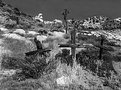
Well being as this is about some pioneer crosses in the landscape, I think it meets the criteria of a landscape. And, well, landscapes tend to be busy and sharp throughout. At 16x20 this is sharp enough to cut your eyes out. Few know of this place. It's 80 miles from LA. Had I chose to, and I did in another version, the crosses are more prominent but there is little else in the scene making it rather boring. And if you study the classic landscape, you will find that many are about the "entire" scene and not about a subject within the scene. Subject dominated images are generally portraits, still life, and photojournalism. Landscapes are about the landscape. Whatever it holds.
|
| Photo By: james mickelson
(K:7344)
|
|
|
Critique By:
james mickelson (K:7344)
1/3/2003 10:56:45 PM
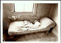
Marc, I guess you didn't read my explaination carefully. There were no other angles due to the fact that this room is barricaded with heavy wire. To the left is a trashpile and to the right is a jumble of other junk. Shot vertically the window dominates the scene and it is filthy. So with careful camera movements with a 90mm lens and amx movements, this is the best there was available in this building. Wre it 20 years ago I could have truned the bed, or stood it on it's head. The print is sumptuos with all kinds of detail in the window. My lack of computer skills doesn't allow me to bring out the detail that is here. I am a printer not a photoshop wiz. This print is so detailed, you can see the dead bed bugs.
|
| Photo By: james mickelson
(K:7344)
|
|
")