|
|
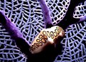
Critique By:
Adam E. J. Squier (K:9803)
2/26/2003 3:50:42 AM
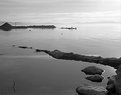
This is really pretty, but a little over exposed. There isn't enough contrast to really make it pop. It would look good as a decorator piece for someone's home
|
| Photo By: Aiman Nassar
(K:11961)
|
|
|
Critique By:
Adam E. J. Squier (K:9803)
2/25/2003 12:01:47 PM
Wow! Using an extension tube on a zone-focus camera. How in the world do you focus that? Does it use one of those frames that stick out from the lens?
Beautiful image.
|
| Photo By: Bob Jarman
(K:3145)
|
|
|
Critique By:
Adam E. J. Squier (K:9803)
2/20/2003 7:56:00 AM
Thanks for the comments. I debated whether to put this in the "commercial" or "macro" categories and decided on "macro."
Maggie, I don't think a specific macro lens would have gotten me anything on this image. In fact, with the set-up I used, I'm pretty sure I have a higher magnification (with the DOF I needed) than if I used a true macro lens. But I don't know for sure. In any case, the client loved it and is using it. Yay!
The 6T diopter is about a +3 close-up lens and the 5T is about a +1.5 close-up lens. They're pretty much the highest quality diopters around (two-element diopters) and the 85/1.8 is one of Nikon's sharpest lenses.
The only way I could have gotten higher magnification while maintaining the DOF and the quality of the light, I believe, would have been to use a camera or lens (or both) with movements to flatten out the DOF.
And yes, I tried to rent Nikon's 85mm/2.8 macro lens that has the movements but no one around here has one. Oh well, it's a pretty specialized lens but one that I could definitely use.
Thanks again for the comments.
|
| Photo By: Adam E. J. Squier
(K:9803)
|
|
|
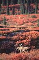
Critique By:
Adam E. J. Squier (K:9803)
1/15/2003 6:35:47 PM
This is beautiful. The moose appears to be glowing. Surveying the marsh.
|
| Photo By: Steve Kaufman
(K:2748)
|
|
|
Critique By:
Adam E. J. Squier (K:9803)
1/15/2003 6:32:01 PM
This must be a trend for me. Commenting on photos again. I mostly wanted to bring this one back to the top. I still stand by my previous comment.
In the past year and a half since my last comment, I've done a lot of macro photos. My question to you is how did you get such deep depth of field? Did you use the movements to compensate? If so, I don't see what you could have done. When I've tried 2X macros, my DOF is usually very, very shallow.
Of course, I'm using a much smaller format but a 180mm lens is still a 180mm lens. The DOF doesn't change. So, can you tell me your secret? Or am I just not thinking this through?
|
Photo By: Phillip Cohen
(K:10561)

|
|
|
Critique By:
Adam E. J. Squier (K:9803)
1/15/2003 6:23:10 PM
That's really weird. I must really like this image. It just jumped out at me from the "random bar" and I looked at it. Turns out, I made the only other comment on it nearly a year ago.
I'm not sure if I still agree with my previous advise. It stands pretty well on its own.
|
| Photo By: John Wall
(K:45)
|
|
|
Critique By:
Adam E. J. Squier (K:9803)
1/15/2003 5:27:37 PM
Thanks for the comment. These kids were tough to shoot. This was the only frame of 36 where they're all looking at (or pretty close to) the camera and mostly smiling. Took a lot of coaching. Don't know if they'll ever be together again. They're all cousins or siblings. Two live in Ohio, two live in Oregon, and the other two live in Switzerland.
The setting is the Alice Keck Park Park in Santa Barbara off Garden Street. A great place for photos.
|
| Photo By: Adam E. J. Squier
(K:9803)
|
|
|
Critique By:
Adam E. J. Squier (K:9803)
1/13/2003 7:14:58 AM
The only nit I have (and it's so minor that you shouldn't worry about it) is that part of the hair is cropped out at the top. This kind of "fuzz" is so wispy and it's nice to see the tips of it
|
| Photo By: Thomas Paul
(K:111)
|
|
|
Critique By:
Adam E. J. Squier (K:9803)
1/1/2003 12:15:10 PM
Yeah, I know the snow is blown out at the top. I used a film that's very high contrast and very saturated. It's also some of the sharpest film I've ever seen. Unfortunately, it's not available any more. I've been saving a couple rolls for a snowy day.
I played around with levels, cropping, and color balance. In the end I was happiest with this, despite the bright snow. Perhaps I was wrong (I often am). ;-)
|
| Photo By: Adam E. J. Squier
(K:9803)
|
|
|
Critique By:
Adam E. J. Squier (K:9803)
1/1/2003 7:50:24 AM
Nice pose on this one. I wish her hands were in there, though.
It would be better without the background and certainly without the shadow from the on-camera flash. It appears that the flash was below (!) the lens. It's usually better to have it above the lens unless you're going for some special effect -- and then it should be obvious.
Try using an off-camera flash (you'll need a special cord but I believe it's possible) and try this again.
|
| Photo By: Bengt Nordborg
(K:24)
|
|
|
Critique By:
Adam E. J. Squier (K:9803)
1/1/2003 7:45:49 AM
Wait! Haven't I seen this some place before. (a minute or two passes). Here:
http://www.usefilm.com/showphoto.php?id=24935
I think this one works better as the composition isn't fighting with the (too?) bright colors. Very nice lines.
|
| Photo By: Aiman Nassar
(K:11961)
|
|
|
Critique By:
Adam E. J. Squier (K:9803)
12/30/2002 6:42:34 AM
This is really cool. I was excited to view the full-sized image but was a bit disappointed. It seems like there was some camera movement or something to make it fuzzy. The focus looks OK but maybe it's a bit off, too.
This photo has tons of potential, it could be really good. I'd keep experimenting with this idea until you get something that really pops out. I wish I'd thought of it. I just might steal your idea. ;-)
|
| Photo By: Molly Walters
(K:1284)
|
|
|
Critique By:
Adam E. J. Squier (K:9803)
12/26/2002 3:54:44 AM
I forgot to add that this "photojournalistic" style is all new to me. I've been thinking about Ron's earlier comment about the grittiness. Ron, did you mean the style or the actual graininess of the photo? I used really high-speed film and a really fast lens so there wouldn't be flashes to startle nor to wait to recharge.
I'd never used the film before and my wife wasn't too keen on my testing out an emulsion with an event that certainly wouldn't happen again (well, where she or I'd be present, at least). I'm very impressed with the grain size and color management. I'd say it's better than any 400 speed film I remember from my high-school days (mid-80s).
The light was mostly fluorescent with a bright spotlight that didn't make it into the photo (she would have killed me on the spot if it had, if you know what I mean).
Thanks again for the comments and congrats. After not having a newborn around for almost six years, I was surprised how it all came back to me.
|
| Photo By: Adam E. J. Squier
(K:9803)
|
|
|
Critique By:
Adam E. J. Squier (K:9803)
12/26/2002 3:46:14 AM
This is a gorgeous image. I don't know how you could make it better. Did you use a soft-focus lens or filter or something? Or was it done in Photoshop. Either way, it works really well.
With kids' portraits, I usually make the lighting as simple as possible (one light -- usually that big one outside, one reflector or fill-flash). I feel it captures the essence of childhood more. Not that what you did is wrong to me at all, it's just a different style than I use.
|
| Photo By: Thomas Paul
(K:111)
|
|
|
Critique By:
Adam E. J. Squier (K:9803)
12/26/2002 3:31:53 AM
The white wall tiles look a bit warm, which is nice, for a change. Stark white would look too antiseptic (though it is a bath, hmmm) but as it is I can almost feel the warmth of the water.
|
| Photo By: Tim Dinofa
(K:162)
|
|
|
Critique By:
Adam E. J. Squier (K:9803)
12/26/2002 3:20:59 AM
Thanks for all your comments. It always amazes me when babies are born. They're small, have no idea what's going on, and wonder why someone took them out of their warm, comfy world.
He's a little peanut. Only a little over 6 pounds and almost a week old now.
|
| Photo By: Adam E. J. Squier
(K:9803)
|
|
|
Critique By:
Adam E. J. Squier (K:9803)
12/25/2002 3:06:09 AM
This is fantastic. It reminds me a lot of another image on this site but I can't seem to find it.
|
| Photo By: Thomas Paul
(K:111)
|
|
|
Critique By:
Adam E. J. Squier (K:9803)
12/25/2002 3:04:04 AM
I love images like this. The bright, bold colors mostly. The happy-face makes for a whimsical feeling. I wonder how it would be with just a blue ball without a face printed on it.
|
| Photo By: Carmen Fuchs
(K:66)
|
|
|
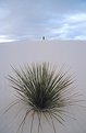
Critique By:
Adam E. J. Squier (K:9803)
12/19/2002 3:45:02 AM
I love the composition but I think it would be better without the figure. Also with all of the leaves intact.
|
| Photo By: Keith Song
(K:-11)
|
|
|
Critique By:
Adam E. J. Squier (K:9803)
12/18/2002 6:10:42 PM
I love the soft colors here. It reminds me of the patina that appears on copper after a while. The rusty shackle just adds to the effect.
Very nice.
|
| Photo By: Reidar Olsen
(K:144)
|
|
|
Critique By:
Adam E. J. Squier (K:9803)
12/18/2002 6:08:29 PM
Ha. I was just going to comment on the chopped foot when I read it in your "about" text. I'd try cropping Wolfie out completely, coming right up to the top of her left (lower) wrist -- just above the sleeve cuff.
But then it wouldn't be a photo of your two favorite people. ;-)
|
| Photo By: Sarah Needham
(K:2482)
|
|
|
Critique By:
Adam E. J. Squier (K:9803)
12/18/2002 5:53:58 PM
I think the ear is too distracting for this portrait to work. Either have someone else in the image or don't. Just an ear and a sliver of a face doesn't seem to work here.
|
| Photo By: Beth Lasoff
(K:539)
|
|
|
Critique By:
Adam E. J. Squier (K:9803)
12/18/2002 5:51:58 PM
The expressions are great. I'm not so sure of the title, though. I think a better prop would have been a game-boy or something like that. Something that many kids do when they ought to be out doing something active.
I sound just like my wife when she talks about me and this dang computer. ;-)
|
| Photo By: Dario Diament
(K:83)
|
|
|
Critique By:
Adam E. J. Squier (K:9803)
12/18/2002 5:48:40 PM
I always seem to comment on bold-shaped images and this one is no exepetion (obviously).
The orange looks good, but do I see a little pixelization going on there? Was this upsampled at all.
I don't really like the bevelled edge and drop shadow, as it immediately make me wonder what other digital manipulation was done on it. I assume the black was added in digitally. If not, you've done a great job getting it so uniform.
|
| Photo By: James P. Watt
(K:5)
|
|
|
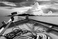
Critique By:
Adam E. J. Squier (K:9803)
12/18/2002 5:40:39 PM
The image and mood are wonderful. My only gripe is the vertical lines in the bottom left. Looks like it could be artifacts from the scanner. I love that little stick down there, too.
|
| Photo By: al shaikh
(K:15790)
|
|
|
Critique By:
Adam E. J. Squier (K:9803)
12/17/2002 2:08:48 PM
Wonderful colors. I keep thinking of an ant on a basketball, for some reason. ;-)
Gives a feeling of freedom. Very nice.
|
| Photo By: Aiman Nassar
(K:11961)
|
|
|
Critique By:
Adam E. J. Squier (K:9803)
12/17/2002 2:04:46 PM
Yes, he looks really happy. Almost like he was trying hard not to show his teeth with his smile. It makes me feel that a split-second later all of his teeth were showing.
|
| Photo By: Keld Nielsen
(K:48)
|
|
|
Critique By:
Adam E. J. Squier (K:9803)
12/17/2002 2:01:17 PM
I really like the soft light of this. Not sure how I feel about the hairs curling around her nose. I think they're a bit distracting. I'd prefer to see this without any eye makeup on as her skin looks great.
|
| Photo By: Jay Dixon
(K:563)
|
|
|
Critique By:
Adam E. J. Squier (K:9803)
12/17/2002 1:56:47 PM
I like the colors a lot, but there doesn't seem to be a focal point to the image. I'm not sure where to look. The green stalk sort of bisects the photo into two.
|
| Photo By: Peter Caracappa
(K:119)
|
|
|
Critique By:
Adam E. J. Squier (K:9803)
12/15/2002 11:46:07 AM
Wow! Her face just sort of jumps out at you. Her hair covering parts of her eyes doesn't bother me at all. In fact, it adds something to the image. She sure looks warm. My only nitpick is the red on the right.
|
| Photo By: Jim Fuglestad
(K:1564)
|
|