|
|
Critique By:
Nichole Belmore (K:73)
2/26/2008 1:09:26 PM
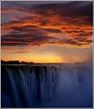
I like the tone and feeling to it. Normally the center straight line would bother me but I think you made the right choice here :)
|
| Photo By: Momento Eterno (Carmen Spitznagel)
(K:1177)
|
|
|
Critique By:
Nichole Belmore (K:73)
2/26/2008 1:00:01 PM
Nice colors :)
|
| Photo By: Celso F
(K:153)
|
|
|
Critique By:
Nichole Belmore (K:73)
2/26/2008 12:54:05 PM
Thanks Maja :)
|
| Photo By: Nichole Belmore
(K:73)
|
|
|
Critique By:
Nichole Belmore (K:73)
2/26/2008 12:53:45 PM
Thank you Riny!
|
| Photo By: Nichole Belmore
(K:73)
|
|
|
Critique By:
Nichole Belmore (K:73)
2/24/2008 5:19:31 AM
Thanks Mike :)
|
| Photo By: Nichole Belmore
(K:73)
|
|
|
Critique By:
Nichole Belmore (K:73)
2/24/2008 5:18:56 AM
Thank you! :)
|
| Photo By: Nichole Belmore
(K:73)
|
|
|
Critique By:
Nichole Belmore (K:73)
2/24/2008 12:05:07 AM
What beautiful colors! I would like to see the dark formation above the water a little darker though. Nice horizon line and use of thirds!
|
| Photo By: giovanni guido marchi
(K:27040)
|
|
|
Critique By:
Nichole Belmore (K:73)
2/23/2008 11:30:31 PM
I like this a lot! Wonderful use of lines. I actually like the blown out sky too, it adds to that infinity feeling the lines create. Also being from Minnesota and knowing what winter is, the solid hazy sky gives me that cold feeling all over again.
|
| Photo By: David M Roberts
(K:914)
|
|
|
Critique By:
Nichole Belmore (K:73)
2/23/2008 11:25:38 PM
Now that is just plain cool! No idea where people find props for this kind of stuff but I like the effect. Very nice colors and light. My only "critique" would be the fact that it's centered pretty squarely..
|
Photo By: James Fraser
(K:941)

|
|
|
Critique By:
Nichole Belmore (K:73)
2/23/2008 11:23:05 PM
Nice set up and composition. Seems like the lighting is good too. I'm a fan of the browns on the right pictures, but in my opinion it's just a bit "washed" or hazed over, maybe too much. Can't get over those expressions though, you know those are two hearts that really understand each other. Nicely captured :)
|
Photo By: Jim Gamble
(K:12164)

|
|
|
Critique By:
Nichole Belmore (K:73)
2/23/2008 11:17:52 PM
Beautiful exposure and colors. The water reflections add just the right touch and the panoramic choice I think was perfect. Great shot!
|
| Photo By: Jason Mckeown
(K:22200)
|
|
|
Critique By:
Nichole Belmore (K:73)
2/23/2008 11:15:26 PM
I love this! Really great composition and colors, I like the fact that the focus for once is only in the sand. Makes it more original and seems to add significant importance to the footprint.
|
| Photo By: Bhabesh Chakrabarti
(K:11394)
|
|
|
Critique By:
Nichole Belmore (K:73)
2/23/2008 11:11:44 PM
Very nice exposure and color tones! The blues/greens are wonderful.
At first the rocks along the bottom edge there kinda bugged me but when I put my hands over the screen to see what it would be cropped, you'd loose too much of the right side rocks. I think if they were either darker or had more to them (adding more along the bottom) they would have been much less of a distraction.
Really nice overall though, I like it!
|
| Photo By: Mark Wakefield
(K:481)
|
|
|
Critique By:
Nichole Belmore (K:73)
2/23/2008 11:07:19 PM
I like the overall composition here and the "foggy" feel to the water area.
I can't however seem to find a clear, sharp point. I'm thinking the focus might be back at the waterfall part? Maybe making the focus on the trees or closer subjects on the right side could help that.
|
Photo By: Mario Studer
(K:1821)

|
|
|
Critique By:
Nichole Belmore (K:73)
9/26/2006 4:35:19 AM
Thanks! I'm glad you liked it!
|
| Photo By: Nichole Belmore
(K:73)
|
|
|
Critique By:
Nichole Belmore (K:73)
9/26/2006 4:34:34 AM
Thank you very much!!
|
| Photo By: Nichole Belmore
(K:73)
|
|


