|
|
Critique By:
anton albert (K:291)
3/17/2004 8:24:01 AM
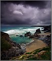
Teunis, beautiful photo! What time of day did you take the photo? It looks like late morning or early evening. I wonder what the lighting would have been like in early morning or late evening. Perhaps more dramatic...not necessarily better though!
|
| Photo By: Teunis Haveman
(K:37426)
|
|
|
Critique By:
anton albert (K:291)
3/15/2004 10:04:41 AM
Beautiful...Not a distraction but with PS you can tweak the eyes. Still very emotive and artsy.
|
| Photo By: Cindi Czaja
(K:5314)
|
|
|
Critique By:
anton albert (K:291)
3/15/2004 9:50:40 AM
I look at this photo and imagine all kinds of stories that can go along with it. I think it is exceptional. Lighting is fantastic and it is very emotive.
|
| Photo By: Chris Spracklen
(K:32552)
|
|
|
Critique By:
anton albert (K:291)
3/15/2004 9:48:25 AM
Stephen, I liked your photo. The silhouette looks a bit dark (I can barely make the two subjects out). I would try bracketing next time to give a wider gamut of colors. You might want to try a ND filter to expose the sky -1 stop vs the foreground.
|
| Photo By: Stephen Smith
(K:861)
|
|
|
Critique By:
anton albert (K:291)
3/15/2004 9:34:38 AM
Perfect juxtaposition of the photographer and the eye!
|
| Photo By: John Zimmerman
(K:220)
|
|
|
Critique By:
anton albert (K:291)
3/15/2004 9:31:33 AM
Very beautiful portrait. I would crop a bit to make the image vertical. The expanse on the left of the subject does not appear to help the strength of the image.
|
| Photo By: zet ka
(K:1411)
|
|
|
Critique By:
anton albert (K:291)
3/15/2004 9:18:49 AM
Giancarlo, execellent photo. Any story to go along with it?
|
| Photo By: Giancarlo Liguori
(K:5281)
|
|
|
Critique By:
anton albert (K:291)
3/15/2004 8:53:51 AM
Since the category is travel, I am rating the photo based upon the quality of the photo and the story that the photo depicts. I give it overall good marks. This is a destination that I'd like to know more about (the photo has peaked my interest...this is one of my criteria for judging a travel photo).
|
| Photo By: G F
(K:-17)
|
|
|
Critique By:
anton albert (K:291)
3/15/2004 8:44:41 AM
I would try to incorporate more of the surroundings so that it would tell a story about the women going to work. Are they on a bridge? Is this close to where they live? Would a vertical composition work?
|
| Photo By: Pajara Thongjaj
(K:50)
|
|
|
Critique By:
anton albert (K:291)
3/15/2004 8:40:26 AM
I really enjoy looking at this photo. Lot's of emotion. Very well done.
|
| Photo By: Darrin James
(K:3944)
|
|
|
Critique By:
anton albert (K:291)
3/14/2004 7:10:46 AM
I rated this photo slightly less than perfect because it is categorized as fashion. I can't see the collar due to the model's hair. If this were simply a portrait it would be perfect to me.
|
| Photo By: larry white
(K:368)
|
|
|
Critique By:
anton albert (K:291)
3/13/2004 4:11:16 PM
The photograph is executed well. Since this is a commercial photo I am judging it based upon what I perceive the product to be or how this would be used for a stock photo. As a stock photo, I would suggest that the model look away from the camera...it would be more believable in a wide variety of venues. The colors are subtle...very nice. The model is wearing glasses, yet the overall theme is relaxed. Just a few thoughts.
|
| Photo By: ppdix
(K:17069)
|
|
|
Critique By:
anton albert (K:291)
3/12/2004 3:23:25 PM
This is well executed!
|
| Photo By: Alex Teller
(K:8286)
|
|
|
Critique By:
anton albert (K:291)
3/10/2004 4:28:43 PM
dAna, fantastic photo!
|
| Photo By: dAna zAhir
(K:2)
|
|
|
Critique By:
anton albert (K:291)
3/9/2004 5:56:24 PM
Daniel, great photo!
|
| Photo By: Daniel McIntyre
(K:772)
|
|
|
Critique By:
anton albert (K:291)
3/6/2004 6:35:45 AM
Vince, I generally rate photos based upon how they make me feel. In this case you've captured more than just a beautiful subject. You've captured the essence of what most people feel is important about portraiture...expression! Great Photograph!
|
| Photo By: Vince Cianci
(K:2505)
|
|
|
Critique By:
anton albert (K:291)
3/6/2004 6:24:54 AM
Tone...great! composition...great! coloration...great! overall...great!
|
| Photo By: A. W. Osnafotos
(K:6373)
|
|
|
Critique By:
anton albert (K:291)
3/6/2004 6:16:37 AM
This photo is very graphic to me. This would work quite well in an advertisement or as a stock image. A vertical second version might work as well. Great job!
|
| Photo By: herwig b
(K:558)
|
|
|
Critique By:
anton albert (K:291)
3/5/2004 4:31:43 PM
I like this photo. I would keep the facial areas sharp if possible.
|
| Photo By: RC. Dany
(K:64104)
|
|
|
Critique By:
anton albert (K:291)
3/5/2004 3:24:57 PM
A.d., I love the color...reminds me of Pete Turner's work.
|
| Photo By: A. A
(K:1987)
|
|
|
Critique By:
anton albert (K:291)
3/5/2004 3:20:08 PM
The tone of this photo is great! Lot's of emotional appeal.
|
| Photo By: Szymon Seweryn
(K:190)
|
|
|
Critique By:
anton albert (K:291)
3/4/2004 2:12:52 AM
Great Photo. It makes me wish that I were there!
|
| Photo By: WALT MESK
(K:10691)
|
|
|
Critique By:
anton albert (K:291)
3/4/2004 2:11:47 AM
good photo.
|
| Photo By: Brenda Orchard
(K:1226)
|
|


