|
|
Critique By:
Eirik Holmøyvik (K:58)
5/28/2005 7:32:38 PM
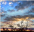
Thanks for the comment. The exposure time is probably between 1-3 minutes here.
|
| Photo By: Eirik Holmøyvik
(K:58)
|
|
|
Critique By:
Eirik Holmøyvik (K:58)
1/18/2005 7:17:08 PM
Gorgeous, although I'd burn in the hand slightly in order to give more attention to the face.
|
| Photo By: rafal ' mojalewastopa ' karpinski
(K:504)
|
|
|
Critique By:
Eirik Holmøyvik (K:58)
1/16/2005 11:18:52 PM
Nice DOF, and a wonderful symetry with the blouse and hair which really improves this portrait a lot. Very captivating.
|
| Photo By: Mark Orchard
(K:110)
|
|
|
Critique By:
Eirik Holmøyvik (K:58)
1/10/2005 10:28:18 PM
Grain? It's frost on the ice 
|
| Photo By: Eirik Holmøyvik
(K:58)
|
|
|
Critique By:
Eirik Holmøyvik (K:58)
10/25/2004 1:44:37 PM
This scene has a huge dynamic range. I wanted to keep some detail in the highlights, although the light on the water had to be overexposed. I metered off the highlights in the sky, and set the exposure appx. 3 stops below. Then I knew I would have detail in the sky, and some detail in the shadow areas, although not in the darkes parts.
|
| Photo By: Eirik Holmøyvik
(K:58)
|
|
|
Critique By:
Eirik Holmøyvik (K:58)
9/13/2004 9:31:50 AM
Very interesting angle and composition. The elements (glass and magazine) are puzzling for me, but are balanced by the face. I like it, but I suspect this one to be too challenging for the average viewer.
|
| Photo By: Rosiness Ma
(K:629)
|
|
|
Critique By:
Eirik Holmøyvik (K:58)
8/27/2004 8:07:59 AM
Thanks for comments
|
| Photo By: Eirik Holmøyvik
(K:58)
|
|
|
Critique By:
Eirik Holmøyvik (K:58)
8/25/2004 7:30:06 AM
Very cool. Dark and moody. You are successful in conveying a strong mood in this shot.
|
| Photo By: Paolo Cardone
(K:1161)
|
|
|
Critique By:
Eirik Holmøyvik (K:58)
5/20/2004 10:33:57 AM
Thanks for all comments.
|
| Photo By: Eirik Holmøyvik
(K:58)
|
|
|
Critique By:
Eirik Holmøyvik (K:58)
4/26/2004 7:54:29 AM
Thanks for the comments. Yes, Norway is a very long country. Streching from as south as London, all the way across the arctic circle.
|
| Photo By: Eirik Holmøyvik
(K:58)
|
|
|
Critique By:
Eirik Holmøyvik (K:58)
1/29/2004 6:35:19 AM
Yes, this camera use 120 film (or 220) in 6x6 format. Very nice little camera.
|
| Photo By: Eirik Holmøyvik
(K:58)
|
|
|
Critique By:
Eirik Holmøyvik (K:58)
1/25/2004 11:45:43 PM
Thanks for the comment Paul. I usually overexpose pictures with snow. In show was one full stop over the metered exposure. The easiest way is to bracket exposures.
|
| Photo By: Eirik Holmøyvik
(K:58)
|
|
|
Critique By:
Eirik Holmøyvik (K:58)
1/19/2004 4:33:25 AM
Very nice. Great contact with the model.
|
| Photo By: kristine wreyford
(K:-205)
|
|
|
Critique By:
Eirik Holmøyvik (K:58)
1/14/2004 4:12:14 PM
There's something about the model's pose which I don't like. I guess it's the hands. Technically it's great though, as usual from you  Keep up the good work. Keep up the good work.
|
| Photo By: Rene Asmussen
(K:138)
|
|
|
Critique By:
Eirik Holmøyvik (K:58)
12/15/2003 3:04:47 PM
Thanks for the comment. If it was a big black void in the bottom, I'd crop it right away! However, it's not a black void. If your monitor is properly calibrated (check the gradient bar on the bottom of this page), you'd see that there are details in the bottom of the picture.
|
| Photo By: Eirik Holmøyvik
(K:58)
|
|
|
Critique By:
Eirik Holmøyvik (K:58)
12/12/2003 3:39:59 PM
Very nice composition.
|
Photo By: Tony Smallman
(K:23858)

|
|
|
Critique By:
Eirik Holmøyvik (K:58)
12/9/2003 1:52:24 PM
Good composition. A bit heavy shadows though.
|
| Photo By: Naty Z
(K:16436)
|
|
|
Critique By:
Eirik Holmøyvik (K:58)
12/7/2003 8:35:37 AM
Yes Filipe, Oslo in Norway. This is from the metro.
|
| Photo By: Eirik Holmøyvik
(K:58)
|
|


