|
|
Critique By:
Bobb Fwed (K:134)
3/17/2004 12:52:34 PM
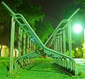
This photo (more than the others) is better viewed at the higher resolutions. The more detail adds to the look of the photo. I love the cotrast between bright lights and dark shadows, this photo isn't one of great contrast, but there a a few small areas that add the contrast I like in photos. Also, the lines of white on the closest angle of the pipes add some more color and contrast flourescent green look to the whole picture. The shadows traveling down the metal toward the back add a nice look. Another element to this photo that I didn't see at first was that with the spot focusing on the front bar, the background starts to almost look fake. The trees have a painted feel to them, I like it. - from website
|
| Photo By: Brandon Nimon
(K:262)
|
|
|
Critique By:
Bobb Fwed (K:134)
8/26/2003 1:34:34 PM
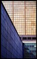
Photo well taken! Lots of lines! Very creative title. Exelent crop. Even the border seems to fit right in with the photo! Very well done!
|
| Photo By: Luis Vieira
(K:1772)
|
|
|
Critique By:
Bobb Fwed (K:134)
8/26/2003 1:29:03 PM
Great shot. I hope it didn't decide to pee on your keyboard. I like how the focus is. Spot focusing with a single subject like that is good and fun! The crop could have been better if you included the whole keyboard though. But this photo is fun and creative as is!
|
| Photo By: Marcy Skizzo
(K:247)
|
|
|
Critique By:
Bobb Fwed (K:134)
8/18/2003 7:08:36 PM
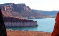
Almost all of the photos of lake Powell you have are very red. All the colors in the phots ore very well brought out. This photo is no exception. I love how there is water thoughout the photo all the way to the last little whole in the back. Showing the theme of all your photos so far... as water
Great job... keep taking pictures!
|
| Photo By: Brandon Nimon
(K:262)
|
|
|
Critique By:
Bobb Fwed (K:134)
8/18/2003 1:27:42 PM
Great shot. Although the border takes away from the beauty of the shot. It's abnormal and rather large. Other than that...great photo and lighting.
|
| Photo By: Jorge Vasconcelos
(K:33746)
|
|
|
Critique By:
Bobb Fwed (K:134)
8/18/2003 1:25:54 PM
Great shot! I love the crop. I love how the subject is off to the side. And the shot is focused on the shadow on the water. The dark area of the photo. It has a dark feeling to the whole shot. And I think other's suggestions to lighten it would be a bad idea..it would take away from what the camera captured. I like it! By the way...what is the shadow from?
|
| Photo By: Jorge Vasconcelos
(K:33746)
|
|
|
Critique By:
Bobb Fwed (K:134)
8/18/2003 1:20:49 PM
Fantastic shot, but the engine is kind of annoying. And the window's reflection on the bottom right. Cropping out the left side of the photo would get rid of some of the odd obscurity, and a little of the beauty, but I think, over all, it would be a better picture.
|
| Photo By: Jorge Vasconcelos
(K:33746)
|
|
|
Critique By:
Bobb Fwed (K:134)
8/18/2003 1:16:21 PM
Great capture with the sun and the airplane, but there is too much -boring- to this photo. After reading the comments, I think the Brandon is right. Some body or "shape" would be great to enhnace this picture. I like how the bleek sky shines on the just parts of the city through the fog (or smog). Great shot, but in the view of a page designer/photographer I think there is too much plain, uneventful space to leave the whole picture in (for it to be more than what is it now...just another amature photo) I think in all your photos (I know you have a lot) you should try to go beyond the amature look. (In many of your photos you've have well surpassed that!)
|
| Photo By: Jorge Vasconcelos
(K:33746)
|
|
|
Critique By:
Bobb Fwed (K:134)
8/18/2003 1:07:55 PM
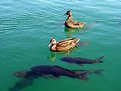
"Pesci Anatra" ("Fish Duck" In Italian) -nice name. That's an awsome capture. I like how close the fish are to the ducks. They are really close to touching. The colors are fantastic: dark where it should be (like the fish: ugly fish!) and detailed and bright other places (the ducks: beautiful ducks). The angle of the sun could have been better (the sun is pretty dark on the face of the duck in the back), but it's hard to get a shot like that anyways.
|
| Photo By: Brandon Nimon
(K:262)
|
|
|
Critique By:
Bobb Fwed (K:134)
8/18/2003 1:03:33 PM
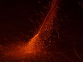
That's an awsome shot! I love how the sparks from the firework (I'm guessing that's what it is (by the name: "Work of Fire")). Good shot.
|
| Photo By: Brandon Nimon
(K:262)
|
|
|
Critique By:
Bobb Fwed (K:134)
8/18/2003 1:01:28 PM
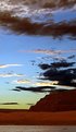
Though it seems kind of gray in some areas, it's a fantastic shot with a wide spectrum of color. With vibrant blues and yellows. I like it. (And yes...it does look superimposed)
|
| Photo By: Brandon Nimon
(K:262)
|
|
|
Critique By:
Bobb Fwed (K:134)
8/18/2003 12:59:23 PM
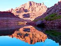
Great reflection shot! I like how the colors in the water are brought out more than the actual mountain.
|
| Photo By: Brandon Nimon
(K:262)
|
|
|
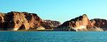
Critique By:
Bobb Fwed (K:134)
8/18/2003 12:58:14 PM
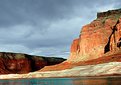
Excelent contrast, from the light in the front right to the dark rocks in the back, and the vibrant color on the rocks to the bleak gray sky.
|
| Photo By: Brandon Nimon
(K:262)
|
|
|
Critique By:
Bobb Fwed (K:134)
8/18/2003 12:56:48 PM
Great color, angle and crop!
|
| Photo By: Brandon Nimon
(K:262)
|
|