|
|
Critique By:
Dmitry Gringauz (K:1157)
5/6/2004 11:15:32 PM
Very emotional photograph. Black-and-white and high-key works well here, as well as the grain.
Figure of the boy is small, but stands out very well. The incline of the sidewalk adds to the mood here -- the boy is tired, whatever was chasing him chased him long and hard.
|
| Photo By: ferzan aydin
(K:415)
|
|
|
Critique By:
Dmitry Gringauz (K:1157)
4/30/2004 9:39:43 PM
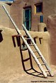
Hi, Janet,
Thank you for your comment. This pic was taken in 2002. At the time, photography at Taos Pueblo was frowned upon, but allowed, after a camera fee was paid. You were expected to respect people living there, and confine photography to the publicly accessible area. Sometimes, people would also be willing to model for you for a fee.
It would be unfortunate if they no longer allow photography.
When I was in Santa Fe area, I visited several of the pueblos. Some of them did not allow photography, and were very frank about it.
|
| Photo By: Dmitry Gringauz
(K:1157)
|
|
|
Critique By:
Dmitry Gringauz (K:1157)
4/30/2004 9:33:55 PM
Hi, Ian,
Thank you for your comment
|
| Photo By: Dmitry Gringauz
(K:1157)
|
|
|
Critique By:
Dmitry Gringauz (K:1157)
4/11/2004 9:12:14 PM
Pleasure to look at.
|
| Photo By: Carol Watson
(K:5185)
|
|
|
Critique By:
Dmitry Gringauz (K:1157)
4/11/2004 9:05:12 PM
The light is good, gray tones are good, the model is great and her expression is good also. Perspective is original, and overall, the picture leaves a good impression.
The picture can benefit from tighter cropping on the top and on the bottom (square format would do well here, the white brick line on the wall is unnecessary), and a better placement of her left hand. Somehow, to me, her left hand looks almost detached, or as if it was someone else's hand.
|
| Photo By: Brad Nirk
(K:142)
|
|
|
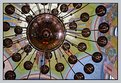
Critique By:
Dmitry Gringauz (K:1157)
4/11/2004 8:53:57 PM
Very interesting view of the church chandelier and the reflection. Framing is just right -- being off center adds to the image a lot, and the candle holders create a neat abstract pattern.
Is this a Russian Orthodox church?
|
| Photo By: Alex Avilov
(K:634)
|
|
|
Critique By:
Dmitry Gringauz (K:1157)
4/11/2004 9:44:30 AM
Sorry, Did not go through the first time.
|
| Photo By: Dmitry Gringauz
(K:1157)
|
|
|
Critique By:
Dmitry Gringauz (K:1157)
4/11/2004 9:28:22 AM
Hi, Ian,
The image is not composite. Like the others, this one was done by applying Sabbatier effect, and then some selective dodging and burning to darken some areas of the background. Outlines, or ridging, are partly the result of Sabbatier effect. They occur in the photo lab as well, when working with B&W Sabbatier photos. Looks like here they were made more prominent by sharpening. Here's the image with selective sharpening in place, it looks a bit better than the first one I posted.
|
| Photo By: Dmitry Gringauz
(K:1157)
|
|
|
Critique By:
Dmitry Gringauz (K:1157)
4/7/2004 4:08:18 PM
Good composition, background and pose.
I would revise lighting a bit -- their faces are not as well lit as their clothes, on inital glance the attention is drawn to the clothes rather than their faces.
|
| Photo By: Eveline Shih-Pitcairn
(K:4406)
|
|
|
Critique By:
Dmitry Gringauz (K:1157)
4/7/2004 4:05:26 PM
Very well composed and well posed photograph. Backlighting is just right. Partial desaturation appears to work here. Will look good in their wedding album 8-).
Did you use a fill flash or a reflector to do frontal lighting?
On my monitor, it appears that there is a sharpening artefact (ridge) on her left hip. You may want to try applying sharpening to selective areas to control that.
|
| Photo By: Eveline Shih-Pitcairn
(K:4406)
|
|
|
Critique By:
Dmitry Gringauz (K:1157)
2/17/2004 4:42:47 PM
Definitely something about this picture. Neat!
|
| Photo By: Kimberley McG
(K:158)
|
|
|
Critique By:
Dmitry Gringauz (K:1157)
2/17/2004 4:41:25 PM
Simple and elegant. Excellent photo.
|
| Photo By: Laurie Ludes
(K:73)
|
|
|
Critique By:
Dmitry Gringauz (K:1157)
2/17/2004 4:39:09 PM
Good lighting, and well performing model.
|
| Photo By: Kala Wlodarczyk
(K:2567)
|
|
|
Critique By:
Dmitry Gringauz (K:1157)
1/12/2004 7:09:26 PM
Folks,
Thank you for your comments.
Benjamin, Tom,
The trumpet player is overexposed pretty badly, but it was one of the compromises that had to be made. There was just too much contrast.
|
| Photo By: Dmitry Gringauz
(K:1157)
|
|
|
Critique By:
Dmitry Gringauz (K:1157)
1/11/2004 9:37:31 PM
Brad,
Thank you, but I was not in the sign business at the time... 8-)
|
| Photo By: Dmitry Gringauz
(K:1157)
|
|
|
Critique By:
Dmitry Gringauz (K:1157)
1/11/2004 9:05:55 PM
Hi, Peta,
Good to hear from you. I've been lurking for a while, being rather busy, but now decided to reload some of the photos again. New stuff will be coming soon...
|
| Photo By: Dmitry Gringauz
(K:1157)
|
|
|
Critique By:
Dmitry Gringauz (K:1157)
1/11/2004 9:04:43 PM
Folks,
Thank you very much for your comments, they are very much appreciated.
|
| Photo By: Dmitry Gringauz
(K:1157)
|
|
|
Critique By:
Dmitry Gringauz (K:1157)
1/6/2004 8:38:20 PM
I like this picture. Very appealing, with interesting texture that comes across very well in b/w.
|
| Photo By: Chris Wenzel
(K:1165)
|
|
|
Critique By:
Dmitry Gringauz (K:1157)
1/2/2004 6:06:25 AM
Folks,
Thank you very much for your comments.
|
| Photo By: Dmitry Gringauz
(K:1157)
|
|
|
Critique By:
Dmitry Gringauz (K:1157)
1/2/2004 6:03:57 AM
Hi, Folks,
Thank you very much for your comments, I really appreciate them.
Image manipulation came up, so here's a bit more info on the picture. The photo was taken about half hour before sunset, in the mountanous area with light-colored hills all around, and (very) patchy low clouds in the sky. There were a lot of reflections and uneven light, hence the somewhat patchy look.
The picture itself is a sandwich of two photos taken with different exposures from a tripod, one for the sky, another one for the walls -- too much exposure difference to handle in one shot. The two photos were taken within a few minutes of each other.
After the sky was pasted in, some burning and dodging was done to the walls to bring out the texture, and perspective was corrected to straighten out the lines.
Some limited burning and dodging was applied around the cross, but not much, primarily to correct for some overexposure.
|
| Photo By: Dmitry Gringauz
(K:1157)
|
|


")