|
|
Critique By:
Mr. Arrey (K:11516)
1/22/2004 4:13:18 PM
nice exposure.
|
| Photo By: David B
(K:26)
|
|
|
Critique By:
Pieter Visser (K:1582)
1/12/2004 8:57:33 AM
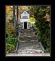
Very, veeeery selective Dof... a shop well done.
|
| Photo By: David B
(K:26)
|
|
|
Critique By:
B:)liana (K:30945)
1/12/2004 5:52:57 AM
Great focus ;-)
|
| Photo By: David B
(K:26)
|
|
|
Critique By:
ana ribeiro (K:21290)
1/12/2004 2:21:12 AM
good work...!
|
| Photo By: David B
(K:26)
|
|
|
Critique By:
Dina Marie (K:-1410)
1/11/2004 10:03:03 PM
This is absolutely stunning! Brilliant in every way.
|
| Photo By: David B
(K:26)
|
|
|
Critique By:
. . (K:16329)
1/9/2004 8:55:07 PM
Focus? Whats that? Good image....love it!!
|
| Photo By: David B
(K:26)
|
|
|
Critique By:
David B (K:26)
1/9/2004 6:03:04 PM
who forgot to focus? this was intentional.
|
| Photo By: David B
(K:26)
|
|
|
Critique By:
Andreas Wolkerstorfer (K:5090)
1/9/2004 5:58:34 PM
cool result with forgetting to focus 
|
| Photo By: David B
(K:26)
|
|
|
Critique By:
Chris Evans (K:795)
12/6/2003 10:04:07 PM
Very sharp photo . I love the blur .
|
| Photo By: David B
(K:26)
|
|
|
Critique By:
Paul's Photos (K:35235)
12/6/2003 8:28:53 PM
very nice photo.. love the long exposure.. good work
|
| Photo By: David B
(K:26)
|
|
|
Critique By:
Pedro Libório (K:36301)
12/6/2003 2:26:12 PM
lovely done, beautiful place!
regards.
|
| Photo By: David B
(K:26)
|
|
|
Critique By:
Teunis Haveman (K:37426)
12/6/2003 9:59:23 AM
Beautiful waterfall
|
| Photo By: David B
(K:26)
|
|
|
Critique By:
Harry Eggens (K:14804)
12/6/2003 9:30:59 AM
Very beautiful composition. Excellent choice David to do this fall scene in B&W, Wonderful tones and great use of slow shutter speed to soften the water nicely. Splendid work....Best regards Harry
|
| Photo By: David B
(K:26)
|
|
|
Critique By:
Muzaffer KURTOGLU (K:4149)
11/21/2003 6:10:05 AM
Excelent frame and light. Great shot for B&W. Regards.
|
| Photo By: David B
(K:26)
|
|
|
Critique By:
José Eduardo Cruz (K:13180)
11/21/2003 4:54:09 AM
Wonderfull!!!!
|
| Photo By: David B
(K:26)
|
|
|
Critique By:
stefano mannucci (K:4793)
11/21/2003 12:07:26 AM
Excellent composition and tones !! Congrats. Ciao Stefano
|
| Photo By: David B
(K:26)
|
|
|
Critique By:
Jan Symank (K:22030)

11/20/2003 11:06:18 PM
Beautiful work.
Very good composition and tones.
Great sky.
Bravo and regards from Jan
|
| Photo By: David B
(K:26)
|
|
|
Critique By:
Amancio Couto (K:15720)
11/20/2003 10:41:07 PM
Great shot, David! Magnificent!!! Excellent composition!!!
|
| Photo By: David B
(K:26)
|
|
|
Critique By:
Federico Garza (K:386)
11/12/2003 7:02:20 PM
hmm...kind of a complex scene...interesting, but can't find the main message...
|
| Photo By: David B
(K:26)
|
|
|
Critique By:
Donald McKay (K:340)
11/12/2003 5:57:55 PM
I think this is excellent work. Welcome to Usefilm. I hope to see more of your material in the future. Thank you for posting.
|
| Photo By: David B
(K:26)
|
|
|
Critique By:
- - (K:10510)
11/8/2003 4:22:55 PM
wonderful image..
|
| Photo By: David B
(K:26)
|
|
|
Critique By:
David Goldfarb (K:7611)
4/14/2001 9:23:50 PM
I see this one in square format, even more centered than it is, with a tiny bit more on top and enough on the bottom to make it symmetrical. If there is a natural frame above, I would exploit that.
|
| Photo By: David B
(K:26)
|
|
|
Critique By:
Deleted User (K:2231)
4/14/2001 11:09:04 AM
My initial impression is that this shot would be better in a vertical format with all or more of the trailing gown shown.. maybe similar to that of a wedding dress shot, where you want the whole trail.
Did you consider a light source from the other side of the wall coming through the opening? Perhaps this might open up the shadows on the girl, make her more center of the image, and produce a nice effect? Just an idea to try.
I'm going over to look at your web site now... post more images!
|
| Photo By: David B
(K:26)
|
|
|
Critique By:
Artie Colantuono (K:12275)
4/13/2001 11:14:41 PM
This is a promo shot so the success or failure of this image will be determined by the ticket sales. It does suggest a mood of fear or terror; however your models facial expression contradicts that. I visited your site and see you have a passion. Get some books out of the library and study composition. Get out of centering everything. also since you like to shoot buildings, a book on architectural photography will solve some of the problems you are encountering. go at it.
|
| Photo By: David B
(K:26)
|
|


