|
|
Critique By:
André Bermak (K:14443)
8/4/2003 8:06:52 AM
Boa captura um pouco escura......
|
| Photo By: n r
(K:101)
|
|
|
Critique By:
Scott Marceau (K:479)
8/3/2003 10:59:59 PM
Too bad that kid is more itallian than you. He is going into the resi.
|
| Photo By: n r
(K:101)
|
|
|
Critique By:
dottie W (K:84)
8/3/2003 7:21:28 PM
that looks a little scary, but very cool experiment!
|
| Photo By: n r
(K:101)
|
|
|
Critique By:
Mark Beltran (K:32612)
8/3/2003 7:20:06 PM
The thumbnail doesn't do it any justice. It's so visually dazzling that one doesn't want to believe it's just a kid with a sparkler.
|
| Photo By: n r
(K:101)
|
|
|
Critique By:
Mark Beltran (K:32612)
8/2/2003 11:26:45 PM
Sometimes when you let a scene be what it is, and you photograph it, it comes through in a sublime way.
|
| Photo By: n r
(K:101)
|
|
|
Critique By:
n r (K:101)
8/2/2003 7:13:34 AM
I don't know where the color came from either. There was a flash involved but the color was just a plus. This picture WAS taken handheld.
|
| Photo By: n r
(K:101)
|
|
|
Critique By:
Stefan Engström (K:24473)
8/1/2003 9:59:00 PM
It is really cool and I have no idea where the color comes form. Was there a flash involved as well? This is not handheld for 5 seconds is it?
|
| Photo By: n r
(K:101)
|
|
|
Critique By:
Joksa Juoperi (K:13473)
8/1/2003 1:37:55 AM
Composition looks very good.
A little bit too unfocused in my mind.
Regards, Joksa.
|
| Photo By: n r
(K:101)
|
|
|
Critique By:
larry terry (K:1965)
7/30/2003 12:30:34 PM
i think the angle of shot could be a little better, but its kind of cool with the light streaks and that, good job
|
| Photo By: n r
(K:101)
|
|
|
Critique By:
Marilyn Adams (K:209)
7/28/2003 10:53:03 PM
I like this alot but this is also one picture I would like to see in color. Good Eye!
|
| Photo By: n r
(K:101)
|
|
|
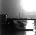
Critique By:
In Transit (K:29432)
7/28/2003 9:11:24 PM
There could be many things said about this capture... but at this moment... I have to find out where it is... as I see there may still be room to build a sanua... and its a spot that I would like to visit... except that I may be concerned about the children on the passing boats... and their innocent eyes!
|
| Photo By: n r
(K:101)
|
|
|
Critique By:
Alex Schlump (K:6)
7/28/2003 7:25:41 PM
Hmmm... Armada never heard of it. I think this picture is awesome!
|
| Photo By: n r
(K:101)
|
|
|
Critique By:
Antti Salovaara (K:139)
7/27/2003 2:47:42 AM
I agree with Mr. Martinidez, and would like to add that the trees on the right side of the image make the composition badly unbalanced. A few minor fixes is all that it takes.
|
| Photo By: n r
(K:101)
|
|
|
Critique By:
Chad Simcox (K:1845)
7/26/2003 7:35:15 PM
Too bad he is going into the foam pit. The composition isnt that great, Its not bad, but then again its nothing special. I'd like to see less room above him, and more of whats below/where he is going. We know gravity should be pulling him down. If the rider is at the top of the frame there is more of a visual struggle against that gravity. but maybe thats just my perspective.
|
| Photo By: n r
(K:101)
|
|
|
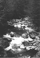
Critique By:
Bob Whorton (K:2740)
7/26/2003 12:30:50 PM
I agree with Matthew on the abstract thumbnail looks like a chess piece on its side!
Great composition but lacking a little in the deffinition one may expect from monochrome. Look forwards to seeing many more.
Cheers, Bob
|
| Photo By: n r
(K:101)
|
|
|
Critique By:
matthew kinslow (K:2525)
7/26/2003 11:30:47 AM
nice photo... in it's thumbnail it looks almost abstract
|
| Photo By: n r
(K:101)
|
|
|
Critique By:
Nabil Majid (K:2073)
7/26/2003 10:45:36 AM
nice monochrome
|
| Photo By: n r
(K:101)
|
|
|
Critique By:
Jamey Cange (K:8)
7/25/2003 1:36:10 PM
Nick Roosen is my new favorite person in the world
|
| Photo By: n r
(K:101)
|
|
|
Critique By:
Robert Walls (K:1728)
7/24/2003 6:42:29 PM
Washed out or not this is fabulous it has an abstract feel I realy like. I've experimented with night photography a little on colour only. I used 400ISO at 10mins f4 and the image looks like daylight but with lights and star trails.
|
| Photo By: n r
(K:101)
|
|
|
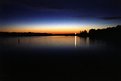
Critique By:
b schlake (K:168)
7/24/2003 5:30:02 PM
..you sure about it being the moon, maybe the sun?....i like the composition, with the three boats and long washed out reflection....sorry, the only thing i know about night pics are long shutter speed and a tripod......good luck....
|
| Photo By: n r
(K:101)
|
|
|
Critique By:
Dave M (K:9043)
7/24/2003 4:18:18 PM
Very nice colors in the sky, Nick. I wish that the entire image were a bit more sharp, and that the composition were more dynamic. For instance, if you could have gotten closer to the electrical junction and used that as the primary focus, the sky might have complimented it very well. Keep at it!
|
| Photo By: n r
(K:101)
|
|
|
Critique By:
Gregory McLemore (K:35129)

7/23/2003 7:46:53 PM
Well done sunset capture.
|
| Photo By: n r
(K:101)
|
|
|
Critique By:
Craig Wiernik (K:312)
7/23/2003 6:42:13 PM
The trees show up grey instead of black. Was this just a scan issue? The brightness is way too high, and washes out the beauty of the colors you must've seen.
|
| Photo By: n r
(K:101)
|
|
|
Critique By:
Judith B. (K:364)
7/13/2003 12:57:21 PM
nice visual topic and good composition but it's a pity you failed the contrasts. try to add more gradation and maybe crop the foreground a bit. :-)
|
| Photo By: n r
(K:101)
|
|
|
Critique By:
Titus Powell (K:1731)
7/9/2003 12:28:13 AM
Very pretty, and nicely composed. Maybe a touch too much contrast, but still attractive.
|
| Photo By: n r
(K:101)
|
|