|
|
Critique By:
buzz kill (K:1808)
3/13/2005 12:12:05 AM
interesting... I like the compo, and the subjects are what makes it intresting. but in succh a small post (limitation of usefilm) it is a bit darks and hard to see
|
| Photo By: Ashraf Foda
(K:95)
|
|
|
Critique By:
buzz kill (K:1808)
3/13/2005 12:02:24 AM
I like it... a tight look at face, nice compo, good contrast and sharpness.
|
| Photo By: dave coley
(K:227)
|
|
|
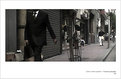
Critique By:
buzz kill (K:1808)
1/26/2005 2:53:01 AM
way cool... great compo... and the subject really works.... the shot is to small to tell if it is really to dark or the focus or dof is off
|
Photo By: Simon Jarvis
(K:489)

|
|
|
Critique By:
buzz kill (K:1808)
1/26/2005 2:50:08 AM
The shot appears small here (don't they all)... to small to comment on the techniques.. but the compo is very very nice!
|
| Photo By: Kim kyungsang
(K:14135)
|
|
|
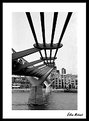
Critique By:
buzz kill (K:1808)
1/26/2005 2:47:39 AM
Nice compo... sharp... good colors.. nice use of reflections
|
| Photo By: Larry Hammond
(K:16631)
|
|
|
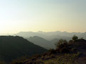
Critique By:
buzz kill (K:1808)
1/24/2005 3:09:48 AM
Just a touch to much sky... a little off the top, just above where the color changes end, would enhance this shot
|
| Photo By: Michele Pesta
(K:256)
|
|
|
Critique By:
buzz kill (K:1808)
1/24/2005 3:07:36 AM
this small picture is hard to comment upon, for the tech part, but the compo is very nice... i think cropping a little off the left might force the the eye more to the man/woman
|
| Photo By: Kim kyungsang
(K:14135)
|
|
|
Critique By:
buzz kill (K:1808)
1/24/2005 3:05:20 AM
Cool compo, great DOF, neat subject and great tone... this is a 7
|
| Photo By: Özlem Mehmet
(K:-454)
|
|
|
Critique By:
buzz kill (K:1808)
1/23/2005 2:50:20 AM
Great compo, sharp, good DOF, cool subject. A well done shot! The only reason a 6 vs. 7... the reds are a little over saturated for my taste.
|
| Photo By: Jose Vladimir
(K:602)
|
|
|
Critique By:
buzz kill (K:1808)
1/23/2005 2:35:48 AM
This could have been a much better photo if you could have moved to limit the clutter in the background. The compo is nice even though part of the right "Body" is cutoff. This shot has a lot of potental!
|
| Photo By: Goudreau Éric
(K:2)
|
|
|
Critique By:
buzz kill (K:1808)
12/5/2004 4:21:17 AM
nice.... cute, funny and technically well done
|
| Photo By: A K
(K:8499)
|
|
|
Critique By:
buzz kill (K:1808)
12/3/2004 2:55:23 AM
i do not think that the neg works or this shot... sorry, b/w would have worked best
|
| Photo By: Ashley Wallis
(K:447)
|
|
|
Critique By:
buzz kill (K:1808)
12/3/2004 2:52:06 AM
cool ashley.... I like the shot ... the dark background really sets you off
|
| Photo By: Ashley Wallis
(K:447)
|
|
|
Critique By:
buzz kill (K:1808)
11/20/2004 12:30:20 AM
Kim, This is another nice effort. I really like the look on the girl's face! The emotion is captured well. the tones of the b/w are great and the sharpness is spot on!
|
| Photo By: Kim kyungsang
(K:14135)
|
|
|
Critique By:
buzz kill (K:1808)
11/10/2004 3:19:16 AM
interesting.... i like it but not sure why
|
| Photo By: Ashley Wallis
(K:447)
|
|
|
Critique By:
buzz kill (K:1808)
11/10/2004 3:16:25 AM
very nice.... try converting to b/w
|
| Photo By: Ashley Wallis
(K:447)
|
|
|
Critique By:
buzz kill (K:1808)
11/10/2004 3:14:41 AM
you need to check your white balance button... I like the compo!
|
| Photo By: Ashley Wallis
(K:447)
|
|
|
Critique By:
buzz kill (K:1808)
10/25/2004 11:46:36 PM
The mud spoils an otherwise awesome shot! Great compo, sharp, good colors!
|
| Photo By: waldemar ebner filho
(K:5242)
|
|
|
Critique By:
buzz kill (K:1808)
10/16/2004 8:59:31 PM
This one does not for me... the wall is overexposed and the womans expression just looks pained....
|
| Photo By: Marcio Janousek
(K:32538)
|
|
|
Critique By:
buzz kill (K:1808)
10/16/2004 7:53:27 PM
another good shot.... on this one the tones are great and the grain really works for this shot... I like the compo and focal points
|
| Photo By: Kim kyungsang
(K:14135)
|
|
|
Critique By:
buzz kill (K:1808)
10/14/2004 12:35:04 AM
The color looks flat... not sure if it is me or the picture... I like the subject and the compo... some detail need a little look though i.e. her left wrist looks a little blurry.
|
| Photo By: larry white
(K:368)
|
|
|
Critique By:
buzz kill (K:1808)
10/12/2004 12:18:04 AM
very intense! nice compo, great use of color and tones. the eyes are what really make this pic stand out
|
| Photo By: EMRE ARICAN
(K:180)
|
|
|
Critique By:
buzz kill (K:1808)
10/11/2004 11:35:27 PM
nice.... interesting... I like the colors the compo is nice as well ... dark shadows.. just well done
|
| Photo By: Neil Niamh White
(K:9165)
|
|
|
Critique By:
buzz kill (K:1808)
10/11/2004 11:31:35 PM
this is a really nice shot.... the perspective is nice... the compo is nice... the grain really works for this shot
|
| Photo By: Kim kyungsang
(K:14135)
|
|
|
Critique By:
buzz kill (K:1808)
10/7/2004 12:42:42 AM
Kim, another great shot..... a strong subject, nice compo and good tones
|
| Photo By: Kim kyungsang
(K:14135)
|
|
|
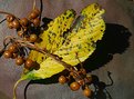
Critique By:
buzz kill (K:1808)
10/6/2004 1:07:43 AM
great color, good compo.. the reason for not a 7, the dof is a little off.. the one part the vine does not appear to be as tack sharp as the rest of the shot and the stem of the leaf is cut off at the bottom
|
| Photo By: Yutaka Itinose
(K:22586)
|
|
|
Critique By:
buzz kill (K:1808)
10/5/2004 1:46:54 AM
Interesting .... i think your DOF sould have been a little greater to get the guy in focus and make him the subject... just my thought
|
| Photo By: Anna A
(K:315)
|
|
|
Critique By:
buzz kill (K:1808)
9/29/2004 3:54:00 AM
a really great effort.. but for me i would have liked to have a little more of the bug in focus. and just a little for lighting
|
| Photo By: Steen Heilesen
(K:440)
|
|
|
Critique By:
buzz kill (K:1808)
9/29/2004 3:52:15 AM
another great shot! even though you can just see the one eye... your focus is drawn to his eyes... I really like this shot... simple but impacts you can see an inner strenght in this man (i hope it is really there?!)
|
| Photo By: Kim kyungsang
(K:14135)
|
|
|
Critique By:
buzz kill (K:1808)
9/27/2004 2:14:00 AM
I think that the background window light overpowers the focus of the shot... which is the touch between the nun and the man. their touch is dark and the bright light just detracts to much from that moment
|
| Photo By: Kim kyungsang
(K:14135)
|
|