|
|
Critique By:
Ray Witter (K:6149)
10/23/2003 7:52:07 AM
Anthony,
Great color patterns in this image, I think it might improve it a bit to crop off the right side, all of the interest seems to be on the left, A crop of that part keeps one involved more in the great abstract rust patterns.
66 GMC, i do believe.
Good Work!!
ray w.
|
| Photo By: Anthony Gargani
(K:4527)
|
|
|
Critique By:
Chris Moore 1 (K:68)
10/23/2003 7:34:54 AM
Good pic. I love the expression - that alone shows how hot it is - the distorted image through the heat haze gives the same feeling. The background (behind the three people) is a small distraction but as this is a documentary image you cant have everything. All in all well seen and documented.
|
| Photo By: Anthony Gargani
(K:4527)
|
|
|
Critique By:
DELETE ACCOUNT (K:5655)
10/23/2003 7:28:37 AM
Great image. The heat waves really make the picture with the facial expressions of the people. The children seem perfectly happy roasting those mellows from a distance.
|
| Photo By: Anthony Gargani
(K:4527)
|
|
|
Critique By:
Kelly Anbach (K:4375)
10/16/2003 5:21:37 PM
You shot a great photo here - I like it. Cool color. Nice work!
|
| Photo By: Anthony Gargani
(K:4527)
|
|
|
Critique By:
BruceDigna (K:137)
10/9/2003 7:06:23 AM
I agree on the oversharpened effect. The top seems too dark to me as well.
|
| Photo By: Anthony Gargani
(K:4527)
|
|
|
Critique By:
Becky V (K:9699)
10/5/2003 9:10:24 AM
On the topic of being a PS newbie . . . I consider myself a self-taught perpetual PS newbie. I think the best way to learn PS is practice. If you've got the patience, bring a photo into PS and start running down all your menu options. See what they do. Begin with the "Image" menu as most of your photo tweaking will originate there. The result I posted came simply by using the curve option in that very menu. 
|
| Photo By: Anthony Gargani
(K:4527)
|
|
|
Critique By:
Matej Maceas (K:24381)

10/4/2003 1:56:53 PM
This is a nice picture, very dynamic and showing well her immersion into the game. The only thing I'm missing here is the ball.
|
| Photo By: Anthony Gargani
(K:4527)
|
|
|
Critique By:
Ranae Fitzgerald (K:1093)
10/4/2003 12:41:51 AM
The concentration on her face is wonderful! Great capture! Ranae
|
| Photo By: Anthony Gargani
(K:4527)
|
|
|
Critique By:
Anthony Gargani (K:4527)
10/3/2003 11:30:33 PM
Thank you all for you comments, suggestions, and kind words! I know how valuable time is, and I appreciate the time you took to offer me help.
Becky V-that is EXACTLY the look I REALLY wanted! Almost a newsprint look. You did a great job on it. RE: lighting, this was taken at dusk with a big slow zoom and I believe built-in flash, so yea it is definately 'flat' (as far as my limited understanding of 'flat' goes-heheh...) I am a total PS-PSP8 'newbie'. I find I have very little patience to learn more than a few level adjustments. I never have tried to figure out layers and stuff like that. It looks like I may have to get out the dreaded 'manual'.
Matej-the story? She was told it was time to clean up and go inside. We were out in the yard and she was not quite ready to quit. Oh well, that's the look you get from the little people sometimes.
|
| Photo By: Anthony Gargani
(K:4527)
|
|
|
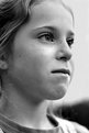
Critique By:
Pat Fruen (K:12076)
10/3/2003 5:58:29 AM
Beautiful eyes! I like the perspective and expression. Could use a bit of sharpening perhaps.
|
| Photo By: Anthony Gargani
(K:4527)
|
|
|
Critique By:
Mário Sousa (K:16985)
10/3/2003 2:48:26 AM
fine photo
|
| Photo By: Anthony Gargani
(K:4527)
|
|
|
Critique By:
Jose Rasquinho (K:12128)
10/3/2003 2:08:19 AM
Nice portrait and good expression.
Good work.
Regards.
|
| Photo By: Anthony Gargani
(K:4527)
|
|
|
Critique By:
Sara R. (K:202)
10/3/2003 2:02:22 AM
A very good Portrait , well done
|
| Photo By: Anthony Gargani
(K:4527)
|
|
|
Critique By:
Becky V (K:9699)
10/2/2003 11:42:20 AM
Actually, I quite like the facial expression as it gives the photo some personality. Who hasn't seen their child do this at one time or another?
Personally, I don't think it's *too* anything. The composition is great and the tightly framed "in your face" shot is perfect for the subject. I think this photo suffers because the lighting is flat. I am by no means an expert on lighting, but I think some well placed highlights and fill would bring some depth and added atmosphere to the photo.
As for a comic-book feel, I did some further pushing (I hope you don't mind.) What do you think?
|
| Photo By: Anthony Gargani
(K:4527)
|
|
|
Critique By:
B:)liana (K:30945)
10/2/2003 6:07:28 AM
Good portrait. Like it in B&W.
Thank you for your comment and Help. but the green glass was a bottle. hm. will put it in the sun. and try. I was trying to play with light from my lamp. but the glass is so solid that there was weak reflections in it. Thank you. Best regards, BIliana
|
| Photo By: Anthony Gargani
(K:4527)
|
|
|
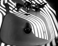
Critique By:
Dave Slaugenhoup (K:827)
10/1/2003 5:37:40 PM
definitely interesting photo. I especially like the curvy lines you've caught here and the decision to shoot it in black and white.
You've got an eye for photography that can not be taught--nice image.
|
| Photo By: Anthony Gargani
(K:4527)
|
|
|
Critique By:
Matej Maceas (K:24381)
10/1/2003 12:36:22 AM
I don't think there are any technical problems. A black background is quite valid, and there's not a lot of it here anyhow. Yes the t-shirt is the lightest thing in the photo, but 1) it's not blown out or anything, 2) the girl's eyes and expression are so intense that I look at the face, not at the white t-shirt. And as has been said, the skin tones are OK. Finally, as someone who usually shoots high-speed films, I really don't worry about the digital grain here.
So what is wrong with the picture (if we assume that something is indeed wrong)? Well, I think the general public likes cute lovely kiddies. Here, she's wearing a rather nasty grimace, so the cute and lovely effect is reduced. You, as someone for whom she's very important (judging by the number of her photos that you have submitted, I would guess she's your daughter), would still perceive her as very lovable in this photo, but the random viewer may not see it the same way.
To me, the problem with this shot may be that to some degree it fails as a portrait. Technically it is a portrait, but I am not convinced that her facial expression is one that is typical of her character. This may have been her mood for a relatively short period of time, but I don't think it's the "real her" that you've shown here.
Alternatively I would have liked to know what caused her to grimace this way, some sort of a story, but the close-up shot doesn't provide that.
|
| Photo By: Anthony Gargani
(K:4527)
|
|
|
Critique By:
Christine Campbell (K:2693)
9/30/2003 3:07:21 PM
I don't see anything wrong. What I can see is the smile lurking behind that glare. Very cute :-)
|
| Photo By: Anthony Gargani
(K:4527)
|
|
|
Critique By:
Stefan Engström (K:24473)
9/30/2003 1:48:57 PM
After some experimentation I've convinced myself that the grainy look is from oversharpening (IMHO). Maybe this is not at all what bug you about it...
|
| Photo By: Anthony Gargani
(K:4527)
|
|
|
Critique By:
Anthony Gargani (K:4527)
9/30/2003 9:53:32 AM
Let's try that again...
|
| Photo By: Anthony Gargani
(K:4527)
|
|
|
Critique By:
Anthony Gargani (K:4527)
9/30/2003 9:51:09 AM
Hi Kim and Sefan, thanks for taking the time to look this over. I thought it best to attach the original so you could see first hand where the shot came from. I have taken your comments into consideration and when I have more time I'll experiment with it some more. Thanks so much again.
|
| Photo By: Anthony Gargani
(K:4527)
|
|
|
Critique By:
Stefan Engström (K:24473)
9/30/2003 9:45:07 AM
I don't think the whites are blown out, nor do I think there is a meaningful zone-system for digital. The comments about dark framing and the white shirt are interesting to me: I thought it worked because of the close shot, creating natural frames for her face. The white shirt isn't ideal, but not the reason for me to be unhappy with the shot.
|
| Photo By: Anthony Gargani
(K:4527)
|
|
|
Critique By:
Stefan Engström (K:24473)
9/30/2003 9:15:10 AM
I think it is a good photo, with the right choice of levels for the grays. The thing that jumps out that is "wrong" is the "grain", or digital version of it as it were. Did you shoot this at a high equivalent iso rating? It is a great face, definitely a good moment to capture it too :-) The little highlight in her forhead - is it a ceiling-bounced flash?
|
| Photo By: Anthony Gargani
(K:4527)
|
|
|
Critique By:
Kim Culbert (K:37070)
9/30/2003 9:12:08 AM
I like the fact that you got in close, and the detail on her face seems nice, but there is so much darkness surrounding her face that she seems to fall off into the shadows.
As well, the fact that she's wearing what appears to be a white shirt really plays havoc with the tonal range... the whites are blown out, the shadows are super dark, but her face is excellent. I don't know too much about the zone system for B&W but maybe something as easy as a darker t-shirt and a little more light on the back of her head so it rims her head and makes it stand out?
|
| Photo By: Anthony Gargani
(K:4527)
|
|
|
Critique By:
Mário Sousa (K:16985)
9/30/2003 7:37:27 AM
beautiful photo
|
| Photo By: Anthony Gargani
(K:4527)
|
|
|
Critique By:
Brendon Cordero (K:3524)
9/28/2003 6:22:54 AM
Hi Anthony,
Nice portait of your friend.
I am still experiencing the Rebel digital. Took a lot of shots of my co-workers for a project this past week. So far, I am having mixed feelings about the camera. It's not the camera fault, shooting digital is not the same as film. That is my mistake. Understand, I am old school trained. This is a new transition for me. While shooting my co-workers, I was under strong fluorecent lighting, evening with a flash, my shots were poor exposures. With a little research I learned to used the exposure compensation and the white balance.
Remember, the lens ratio is not the same as film, you must compensat for the flash.
I throught the automation of this camera suppose to take care of those lighting situation I was in.
On the good side, I didn't waste any film, or I have wait for it. Not all my shot as I mentioned above were bad. Some were excellent. I just got to watch, my lighting situation.
I don't have the kit lens. I ordered the body only. I do you like your's? Is it a true 18-55mm ratio?
|
| Photo By: Anthony Gargani
(K:4527)
|
|
|
Critique By:
Matej Maceas (K:24381)
9/26/2003 1:39:22 PM
Ok, it's real flash this time, right? It seems too strong, causing that very noticable shadow, and the highlights on his hand. The red bit behind his ear draws unwanted attention.
I've taken the image into PS, and it seems that pushing up the shadows in Levels makes the image look less overexposed. I also very quickly burned the strongest highlights on his hand and face (they'd need some more burning in places). The shadow is still there, though. I guess it possibly could have been eliminated by moving the subject further away from the wall.
It's a great expression he's got. What does the hand gesture mean? "That'll be TWO beers for letting you take my picture"? :-)
|
| Photo By: Anthony Gargani
(K:4527)
|
|
|
Critique By:
Matej Maceas (K:24381)
9/26/2003 1:38:36 PM
That fill-flash tool has really fooled me - which is good because it has increased my motivation to learn to use an external flash, so that next time I can tell the difference! Or maybe it would help if I simply read the About text more slowly :-)
|
| Photo By: Anthony Gargani
(K:4527)
|
|
|
Critique By:
Sue O'S (K:12878)
9/26/2003 9:58:47 AM
Wooooo, blue-eyed silver tabby with a bad attitude! Very cool!
I agree with the comment about the closeness of the left-side crop, but when you can catch an expression like that, you can't mess too much with frame set up. Nice job here, Anthony.
|
| Photo By: Anthony Gargani
(K:4527)
|
|
|
Critique By:
Kaj Nielsen (K:15279)
9/26/2003 4:38:53 AM
Wonderful cat foto, the only thing I find a shame, is the crop in lef side at the ear. Excellent light and color. Regards Kaj Nielsen
|
| Photo By: Anthony Gargani
(K:4527)
|
|