|
|
Critique By:
Jeff Melnick (K:139)
1/12/2006 11:21:29 PM
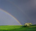
Good use of DOF.
I do find the blurry white stuff in the lower right corner distracting.
|
| Photo By: Pradip Chanda
(K:80)
|
|
|
Critique By:
Jeff Melnick (K:139)
10/22/2003 6:56:30 PM
I find the bluriness in the upper right a little distracting. Otherwise a very nice shot.
|
Photo By: Studio East
(K:3349)

|
|
|
Critique By:
Jeff Melnick (K:139)
5/29/2003 2:45:14 PM
Very nice lighting. I think that the compositon could have been stronger if the sun was off to the side a bit more than it is.
|
| Photo By: Uri Gil Cohen
(K:494)
|
|
|
Critique By:
Jeff Melnick (K:139)
5/29/2003 2:41:54 PM
I assume you meant the technique? If so, its a double exposure. One is completly in focus, the other is completly out of focus. Of course I underexposed both by 1 stop.
|
| Photo By: Jeff Melnick
(K:139)
|
|
|
Critique By:
Jeff Melnick (K:139)
5/20/2003 1:10:27 PM
A nice composition. I like the juxtaposition - the hard shells of the eggs with the softness of the tomato. It just seems underexposed to my eye.
|
| Photo By: sang pemimpi
(K:0)
|
|
|
Critique By:
Jeff Melnick (K:139)
5/20/2003 12:57:52 PM
I really don't think that this works on any level. I would have prefered it if you'd concentrated on one of the fuzzy flowers, or the single leaf with the drop on it.
|
| Photo By: Dmitry Pushilov
(K:214)
|
|
|
Critique By:
Jeff Melnick (K:139)
5/20/2003 12:48:52 PM
I like the way that you captured the movement of the wheat in the wind. I just wish that the horizon wasn't so centered.
|
| Photo By: Roland Le Gall
(K:7018)
|
|
|
Critique By:
Jeff Melnick (K:139)
5/20/2003 12:46:39 PM
A classic boat shot. I really like the way the underside of the boat is glowing in its reflection.
|
| Photo By: eleni mohianaki
(K:10)
|
|
|
Critique By:
Jeff Melnick (K:139)
5/20/2003 12:44:27 PM
I really like the dramatic sky and the repeating patterns in the wheat. I just think that there's too much of the sky, or it isn't being used in an effective manner. How about if you were shooting from a lower position, with some of the wheat poking up into the sky? Just a thought.
|
| Photo By: Roland Le Gall
(K:7018)
|
|
|
Critique By:
Jeff Melnick (K:139)
5/16/2003 3:36:29 PM
I really like the nice soft focus on this.
|
| Photo By: Jerry Ann Deddo
(K:435)
|
|
|
Critique By:
Jeff Melnick (K:139)
5/16/2003 3:34:14 PM
Needs to be a lot sharper - with lots of DOF. The lighting is way awful - it needs to be a lot softer.
|
| Photo By: AluiZio DeriZans da Silva
(K:50)
|
|
|
Critique By:
Jeff Melnick (K:139)
5/16/2003 11:39:22 AM
My big complaint is that the flamingo in the front seems to have flamingos growing out of it's back. Gotta watch those merges.
|
| Photo By: Hayri CALISKAN
(K:16195)
|
|
|
Critique By:
Jeff Melnick (K:139)
5/16/2003 10:50:48 AM
Very nice job. However, I think that a bit more DOF is needed to bring that red boat into focus.
|
| Photo By: brian daws
(K:3376)
|
|
|
Critique By:
Jeff Melnick (K:139)
4/29/2003 3:22:08 PM
Very lovely - I just wish that the flowers weren't so centered. I especially love the background.
|
| Photo By: Heidi Hart
(K:853)
|
|
|
Critique By:
Jeff Melnick (K:139)
4/29/2003 3:19:16 PM
My main complaint would be the framing. The horse's nose is too close to the right side - it feels cramped. It would have worked better if there was more room on the right and less on the left.
|
| Photo By: Karen Dove
(K:763)
|
|
|
Critique By:
Jeff Melnick (K:139)
4/29/2003 3:16:32 PM
Wonderful sunset colors. I think it could be better if the clouds and the branches didn't merge into one unidentifiable mass.
|
| Photo By: rino sirio
(K:8012)
|
|
|
Critique By:
Jeff Melnick (K:139)
4/23/2003 9:52:51 AM
The lighting's not very good on this one. Maybe some fill flash might have helped. I'm also not too crazy about the composition - Less water, more bird.
|
| Photo By: Joy Bhowmik
(K:854)
|
|
|
Critique By:
Jeff Melnick (K:139)
4/22/2003 3:31:57 PM
Needs less DOF - this will blur the background more. Nice colors though.
|
| Photo By: Lucas Macedo
(K:12843)
|
|
|
Critique By:
Jeff Melnick (K:139)
4/16/2003 12:12:47 AM
I like the layout of your composition. I don't care for where you focused. The leaves and the rock on the left are in sharp focus. However, my eyes are drawn towards the cascade which isn't in focus. It would be better if they both were in focus. I would have focused just slightly past the leaves and use a higher f-stop for more depth of field.
|
| Photo By: Zsolt Sárvári
(K:61)
|
|
|
Critique By:
Jeff Melnick (K:139)
4/15/2003 9:15:18 PM
An excellent sunset shot. Really captures the vastness of Monument Valley. Congratulations.
|
| Photo By: Bob Tomerlin
(K:5460)
|
|
|
Critique By:
Jeff Melnick (K:139)
4/15/2003 9:13:23 PM
This doesn't work for me. It's just not clear what you're tyring to show. I would have tried to get closer and really show the ice covered branches and twigs.
|
Photo By: Howard M. Parsons
(K:3496)

|
|
|
Critique By:
Jeff Melnick (K:139)
4/15/2003 3:08:47 PM
The light is a bit too harsh and the focus isn't sharp enough. I also think that it would have been nicer not to cut off the top petal of the main subject.
|
| Photo By: Vicki Bentley
(K:5080)
|
|
|
Critique By:
Jeff Melnick (K:139)
4/15/2003 2:10:13 PM
What wonderful fall colors - enhanced by the nice soft light. Excellent composition with a good use of DOF.
|
| Photo By: dave jones
(K:608)
|
|
|
Critique By:
Jeff Melnick (K:139)
4/15/2003 1:52:09 PM
Very nice.
|
| Photo By: Chuck Freeman
(K:13616)
|
|
|
Critique By:
Jeff Melnick (K:139)
4/15/2003 1:48:48 PM
Wonderful job!
|
| Photo By: Theresia Makatita
(K:2114)
|
|


