|
|
Critique By:
Ed Dalton (K:280)
3/17/2003 6:27:48 PM
Compostition is very good, like the color of the flag flying atop the mast. The technical aspects are good and the visual impact is quite high. I like the color of the building against the blue sky.
|
| Photo By: Kelly Pater
(K:615)
|
|
|
Critique By:
Ed Dalton (K:280)
3/15/2003 10:57:10 AM
Very dramatic photograph. I'm told that on a clear day you can see all the way to Vancouver,British Columbia, if the Rocky Mountains don't get in the way. The clouds and sky add the height of this tower. I've seen a tv programme where people actually break the law by climbing all the way to the top and then jumping off with parachutes tied to their backs? Craaazzy! You've been able to seize a wonderful photograph here and you've done it justice with the sky and clouds.
|
| Photo By: Kelly Pater
(K:615)
|
|
|
Critique By:
Ed Dalton (K:280)
3/14/2003 7:34:00 PM
Don't take this too much to heart - the hat is just a tad too low to the eyes, Iwould like to have seen his eyes just a bit more, the eyes lead directly to the heart, the spirit, etc. The background - keep it uncluttered - the Sea, the ship, leads my eyes away from your subject, your horizin is NOT straight - keep this in mind, other wise, you've got another great prortrait here just like the female and the two shots of the children. Keep up the great work - and remember - keep my eyes on your subject - not on what's around him/her! :} and where's the aperture and shutter information I keep asking about?? Keep smiling, Ms Pater, Good work!
|
| Photo By: Kelly Pater
(K:615)
|
|
|
Critique By:
Ed Dalton (K:280)
3/14/2003 7:31:33 PM
Don't take this too much to heart - the hat is just a tad too low to the eyes, Iwould like to have seen his eyes just a bit more, the eyes lead directly to the heart, the spirit, etc. The background - keep it uncluttered - the Sea, the ship, leads my eyes away from your subject, your horizin is NOT straight - keep this in mind, other wise, you've got another great prortrait here just like the female and the two shots of the children. Keep up the great work - and remember - keep my eyes on your subject - not on what's around him/her! :} Keep smiling!
|
| Photo By: Kelly Pater
(K:615)
|
|
|
Critique By:
Ed Dalton (K:280)
3/14/2003 7:25:33 PM
come on, don't blame a scanner for a photographer's mistakes. . . and where's the shutter info? Okay, okay, I'll lighten up a little. Great photo again of your kids here, but I like the smile of that 'lil guy at the back of the slide. You really seem to get your subjects relaxed when you take their photos - how do you do it? Everyone that I've looked at have that relaxing look. . . Great outdoors portrait! Nice and clean, well focused, background nicely blurred. . .
|
| Photo By: Kelly Pater
(K:615)
|
|
|
Critique By:
Ed Dalton (K:280)
3/12/2003 2:47:07 PM
Being a bit of an expert, the only thing that I could suggest is that you look carefully and just powder her cheeks slightly and bottom of her lip to get rid of the light "that flashes off" that area. Other than that you've captured a nice portrait of a friend for "fooling" around. I really enjoy reading the technical aspects that young photographers use, i.e. lens, shutter speeds, etc. So many of them today don't bother to write any of this info down anymore. . . Nice piece of work!
|
| Photo By: Kelly Pater
(K:615)
|
|
|
Critique By:
Ed Dalton (K:280)
3/12/2003 1:43:52 AM
Great shot Brian. You've captured him in full surprise, nice colours, especially his eyes, absolutely the greatest I've seen for awhile.
|
| Photo By: Brian Steele
(K:620)
|
|
|
Critique By:
Ed Dalton (K:280)
3/12/2003 1:39:33 AM
very good imagination and use of your brain power. Good to see that some people put some thought into their photographic skills today. Great b&w shot, nice and clear up to the window and the ketchup,nice grain on the wood, really great photography, David.
|
| Photo By: David Chang-Sang
(K:680)
|
|
|
Critique By:
Ed Dalton (K:280)
3/12/2003 1:34:54 AM
just love this shot. So much power sitting there looking so innocent. Nice crisp colours, focus is sharp, great colour for the sky as a background. Wonderful work, Brian.
|
| Photo By: Brian Steele
(K:620)
|
|
|
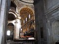
Critique By:
Ed Dalton (K:280)
3/11/2003 10:50:59 AM
Right off, I just want to say I really dislike it when Photographers refuse to give info on shutter and aperture info, like it's a big secret or something.
You have taken a beautiful picture of an important building to the Catholic Faith. The texture colouring of the brick is outstanding and you caught the sun shining off the two towers just at the perfect time. Your photo has even caught the shadows of the lower left tower and both doorways. Excellent photo Ms. Pater. Bravo!
May I also add that your choice of border, I feel, takes away from your excellent photograph though. A real small black may have been better. Blue on blue I think is too much. Sincere Regards.
|
| Photo By: Kelly Pater
(K:615)
|
|
|
Critique By:
Ed Dalton (K:280)
3/10/2003 7:38:46 PM
I would like to have seen more of the flower. Larger is not always better. I like the red and yellow on the stem and would like to see more of the red petals. I like the way you've blurred the background out. Good photo.
|
| Photo By: Danny Provost
(K:812)
|
|
|
Critique By:
Ed Dalton (K:280)
3/10/2003 7:35:53 PM
Lovely color, well composed, instead of centering the flower, next time try using the rule of 3rds and see what happens. I like the way you've kept the greens in the backgrounds.
|
| Photo By: Danny Provost
(K:812)
|
|
|
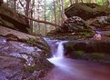
Critique By:
Ed Dalton (K:280)
3/10/2003 11:47:48 AM
Love photograph, the way you've captured the water is talentful, and the colour is just great, makes one feel like you could almost reach out and touch the water. Great job, well done!
|
| Photo By: Mike Allebach
(K:391)
|
|
|
Critique By:
Ed Dalton (K:280)
3/10/2003 11:43:07 AM
Nice colour. I like the mountain ranges that you have in the country, especially the way they overlap together in your photograph, and the colour of the sky is a lovely orange which is unusual to see. Nice job! Keep up the good work!
|
| Photo By: Kelly Pater
(K:615)
|
|
|
Critique By:
Ed Dalton (K:280)
3/9/2003 10:36:40 PM
The Black and White is certainly different from the color which we see every day. It's nice and crisp and clear, eyes come to rest on the boys and their smiles, the background does not take away from them at all, and the subjects stay nice and sharp and in focus. Nice job!
|
| Photo By: Kelly Pater
(K:615)
|
|
|
Critique By:
Ed Dalton (K:280)
3/9/2003 10:31:31 PM
I would have taken from the centre front, and yes I would have cropped closer and taken the corner off altogether.
|
| Photo By: Jamie
(K:530)
|
|
|
Critique By:
Ed Dalton (K:280)
3/9/2003 10:23:52 PM
beautiful shot, lovely color
|
| Photo By: David Chang-Sang
(K:680)
|
|


")