|
|
Critique By:
JL E (K:9693)
11/6/2003 12:49:58 PM
Excellent photo!
Cheers,
Jose.
|
| Photo By: Arjen VandeMerwe
(K:796)
|
|
|
Critique By:
Zé Ovo (K:7579)
9/2/2003 10:22:15 AM
Very Nice work in B&W!
Iso 400 !
Perfect capture!
|
| Photo By: Arjen VandeMerwe
(K:796)
|
|
|
Critique By:
Isaac Shaw (K:2563)
8/30/2003 3:09:11 PM
For your first session it's really wonderful. Beautiful model and great composition. Lightingof the face is better than what I could have accomplished at this stage and will only get with time. Keep it up!
|
| Photo By: Arjen VandeMerwe
(K:796)
|
|
|
Critique By:
Isaac Shaw (K:2563)
8/30/2003 3:04:20 PM
I am certainly not a pro but have a desire to be a great studio artist. My 2cents...I really like this work. Great model, excellent pose and angle but I agree with Andrew on the ceiling thing...lose it and perhaps step back just a tiny bit to compensate for the hand (which is minimal if you ask me) and you would have a really great(er) shot.
You are lucky to have such a great model to work with...how did you land her?
|
| Photo By: Arjen VandeMerwe
(K:796)
|
|
|
Critique By:
Robin McAulay (K:8908)
8/28/2003 8:01:36 AM
i'm grooving out!
|
| Photo By: Arjen VandeMerwe
(K:796)
|
|
|
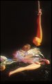
Critique By:
Marc Volovic (K:425)
8/28/2003 2:27:06 AM
Very interesting shot. I would have preferred for the knee halos to be complete and the green to be just a wee bit less acidic, but I quite love this.
M
|
| Photo By: Arjen VandeMerwe
(K:796)
|
|
|
Critique By:
Paolo De Maio (K:34932)
8/28/2003 2:20:36 AM
Great mood.
|
| Photo By: Arjen VandeMerwe
(K:796)
|
|
|
Critique By:
Bjorn Beheydt (K:12096)
8/27/2003 6:01:30 AM
Overexposed and not very sharp, but a great journalism picture, and especially a very colorful one (in several meanings).
|
| Photo By: Arjen VandeMerwe
(K:796)
|
|
|
Critique By:
Bob Stapleton (K:575)
8/20/2003 3:01:22 AM
I live in South Africa and appreciate the need for this kind of sex education - yes it is a comical picture, I mean how often is it that you get to see a woman with a condom in her mouth about to go down on a wooden "penis" however, comedy aside, Aids is a serious problem in this part of the world and I applaud the people and organisations who organise these kind of sex education projects in the townships and rural areas.
As for Maciek's comment about the people being so stupid this is totally wrong. I think that if Maciek took the time to visit South Africa you would find that the rural population are generally not stupid but are simply just uneducated. You must remember that they have been living according to thier own culture and beliefs for centuries and have only recently (the last 150 years or so) been introduced to western culture. In most African cultures, the more children you have, the richer you are as they will look after you when you are old (almost like a pension plan - more kids = more money) therefore contraception has never been a factor for concern. The general consensus is that if you take away a man's power to reproduce then you are in essence taking away his manlyhood. This myth has filtered down to the younger generation and unfortunately is not only true in the rural areas but in the cities and townships too. I have young black educated friends, the kind of guys who have good jobs, nice houses and drive around in fancy cars and yet they still believe that they are surrendering their manhood if a lady asks them to wear a condom - this is the light in which condoms are seen and as a result this kind of education is imperative to preventing aids from becoming more widespread than it already is.
Apart from that, photographywise, this is a great shot, I love the experssion on her face and like the use of DOF to keep her face sharp and her hand and the "penis" slightly blurred, your crop is also spot on - well done - I like this pic a lot - Regards Bob
|
| Photo By: Arjen VandeMerwe
(K:796)
|
|
|
Critique By:
John Reed (K:6994)
8/19/2003 3:58:19 PM
Gee, the way you jumped all over my Embera girl for lack of information, I'm surprised to see nothing here. Nice picture, though.
|
| Photo By: Arjen VandeMerwe
(K:796)
|
|
|
Critique By:
Fabio Keiner (K:81109)
8/18/2003 2:12:46 PM
yes, we can see it, of course

raped, demolished and tore apart
: childcaring of the forthcoming generations
|
| Photo By: Arjen VandeMerwe
(K:796)
|
|
|
Critique By:
Jose Ignacio (Nacho) Garcia Barcia (K:96391)
8/16/2003 2:46:38 PM
great tones.I agree with Biliana.very difficult to take.very nice.
|
| Photo By: Arjen VandeMerwe
(K:796)
|
|
|
Critique By:
Craig Garland (K:27077)
8/16/2003 1:47:58 PM
........this is excellent! Pastel colors and lady with a big gun! You certainly did a wonderful job of coloring-- I thought it was a regular color photo. The skin tones are perfect, although the colors of the pastel background wouldn't be my 1st choice. Beautiful work.
|
| Photo By: Arjen VandeMerwe
(K:796)
|
|
|
Critique By:
First Last (K:6897)
8/16/2003 1:45:14 PM
Nice colours and tones! well done with the focus on the right level.
congrats.
|
| Photo By: Arjen VandeMerwe
(K:796)
|
|
|
Critique By:
larry terry (K:1965)
8/16/2003 1:12:19 PM
this is super cool, great perspective and pink, well done.
|
| Photo By: Arjen VandeMerwe
(K:796)
|
|
|
Critique By:
André Miranda (K:393)
8/16/2003 1:02:34 PM
Muito boa esta foto.
|
| Photo By: Arjen VandeMerwe
(K:796)
|
|
|
Critique By:
Richard Thornton (K:26442)
8/11/2003 4:11:25 AM
A lovely model and dynamic pose. This is different from the run of the mill and you should continue to pursue something to differentiate your work. That little something on her right arm (hair?) is distracting. I like the high key background.
|
| Photo By: Arjen VandeMerwe
(K:796)
|
|
|
Critique By:
Mário Sousa (K:16985)
8/6/2003 7:05:35 AM
beautiful lady
|
| Photo By: Arjen VandeMerwe
(K:796)
|
|
|
Critique By:
Jan van Schaaik (K:125)
8/6/2003 4:04:03 AM
Mooie foto Arjen. De kleuren en de vorm "maakt" deze foto tot 'n heel bijzondere. Jan
|
| Photo By: Arjen VandeMerwe
(K:796)
|
|
|
Critique By:
B:)liana (K:30945)
7/29/2003 8:00:41 AM
Good colors and feeling of motion, but missing the legs!
|
| Photo By: Arjen VandeMerwe
(K:796)
|
|
|
Critique By:
zosia zija (K:11106)
7/15/2003 1:31:09 PM
very nice tonality. super. i like this.
|
| Photo By: Arjen VandeMerwe
(K:796)
|
|
|
Critique By:
Erzebet M (K:1277)
7/15/2003 1:29:10 PM
This is just great, I love the grain. Very interesting! In a good way of course =)
|
| Photo By: Arjen VandeMerwe
(K:796)
|
|
|
Critique By:
Deepti DCunha (K:891)
7/14/2003 12:31:28 PM
i like the blueness of this photograph!....and its an intersting composition where u allow so much of the sky
what is this building?
|
| Photo By: Arjen VandeMerwe
(K:796)
|
|
|
Critique By:
Ty Cooper (K:663)
7/14/2003 8:49:34 AM
Very dramatic lighting for this one! I would prefer to see it cropped closer or farther back, but as is, the shoulers/arms/breasts are neither in the picture or out of it: makes it feel a little cramped. Good portrait overall, though.
|
| Photo By: Arjen VandeMerwe
(K:796)
|
|
|
Critique By:
Massimo Di Maggio (K:36342)

7/13/2003 10:00:52 AM
It seems a good image to me, lights, shades model?s pose are good, maybe there are too much shadows on her face and the skin of the forehead is a bit antiaesthetics, but it should not be difficult to correct these little faults with PS. Bye Max
|
| Photo By: Arjen VandeMerwe
(K:796)
|
|
|
Critique By:
Jose Ignacio (Nacho) Garcia Barcia (K:96391)
7/11/2003 12:32:28 PM
stunning contrast.you may look Chiapas.
|
| Photo By: Arjen VandeMerwe
(K:796)
|
|
|
Critique By:
Haley Peay (K:15)
7/8/2003 3:21:37 AM
Good shot. I like the angle. Very pretty model.
|
| Photo By: Arjen VandeMerwe
(K:796)
|
|
|
Critique By:
Andrew Cohen (K:118)
7/6/2003 8:21:51 PM
This is a decent shot I have never really done any studio work nor wish to. I can offer my advice though and I believe that everything above showing the ceiling is not good for the shot at all if you are going for the studio clean look. If you wanted a more portrait "real" atmosphere then take away the screen. But for a whole clean studio look IMO i would get rid of the ceiling stuff. Just my 2cents.
|
| Photo By: Arjen VandeMerwe
(K:796)
|
|
|
Critique By:
Stephen Rogers (K:3370)
7/6/2003 6:08:24 PM
This is a Wow shot as the colors are great. Sun and sky could not be any better. Nice capture. One of my favorites.
|
| Photo By: Arjen VandeMerwe
(K:796)
|
|
|
Critique By:
edom ehceped (K:485)
6/28/2003 5:51:08 AM
nice shot!
|
| Photo By: Arjen VandeMerwe
(K:796)
|
|