|
|
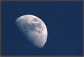
Critique By:
Boris Liberman (K:404)
9/9/2004 8:08:03 PM
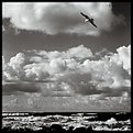
What is particularly pleasing here is that the image is basically square. It immediately attracted my attention.
Thanks for sharing.
|
| Photo By: Lukasz Kuczkowski
(K:14687)
|
|
|
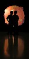
Critique By:
Boris Liberman (K:404)
9/5/2004 11:08:13 AM
This reflection of a person on the right. It looks like a guy who's actually watching that girl walking by. And in the middle is this "private exitence does not exist" message...
I should say this is moment very well caught.
|
| Photo By: Patrick Jacobson
(K:29151)
|
|
|
Critique By:
Boris Liberman (K:404)
9/5/2004 11:00:26 AM
Junctions of life. We meet and we part. And the stairways are always there for us, so that the cycle can repeat itself.
I must say that the "presence effect" is very strong here. I can almost feels like I am standing on top of this stairway myself...
Thumbs up!
|
| Photo By: Dubravko Grakalic
(K:25235)
|
|
|
Critique By:
Boris Liberman (K:404)
9/5/2004 10:49:38 AM
Thanks for the lesson. I will remember this image when I am out shooting again with my Perkeo folder  . .
|
| Photo By: Piotr Niewierowicz
(K:2401)
|
|
|
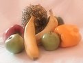
Critique By:
Boris Liberman (K:404)
9/5/2004 10:37:36 AM
Very fascinating. I wonder how you obtained this soft focus effect... And if I am at that - may I ask why peppers and bananas together?
Thanks for sharing. I take it as a lesson.
|
| Photo By: Judi Liosatos
(K:34047)
|
|
|
Critique By:
Boris Liberman (K:404)
9/5/2004 10:35:49 AM
I think the couple on the right completes this frame. It adds this bit of dynamism so necessary here. I only wish these two walkers by were a little bit more into the frame.
Just my pixels...
|
| Photo By: Sergey Gawrilow
(K:9)
|
|
|
Critique By:
Boris Liberman (K:404)
1/7/2004 2:08:57 AM
"And there they stood, watching the Ocean of Solaris in front of them..." I think it well may be an original book cover. Wonderfully done.
|
| Photo By: Antonio Delicado
(K:189)
|
|
|
Critique By:
Boris Liberman (K:404)
1/7/2004 1:56:28 AM
Just beautiful. I wonder whether the fact that you used digital camera helped here. For instance, what was the distance between the match and the front element of your lens. Nevertheless, this is just stunning.
|
| Photo By: Stephan Schute
(K:104)
|
|
|
Critique By:
Boris Liberman (K:404)
1/7/2004 1:40:03 AM
This is very fascinating photo. On one hand it is perfectly executed from technical point ov view. And it is a pleasure to look at. On the other hand, it breaks in two. The eye cannot find a place where to arrive and rest. For a moment it looks at the cross above and on the next moment it wonders about the old building to which a path leads.
I think that perhaps cropping the cross so that the result would be (almost) square would simplify things somewhat. While it will still be a beautiful image.
|
| Photo By: Piotr Bozejewicz
(K:298)
|
|
|
Critique By:
Boris Liberman (K:404)
1/1/2004 3:03:02 AM
For me it is a great work from which I could learn. For that I am thankful. Everything is so put together in this image...
Thanks for sharing.
|
| Photo By: Barry Walthall
(K:5312)
|
|
|
Critique By:
Boris Liberman (K:404)
1/1/2004 2:59:49 AM
Fascinating color, interesting geometry in this shot... Perhaps I should try something like this myself, with your permission of course .
|
| Photo By: Rodrigo D
(K:1577)
|
|
|
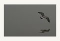
Critique By:
Boris Liberman (K:404)
1/1/2004 2:56:56 AM
Could it be that if you could capture this gracious bird just a little earlier, so that it would be more to the left in the frame, then perhaps, bird's freedom would not be limited by just few pixels between it and the right border?
Thanks for sharing!
|
| Photo By: ANTONIO SILVA
(K:1143)
|
|
|
Critique By:
Boris Liberman (K:404)
1/1/2004 2:54:06 AM
Kim, your idea is good and execution is not bat either. But the light patch from the window on the background is too distracting. After all, I guess most of that patch is pure white - grabs attention. Could be that if you were to close completely the windows/curtains it would improve on this shot.
|
| Photo By: Kim Taylor
(K:2816)
|
|
|
Critique By:
Boris Liberman (K:404)
1/1/2004 2:51:25 AM
Wonderfully done. I only wonder what was the size and weight of the tripod that held steady almost 2 meters of focal length for 1/30 sec .
|
| Photo By: Ronnie Gaubert
(K:3700)
|
|
|
Critique By:
Boris Liberman (K:404)
1/1/2004 2:30:57 AM
It does not look particularly cold to me. However it looks like a staged miniature shot which is most fascinating.
|
| Photo By: Kamran Khoshi
(K:82)
|
|
|
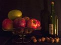
Critique By:
Boris Liberman (K:404)
1/1/2004 2:27:39 AM
Interesting photo, at least to me. I wonder about two things - could it be that by lighting it so as to remove the shade of the bottle it would look more painting like? And second, I think it is somewhat out of focus, perhaps you could stop down a lens a little to get more DOF. I think that if the largest letters on the bottle were in focus, it would've been better in a sense.
Just MHO.
|
| Photo By: Jacek Jurczynski
(K:30)
|
|
|
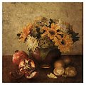
Critique By:
Boris Liberman (K:404)
11/27/2003 10:55:15 AM
It definitely looks like a painting!
|
| Photo By: Vladimir Feodorov
(K:19)
|
|
|
Critique By:
Boris Liberman (K:404)
11/14/2003 11:50:27 AM
Little fellow is definitely enjoying himself. I like most the quite unusual perspective of this shot. Eventually he will grow, and if this chair would still be, the little guy would assume very different pose [grin]...
|
| Photo By: Michael Buehler
(K:7)
|
|
|
Critique By:
Boris Liberman (K:404)
11/14/2003 11:44:49 AM
Very fragile this hare is. Actually the reddish tone of this work makes me think about "The Red Book" of animals that are under threat of extinction.
Thanks for sharing!
|
| Photo By: Terje Hellesø
(K:40)
|
|
|
Critique By:
Boris Liberman (K:404)
10/16/2003 11:28:26 AM
The setup is undoubtedly funny (in both meanings of the word I know of). The lens, the sensitivity, the subject - all are quite unusual.
Bill, what's this car? We don't have those in Israel, or at least I couldn't recognize it [grin]. I think that without pink residue of the houses on the top though, it could be looking even more futuristic.
Thanks for sharing. It was fun to look at this photo.
|
| Photo By: william robb
(K:216)
|
|
|
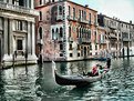
Critique By:
Boris Liberman (K:404)
10/12/2003 5:56:17 AM
Personally, I don't think that old city of Venice goes well along with modern filters of digital retouching... The composition is great and the thumbnail is very catching. But the way you arranged/edited it, make it look just a little too artificial.
Just MHO, nothing more.
|
| Photo By: Aldo Costantini
(K:659)
|
|
|
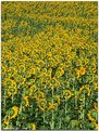
Critique By:
Boris Liberman (K:404)
10/12/2003 5:46:26 AM
I suppose the wrong one is blind. The sun is where all his buddier are turned, right? Excellent catch. Topping on the cake is of course the little flowerless spot on the top left, which balances well with the wrong one [grin].
|
| Photo By: Bulent Ahiskal
(K:1251)
|
|
|
Critique By:
Boris Liberman (K:404)
10/12/2003 5:18:26 AM
I see it like this - the tree points upwards to the sky while the light rays on the field on the background lead me to the right bottom corner of the frame. Since tree is much more prominent, the order is broken. I first looked at the tree and only then noticed the second path...
It is good landscape shot, no doubt, but some little extra is necessary, I think.
|
| Photo By: marek madzo
(K:354)
|
|
|
Critique By:
Boris Liberman (K:404)
10/12/2003 5:13:34 AM
Very dreamy eyes.
I tried to look at the image as if it was cropped and it did not work just as well. The eye placement is very effective in the original.
The loveliest part of course is contrast between serious, thoughtfull eyes, and hair playfully played by the wind.
Very facinating work.
|
| Photo By: Wim Swyzen
(K:110)
|
|
|
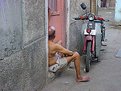
Critique By:
Boris Liberman (K:404)
9/24/2003 5:49:23 AM
There is certain subtlety in this image. It has a definite calm mood, a sense of wisdom. It forces the viewer to think, to reflect on themselves.
Technically, I think I would at least clone out a piece of something on the middle right and probably do something about the corner of the building on the top right. They do distract as the eye starts on the man, then moves to the motorcycle and then gets kind of stuck on these two distractions.
But admittedly, this is excellent work.
|
| Photo By: Girish Menon
(K:1384)
|
|
|
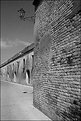
Critique By:
Boris Liberman (K:404)
8/31/2003 12:42:58 AM
IMHO, the street light spoils the composition here. Having read the title "Citadel" I have prepared myself to something that would look unpenetrable, like a fortress. And somehow I thought it would be shot from without, from outside. I just don't feel like real citadel has street lights outside, you know, to help to attacking army in the night.
Composition is excellent, but this street light is distracting, unnecessary.
|
| Photo By: marco biancardi
(K:10582)
|
|
|
Critique By:
Boris Liberman (K:404)
4/23/2003 3:29:28 AM
IMHO, it is a little too tight. Although of course, you probably did not have time to figure out the best way to shoot this wonderful occassion.
|
| Photo By: John Glibota
(K:310)
|
|
|
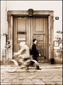
Critique By:
Boris Liberman (K:404)
4/23/2003 3:09:45 AM
In my eyes it looks just perfect. The little tilt of the street. The blurred motion. The sepia tone. It all adds up perfectly and makes me feel I am almost there, watching the time go by.
|
| Photo By: Paolo Stefano Amero
(K:5607)
|
|
|
Critique By:
Boris Liberman (K:404)
4/18/2003 9:59:59 AM
IMHO, it is a little difficult to tell apart the toes and the arm of the parent. All the rest is truly excellent. I particularly like the soft-focus like effect and the lighting of the toes. Softness really fits here.
|
| Photo By: Bree Watson
(K:56)
|
|
|
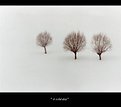
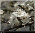
Critique By:
Boris Liberman (K:404)
3/7/2003 10:20:43 AM
It does not make me feel particularly spring'ish so to say. It is a solid work, but IMHO it does not convey too much of a spring feeling.
I think I might have tried to get rid of an off focus flower on the left side of the image.
Otherwise, both technically and aesthetically it is very good. But again, IMHO, it does not manage to convey the message of spring.
|
| Photo By: Sebastian Duda zolo2
(K:41)
|
|