|
|
Critique By:
Andrew Lahanas (K:7062)
5/4/2003 6:28:47 PM
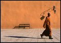
This one is good too. I like the man's colour and his presence here is nice. I think one more step would make his positioning a little better, so that is the only thing I can think you could do to improve this one.
|
| Photo By: Dana James
(K:191)
|
|
|
Critique By:
Andrew Lahanas (K:7062)
5/4/2003 6:23:23 PM
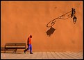
I lile this one too. I know it is usually the case where the subjects is walking in to the open space, but this way you see what he is leaving behind not what he is going to. Also, the shadow behind him is the focal point. It is a shame about the shadow placement of the wall lamp near his head. It looks like it is too close and it does sort of close him in a little. I love the colours and the lighting, and the texture of the wall adds another element to the photo. It is very good alround. Nice to have you back!
|
| Photo By: Dana James
(K:191)
|
|
|
Critique By:
deniz kaan copur (K:12726)
5/3/2003 8:42:21 AM
very well seen. colours are a bit strong, but its ok.
|
| Photo By: Dana James
(K:191)
|
|
|
Critique By:
Girish Menon (K:1384)
5/3/2003 4:16:07 AM
Nice!
|
| Photo By: Dana James
(K:191)
|
|
|
Critique By:
lisa . (K:9370)
5/2/2003 6:31:08 PM
i need to go here........i almost forgot!
|
| Photo By: Dana James
(K:191)
|
|
|
Critique By:
Rena Tsiflidou (K:2606)
5/2/2003 5:33:54 PM
Very beautiful!
|
| Photo By: Dana James
(K:191)
|
|
|
Critique By:
Rena Tsiflidou (K:2606)
5/2/2003 5:32:57 PM
A nice composition...simple yet powerful with beautiful light and shadow effects.
|
| Photo By: Dana James
(K:191)
|
|
|
Critique By:
Richard Hogg (K:155)
5/2/2003 5:11:55 PM
This is very creative, excellent use of color, light and shadow. The composition could be used to teach a photography class. Outstanding!
|
| Photo By: Dana James
(K:191)
|
|
|
Critique By:
Knut Hoftun Knudsen (K:526)
5/2/2003 3:09:02 PM
Great captured! Love it!
|
| Photo By: Dana James
(K:191)
|
|
|
Critique By:
Roland Le Gall (K:7018)
5/2/2003 1:01:02 PM
Yes, suits like this....:-)Wonderful shadows....
|
| Photo By: Dana James
(K:191)
|
|
|
Critique By:
Roland Le Gall (K:7018)
5/2/2003 12:58:21 PM
Outstanding composition...marvellous light....really Marrakech...I would have liked a man with a djellaba...not occidental suits....:-)
|
| Photo By: Dana James
(K:191)
|
|
|
Critique By:
Hayri CALISKAN (K:16195)
5/2/2003 12:22:46 PM
excellent
|
| Photo By: Dana James
(K:191)
|
|
|
Critique By:
Britt Park (K:2210)
5/2/2003 12:17:15 PM
Great execution. How long did you wait for a person with just the right colored clothing to pass? I was just about to write that letting the man make one more pace would have given you a better composition, but now think that the almost perfect alignment of the trailing foot with the end of the bench is fantastic.
|
| Photo By: Dana James
(K:191)
|
|
|
Critique By:
Aguinaldo Vera-Cruz (K:326)
5/2/2003 11:14:17 AM
Very well done ! Colour and composition.
|
| Photo By: Dana James
(K:191)
|
|
|
Critique By:
Nando Mondino (K:14261)

5/2/2003 11:08:41 AM
Another great pic!
|
| Photo By: Dana James
(K:191)
|
|
|
Critique By:
Günter Koth (K:13841)
5/2/2003 10:51:59 AM
Wonderful colors, light and shadows. Original shot.
|
| Photo By: Dana James
(K:191)
|
|
|
Critique By:
Andy Eulass (K:13435)
5/2/2003 10:27:42 AM
Now this is a shot that Velvia is made for. God, those big blocks of color are just amazing. Simple and very powerful. Lovely work.
|
| Photo By: Dana James
(K:191)
|
|
|
Critique By:
Andy Eulass (K:13435)
5/2/2003 10:25:25 AM
Marvellous work Dana. I think some of the softness could be remedied with a touch more USM. The composition is absolutely phenomenal with those wonderful long shadows. The shadows really add a dynamic quality to the shot. You just illustrated the virtues of simplicity in composition with this powerful image.
|
| Photo By: Dana James
(K:191)
|
|
|
Critique By:
sean slavin (K:3488)
5/2/2003 10:21:08 AM
I like this one better than the one with the person more in the foreground. Great color. The shadows really make this one. 8)
|
| Photo By: Dana James
(K:191)
|
|
|
Critique By:
Ronny Van Eeckhoutte (K:12734)
5/2/2003 10:07:06 AM
Excellent composed.
|
| Photo By: Dana James
(K:191)
|
|
|
Critique By:
Jean Luc LERY (K:4975)
5/2/2003 10:03:07 AM
Wonderful too.Great sery.Regards Jluc
|
| Photo By: Dana James
(K:191)
|
|
|
Critique By:
Jean Luc LERY (K:4975)
5/2/2003 10:01:34 AM
Wonderful shadow and colors.Great light. Regards Jluc
|
| Photo By: Dana James
(K:191)
|
|
|
Critique By:
Bob Tomerlin (K:5460)
5/2/2003 9:52:30 AM
Very clever framing of the man with the shadow of the lamp (I notice you have an opposite opinion about that - aren't critiques wonderful?). I think it could be just a bit sharper, but he appears to be striding along pretty rapidly.
|
| Photo By: Dana James
(K:191)
|
|
|
Critique By:
Augusto Getirana (K:57)
5/2/2003 9:47:06 AM
Great composition! I liked the texture of the wall and the shadows. But I believe the man is a litlle bit out of focus.
Augusto Getirana.
|
| Photo By: Dana James
(K:191)
|
|
|
Critique By:
Paulo Gama (K:5067)
5/2/2003 9:44:30 AM
TOP!!
|
| Photo By: Dana James
(K:191)
|
|
|
Critique By:
- simos - (K:9354)
5/2/2003 9:43:59 AM
Again.... excellent shot!!! good work.
regards, simo
|
| Photo By: Dana James
(K:191)
|
|
|
Critique By:
Ari A. Alves (alvesari) (K:7733)
5/2/2003 9:43:11 AM
Very nice shot.
|
| Photo By: Dana James
(K:191)
|
|
|
Critique By:
- simos - (K:9354)
5/2/2003 9:43:00 AM
Excellent moment!!!
regards, simo
|
| Photo By: Dana James
(K:191)
|
|
|
Critique By:
Howard M. Parsons (K:3496)
5/2/2003 9:33:02 AM
The phrase "less is more" applies here. The photo contains nothing except those things which are essential to the idea. Very nice work.
|
| Photo By: Dana James
(K:191)
|
|
|
Critique By:
Jonathan Slack (K:8)
5/2/2003 9:30:35 AM
Oh now - this is a great shot - I love the angle of the shadow and the hangdog guy - wonderful
|
| Photo By: Dana James
(K:191)
|
|