|
|
Critique By:
Mont Vert Studio (K:176)
4/5/2008 10:49:31 PM
Thanks
|
Photo By: Paul Lara
(K:88111)

|
|
|
Critique By:
Mont Vert Studio (K:176)
4/5/2008 10:26:52 PM
Very nice perspective and tones. Congratulations.
|
| Photo By: Tim Schumm
(K:29196)
|
|
|
Critique By:
Mont Vert Studio (K:176)
4/5/2008 10:15:28 PM
Paul, very nice photo. How did you light it?
|
| Photo By: Paul Lara
(K:88111)
|
|
|
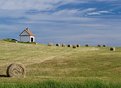
Critique By:
Mont Vert Studio (K:176)
4/1/2008 2:43:08 AM
Sheila, Thanks for the comment. I posted this quite some time ago so my memory may be a bit vague. I think I slightly cleaned up the grass at the bottom with clone stamp and slightly darkened te picture to bring out the sky. I may have added some saturation, but don't think it needed it. I had wanted to take this shot for a while and that morning was perfect...
|
| Photo By: Mont Vert Studio
(K:176)
|
|
|
Critique By:
Mont Vert Studio (K:176)
10/13/2003 10:34:52 AM
Dirck, thanks for the comment. I don't mind your re-correcting my shot. I think it probably look different on your monitor than it does on mine, as my shot is pretty saturated on my screen. With that said, I like your version too. Also, I looked at you portfolio and really like your work, which of course, makes the value of your input that much higher. Cheers! RG
|
| Photo By: Mont Vert Studio
(K:176)
|
|
|
Critique By:
Mont Vert Studio (K:176)
10/11/2003 8:55:43 AM
Well done
|
| Photo By: Harlan Heald
(K:15732)
|
|
|
Critique By:
Mont Vert Studio (K:176)
10/11/2003 8:44:45 AM
Tamara, this is a beautiful shot. Well composed, lit, etc. The shadow detail on the wall, and particularly on the side of the mattress is great! The model's pose is wonderful. I'd be interested to know more about how you achieved this look. Thanks.
|
| Photo By: Tamara L
(K:1387)
|
|
|
Critique By:
Mont Vert Studio (K:176)
10/11/2003 8:37:46 AM
Overall, a very nice shot Great DOF and composition. Although I like the saturation of the sky, it's so saturated that it looks a bit unnatural. Did you bump the saturation in processing or is that just how it came out?
|
| Photo By: Armando Jorge
(K:7937)
|
|
|
Critique By:
Mont Vert Studio (K:176)
10/11/2003 8:32:46 AM
Great colors and composition. I love the way the shadows are picked up in the water.
|
| Photo By: Kaj Nielsen
(K:15279)
|
|
|
Critique By:
Mont Vert Studio (K:176)
10/6/2003 1:53:50 PM
Here's the second crop. RG
|
| Photo By: Mont Vert Studio
(K:176)
|
|
|
Critique By:
Mont Vert Studio (K:176)
10/6/2003 1:52:44 PM
Thanks for all the comments and ecouragement. I've made two attempts at cropping the picture as suggested by Marie, et al. Personally, I like the original, although I am now considering clone stamping out the grass. Thanks, again. RG
|
| Photo By: Mont Vert Studio
(K:176)
|
|
|
Critique By:
Mont Vert Studio (K:176)
3/5/2003 3:42:58 PM
Ricky, this is a very unique photograph. I'm surprised you haven't received any comments and disagree with the user rating (I don't use them but would rate this higher). I like the shot. The colors are untersting snd the washing out of the skin is well done. I'd be interested in learining more about how you achieved this effect.
|
| Photo By: Ricky Hirshfield
(K:832)
|
|
|
Critique By:
Mont Vert Studio (K:176)
2/21/2003 3:27:43 AM
I agree with the above comment. This photo is beautifully laid out and lit. Very well done. I wish you had given more information on how you achieved the final result.
|
| Photo By: Jean-François Dupuis
(K:70)
|
|
|
Critique By:
Mont Vert Studio (K:176)
2/21/2003 3:27:17 AM
I agree with the above comment. This photo is beautifully laid out and lit. Very well done. I wish you had given more information on how you achieved the final result.
|
| Photo By: Jean-François Dupuis
(K:70)
|
|
|
Critique By:
Mont Vert Studio (K:176)
2/21/2003 3:22:54 AM
Beautiful photo. I love the colors and also like the composition a lot. I might, however, have liked it even more with less of the beach in the foreground and more sky/water. Nonetheless, your early morning wake-up call was well worth the effort. Congrats
|
| Photo By: Andrew Lahanas
(K:7062)
|
|
|
Critique By:
Mont Vert Studio (K:176)
2/15/2003 5:06:29 AM
Thanks for the comment. I'll try to upload a shot of the guys playing ball this weekend.
|
| Photo By: Mont Vert Studio
(K:176)
|
|
|
Critique By:
Mont Vert Studio (K:176)
2/15/2003 5:05:41 AM
Thanks for the comment. I'll try to upload a shot of the guys playing ball this weekend.
|
| Photo By: Mont Vert Studio
(K:176)
|
|
|
Critique By:
Mont Vert Studio (K:176)
2/12/2003 5:03:32 PM
Todd, I like this shot alot. It has a great feel to it and proves that the "rule" about shooting your subject's face is meant to be broken. I must admit that I didn't catch the curvature on the floor until I read your comments. I'm not sure why that happened, but believe it would be relatively easy to adjust out in Photoshop.
|
| Photo By: Todd Miller
(K:16464)
|
|
|
Critique By:
Mont Vert Studio (K:176)
2/9/2003 6:13:10 PM
Thanks for the comment. I never considered B&W for this shot. I really like the color saturation. On the other hand, I would like to soften the focus of the background. When I have the time, I'll play around with both ideas.
|
| Photo By: Mont Vert Studio
(K:176)
|
|
|
Critique By:
Mont Vert Studio (K:176)
2/6/2003 11:14:42 AM
I agree with the other comments. A beautiful picture. I'm curious, how did you light the shot?
|
| Photo By: Wallace Rollins
(K:149)
|
|
|
Critique By:
Mont Vert Studio (K:176)
12/4/2002 5:20:47 PM
Really like the mood of the photo. Wondering how you achieved that washed out/grainy effect?
|
| Photo By: Wallace Rollins
(K:149)
|
|