|
|
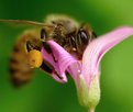
Critique By:
Tony Bruguiere (K:160)
7/7/2003 11:38:14 AM
Wonderful image. Good choice to leave the pollen ball.
|
| Photo By: Richard Walters
(K:480)
|
|
|
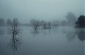
Critique By:
Tony Bruguiere (K:160)
5/16/2003 5:16:35 PM
Beautiful composition. I really like the tree on the right being darker - gives a feeling of depth to the image. Excellent work with the sepia toning and presentation.
|
| Photo By: Ilona Wellmann
(K:101)
|
|
|
Critique By:
Tony Bruguiere (K:160)
12/3/2002 4:31:52 PM
That is a really amazing image, Tony, but I agree with Dan that it is quite soft.
|
Photo By: Tony Smallman
(K:23858)

|
|
|
Critique By:
Tony Bruguiere (K:160)
12/3/2002 4:29:17 PM
Beautiful image, Tess. Really like your composition. That IR filter does magical things to an image.
|
| Photo By: tess campbell
(K:515)
|
|
|
Critique By:
Tony Bruguiere (K:160)
12/3/2002 4:26:26 PM
Very nice, Greg. I like the monochromatic colors and the reflections.
|
| Photo By: Greg Summers
(K:1115)
|
|
|
Critique By:
Tony Bruguiere (K:160)
11/26/2002 4:50:17 PM
Very nice portrait! Maggie gave you some excellent suggestions on how to bring out the details in your subject. If it turns out that you have neither a reflector or an assistant, you could always use Dodge and Burn in your image editor.
|
| Photo By: Elangovan S
(K:10675)
|
|
|
Critique By:
Tony Bruguiere (K:160)
11/26/2002 4:24:14 PM
Nice capture of our little snow storm, Greg. The overall image looks a little flat to me. I have been trying the method outlined by Ray Wearm in his article "Colour to B&W In Photoshop: ...", with some very good results. I use Channel Mixer also and his method is a good alternative.
|
| Photo By: Greg Summers
(K:1115)
|
|
|
Critique By:
Tony Bruguiere (K:160)
11/26/2002 4:06:02 PM
Congratulations! This is much better than the original. Good work with your image editor. I must admit that the "technician" in me cringed a little bit when I saw the horizon, but without it, I think the image would lack its powerful impact. Very creative.
|
| Photo By: matt fruge
(K:83)
|
|
|
Critique By:
Tony Bruguiere (K:160)
11/25/2002 8:05:31 PM
Certainly a departure from your usual image, Greg. I like the strong diagonal composition. The DOF is amazing. The lighting is very good. Good eye to see this.
|
| Photo By: Greg Summers
(K:1115)
|
|
|
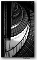
Critique By:
Tony Bruguiere (K:160)
11/25/2002 7:57:58 PM
Good eye to see this fine composition. Reflective highlights are very good, but I would like to see a little dodging in the "rust" area to bring out more detail.
|
| Photo By: Chelsea Burke
(K:5750)
|
|
|
Critique By:
Tony Bruguiere (K:160)
11/25/2002 7:55:06 PM
Very nice composition. Good detail and separation from background. Lighting is very good. Image has an abstract quality to it.
|
| Photo By: Beverly Gustafson
(K:1572)
|
|
|
Critique By:
Tony Bruguiere (K:160)
11/25/2002 7:51:17 PM
Great light and composition. I like the way that the shoreline leads to the lighthouse and then around the breakwater. Well Done!
|
| Photo By: Gary Martin
(K:579)
|
|
|
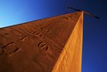
Critique By:
Tony Bruguiere (K:160)
11/25/2002 7:48:25 PM
Good exposure and colors. The wide angle lens and camera perspective has caused a pronounced "keystone" effect. You should be able to fix this in your image editor. Russ Cooper has a good tip in the Digital Darkroom Forum on how to keep horizons level. The principal is the same for verticals, if you want to give it a try.
|
| Photo By: Rachel Radcliffe
(K:17)
|
|
|
Critique By:
Tony Bruguiere (K:160)
11/24/2002 6:35:20 PM
Thanks, Greg. I see the area that you are talking about and I will take care of it.
|
| Photo By: Tony Bruguiere
(K:160)
|
|
|
Critique By:
Tony Bruguiere (K:160)
11/24/2002 2:50:48 PM
Julien - I really want to thank you for your comment. It made a profound improvement to my image. Constructive comments are always welcomed by me and are one of the reasons that I enjoy posting my images. Thank you for your honesty in pointing out an obivious flaw.
|
| Photo By: Tony Bruguiere
(K:160)
|
|
|
Critique By:
Tony Bruguiere (K:160)
11/24/2002 1:45:37 PM
I guess I should have gone to your comment first as it took me a couple of minutes to figure out what I was looking at. I think if you would lower your perspective so that you have translucent blinds above and below the opening, it would help a lot. There is no detail in the hand. You might try taking two exposures - one for the interior and one for the exterior and then sandwiching them together.
|
| Photo By: martin david brown
(K:25)
|
|
|
Critique By:
Tony Bruguiere (K:160)
11/24/2002 1:35:45 PM
Good concept, but as you point out, the focus is very soft. While you are in PS, you might consider removing the arching root on the left.
|
| Photo By: Ken Lucas
(K:110)
|
|
|
Critique By:
Tony Bruguiere (K:160)
11/24/2002 8:54:13 AM
Good concept, but my eye keeps jumping up to the bright area above the circle of light. Perhaps if you burned this area in a little or moved some of the blue color to it.
|
| Photo By: piper lehman
(K:256)
|
|
|
Critique By:
Tony Bruguiere (K:160)
11/24/2002 8:48:15 AM
Nice work, Greg. Good color choice. To me, the leaves seem overly sharp compared to the artistic softness of the overall image.
|
| Photo By: Greg Summers
(K:1115)
|
|
|
Critique By:
Tony Bruguiere (K:160)
11/24/2002 8:38:00 AM
Very nice composition and DOF. I think the high contrast adds to the image.
|
| Photo By: Gary Martin
(K:579)
|
|
|
Critique By:
Tony Bruguiere (K:160)
11/24/2002 8:32:22 AM
Nicely done. I like the contrast between the detail in the foreground and the featureless sea.
|
| Photo By: Christian Gennert
(K:964)
|
|
|
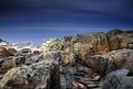
Critique By:
Tony Bruguiere (K:160)
11/24/2002 8:27:25 AM
Detail and lighting in the foreground is very good. I found the lack of separation between the horizon and sky a little distracting.
|
| Photo By: Christian Gennert
(K:964)
|
|
|
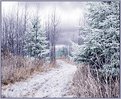
Critique By:
Tony Bruguiere (K:160)
11/23/2002 5:21:10 PM
Beautiful, Tess! Looks like a Christmas card. I really like the soft pastels in the snow and sky. While I am a big believer in tripod use, I think a critically sharp image would lessen the mood.
|
| Photo By: tess campbell
(K:515)
|
|
|
Critique By:
Tony Bruguiere (K:160)
11/23/2002 5:10:29 PM
I really like this image, Steve. As you said, it would have been great to have more of her shadow, but this is quite good. Her placement is good and I like the way that she stands out from the landscape. The image needs some contrast which will also lighten the overall image. If you don't want to spring for the full Photoshop package, you might try Paint Shop Pro. Excellent program with Layers, Masks, Filters, and a browser, for under $100.
|
| Photo By: Steve Wise
(K:215)
|
|