|
|
Critique By:
Free Rider (K:430)
5/29/2007 7:32:52 PM
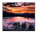
Thanks. I'm lousy at Photoshop, but hope to start learning now that I'm into the digital revolution.
|
| Photo By: Free Rider
(K:430)
|
|
|
Critique By:
Free Rider (K:430)
5/25/2007 8:49:18 PM
A classic.
|
Photo By: Gene Zonis
(K:6949)

|
|
|
Critique By:
Free Rider (K:430)
5/25/2007 8:48:16 PM
Superb. Wouldn't change a thing about this one. The warm colors are very nice and the wet road provides wonderful mood.
|
Photo By: Gene Zonis
(K:6949)

|
|
|
Critique By:
Free Rider (K:430)
5/25/2007 8:47:11 PM
Street scenes are always difficult. I like the old man and the youngster talking together out front and I think it might be fun to shift the focus to them rather than the sign pointing around the corner. What do people do at diners? Eat and chat with each other and that's what the old man and youngster are either about to do or have just done.
|
Photo By: Gene Zonis
(K:6949)

|
|
|
Critique By:
Free Rider (K:430)
5/25/2007 8:43:51 PM
I like the choice of black and white for this one, but some aspects appear missing. I can't quite put my finger on it, but perhaps it's the loss of detail. Such lack of detail does, however, contribute to an omninous feeling.
|
Photo By: Gene Zonis
(K:6949)

|
|
|
Critique By:
Free Rider (K:430)
5/25/2007 8:41:44 PM
This one is just lovely. I don't know how you did it, but the impressionistic grain is perfect for this. All seems rather peaceful.
|
Photo By: Gene Zonis
(K:6949)

|
|
|
Critique By:
Free Rider (K:430)
5/25/2007 8:40:14 PM
I saw your comment in the forum and came to look at your photos because I feel the same way you do. My photos are not spectacular as I only have a little p&s to work with, but I can surely sympathise with you some real critique rather than just an ego-rubbing rah, rah for the usual suspects would be nice
That said, I really like this shot but for one thing... The shape of the horse gets a little lost next to the open barn doors. I do like the symmetry, however.
|
Photo By: Gene Zonis
(K:6949)

|
|
|
Critique By:
Free Rider (K:430)
5/18/2007 5:29:24 PM
Lovely shot. It's too bad the bird's reflection is cut off a bit. Very nice though.
|
| Photo By: Frank Sollecito
(K:-73)
|
|
|
Critique By:
Free Rider (K:430)
5/17/2007 8:27:58 PM
This is just lovely. The small branch is a bit of a problem, but still this is a fantastic find.
|
| Photo By: sarel van staden
(K:287)
|
|
|
Critique By:
Free Rider (K:430)
5/4/2007 6:43:43 PM
Great composition and choice of b&w for it. Captivating image.
|
| Photo By: Milena G
(K:1098)
|
|
|
Critique By:
Free Rider (K:430)
5/4/2007 6:42:05 PM
great work with the colors
|
| Photo By: nathan combs
(K:2242)
|
|
|
Critique By:
Free Rider (K:430)
5/4/2007 6:40:58 PM
absolutely gorgeous
|
| Photo By: Atish Sen
(K:6346)
|
|
|
Critique By:
Free Rider (K:430)
5/4/2007 1:12:33 AM
No, this was a scan I found while cleaning up my system in readiness for the Casio. The Casio has its place and time. It's for me to experiment so that I can convince myself to buy the D80. 
|
| Photo By: Free Rider
(K:430)
|
|
|
Critique By:
Free Rider (K:430)
5/2/2007 11:08:32 PM
Love the choice of background... royal purple. Great image.
|
Photo By: AJ Miller
(K:49168)

|
|
|
Critique By:
Free Rider (K:430)
5/2/2007 5:44:42 PM
I've enjoyed the camera so far, but it is having a backfocus problem. I dealt with it as best I could for this photo, but the macro mode is worthless. Casio customer service has been great so far and I've tried what they've said to do. I'm going to make another set of experimental pics to see if the backfocus is fixed this weekend.
Funny, I was thinking last night that I should have done this shot in black and white. With digital, I had the option and I totally forgot about it.
|
| Photo By: Free Rider
(K:430)
|
|
|
Critique By:
Free Rider (K:430)
4/27/2007 11:46:29 PM
Thanks, Jacques. I've been enjoying Usefilm so far. I stumbled upon it totally by accident (following the photographs of someone I think does great work and he has some up here), but it's been one of the better accidents of my life. ;)
|
| Photo By: Free Rider
(K:430)
|
|
|
Critique By:
Free Rider (K:430)
4/27/2007 7:59:58 PM
The lighter colors are fantastic, but the darker ones blur out the details. I really like how it almost comes off as a black and white, hand-painted photo.
|
Photo By: Paolo Corradini
(K:59552)

|
|
|
Critique By:
Free Rider (K:430)
4/27/2007 7:23:17 PM
This is the Sonoran Desert. The photo was taken at the Lost Dutchman State Park.
If I had a decent scanner, I would be able to post more. I have some scanned, but they have a blue line up the middle because of the scanner.
I just got my first digital camera though (a small p&s with lots of features, including manual focus), so we'll see what happens now. My plan is to get a Nikon D80 if all goes well with my digital experiment.
I've got lots of pics of SA that I took with a borrowed camera. Cape Town, specifically.
|
| Photo By: Free Rider
(K:430)
|
|
|
Critique By:
Free Rider (K:430)
4/19/2007 12:39:53 AM
Nice. Such hot subjects can be difficult. You've done well.
|
| Photo By: Zamrud Fisantrino
(K:198)
|
|
|
Critique By:
Free Rider (K:430)
4/19/2007 12:38:38 AM
A little soft, but it adds to the mood.
|
| Photo By: jacques brisebois
(K:73883)
|
|
|
Critique By:
Free Rider (K:430)
4/17/2007 6:56:50 PM
A gentle sea in the Cape? ;)
This really is beautiful. Nice warm colors. Gentle.
|
| Photo By: sarel van staden
(K:287)
|
|
|
Critique By:
Free Rider (K:430)
4/12/2007 5:56:46 PM
The original was outstanding, but you've given it a whole new meaning. Very good.
|
| Photo By: Mladen Borisov
(K:518)
|
|
|
Critique By:
Free Rider (K:430)
4/11/2007 11:28:32 PM
I really like this. Good use of color. I see this one proudly sports a lock.
|
| Photo By: Zefram Zef
(K:1443)
|
|
|
Critique By:
Free Rider (K:430)
4/11/2007 11:02:04 PM
:) Oh, Doyle, I probably stepped on one or two. Thank goodness for that 300mm lens or it would have been much worse.  
This was my first outing ever with my Nikon N65. I hadn't touched a camera in over 20 years and my prior experience was a Kodak Instamatic 155x. I am a fool with PhotoShop, so the best I can do is some cropping. Hope to change that with an entrance into the digital age.
Thank you for taking the time to look.
|
| Photo By: Free Rider
(K:430)
|
|
|
Critique By:
Free Rider (K:430)
4/11/2007 6:51:13 PM
Composición perfecta! Dice mucho sobre su país. Hay problemas con la resolución pero creo que tiene que ver con el método de upload y no con la calidad de la photo. Gracias por compartirla.
|
Photo By: Carlos A. Alvis
(K:1205)

|
|
|
Critique By:
Free Rider (K:430)
4/10/2007 11:56:42 PM
Super fantastic abstract art. Nicely concentric too.
|
| Photo By: sascha jonack
(K:19715)
|
|
|
Critique By:
Free Rider (K:430)
4/10/2007 9:15:08 PM
I have been looking for a good photograph from a Nikon D80 and this is just what I was thinking of... using what is available in the camera for the best. This has difficult lighting, but you've handled it in an interesting way.
|
Photo By: Paolo Corradini
(K:59552)

|
|
|
Critique By:
Free Rider (K:430)
4/10/2007 9:12:21 PM
Sometimes the simplest things make for really good images. Your composition is good, evoking a sense of tranquility.
|
| Photo By: Freddy P.
(K:212)
|
|


