|
|
Critique By:
Beverly Britton (K:133)
4/17/2003 6:38:49 AM
I love everything about this photo...great choice on shutter speed!!! Nice work!
|
| Photo By: john lochnell
(K:28)
|
|
|
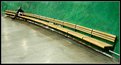
Critique By:
Beverly Britton (K:133)
4/17/2003 6:35:05 AM
wow...so simple yet soooooo perfect and balanced. excellente!
|
| Photo By: Toini Blom
(K:2039)
|
|
|
Critique By:
Beverly Britton (K:133)
4/1/2003 5:39:06 PM
manuael, this photo looks as if the photographer has travelled in time. you've got nice composition here, I think. You might want to crop it on the left side, to cut out the white rectangle on the top left, as well as the darkness down on the bottome left - see my attachment - what do you think? Overall I think it's an awesome photo!
|
| Photo By: manuel valgode lopes vall
(K:0)
|
|
|
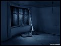
Critique By:
Beverly Britton (K:133)
4/1/2003 5:09:18 PM
Rene, I just finished looking at your exhibition on usefilm. One notable thing...I love the way you incorporate so much darkness, with an attention to light and detail - the way you gently capture (or maybe enhance) such soft lighting on the subject or various areas. Like Katie, I'm curious how you created "the reaper is coming"...not so much the hands through the window part, but more your color and tone and lighting. Awesome work!
|
| Photo By: Rene Asmussen
(K:138)
|
|
|
Critique By:
Beverly Britton (K:133)
4/1/2003 5:00:12 PM
You get a high score for originality and also timing - nice capture. don't think I've ever seen a shot of subaqueous algae before. I wonder what it would look like (maybe better, maybe not) if you cropped it a bit on the right and bottom. It's cool!
|
| Photo By: Bob Hearn
(K:4)
|
|
|
Critique By:
Beverly Britton (K:133)
4/1/2003 4:50:23 PM
beautiful model, expression, composition...awesome capture...the tone and color I especially like - well, well, done!
|
| Photo By: Dren Gjonbalaj
(K:33)
|
|
|
Critique By:
Beverly Britton (K:133)
11/14/2002 8:03:00 AM
This is an Amazing photograph!
|
| Photo By: Beverly Gustafson
(K:1572)
|
|
|
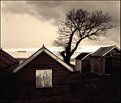
Critique By:
Beverly Britton (K:133)
11/14/2002 7:52:49 AM
Wow, the tone in this one creates a very interesting mood. The tree's soft branches are a nice focal point over the horizon. the contrast of the window and 'v frame' roofs break up the darkness in the foreground. I like it. I wonder what it would look like if you cropped out the far left hut - of course that would chop the ship in half..might be cool. Beautiful photo, I think.
|
| Photo By: Michael Busselle
(K:221)
|
|
|
Critique By:
Beverly Britton (K:133)
11/14/2002 7:36:04 AM
When I saw the thumbnail image I immediately wanted to see the larget one. Anyone who has ever had a cat can appreciate this! nice contrast, and you caught a truly "I am king or queen of this house" cat expression. Am I right that the upper right and left corners are miscellaneous things on the countertop? Perhaps it might be better without those. Great photo!
|
| Photo By: martin david brown
(K:25)
|
|
|
Critique By:
Beverly Britton (K:133)
11/14/2002 7:27:28 AM
Something about this photo really sucked me in. I love the strong color and then the touch of green from the petite little leaves. I really like the translucent effect. At first I thought maybe there is too much white space around the subject but, actually, I think it's quite striking. Nice!
|
| Photo By: Greg Summers
(K:1115)
|
|


")