|
|
Critique By:
Nicholle Kuzniak (K:98)
12/27/2002 5:48:58 PM
Great photo. Congratulations.
|
| Photo By: Tim Dinofa
(K:162)
|
|
|
Critique By:
Alex Avilov (K:634)
12/27/2002 5:12:13 PM
I agree with heather, that is very cool self portrait. will check your web site now 
|
| Photo By: Tim Dinofa
(K:162)
|
|
|
Critique By:
Thibault Grouas (K:848)
12/26/2002 11:40:15 PM
I spent some time on your agenda and all I can say is that you have a really nice work as a whole, containing some very intimate and personal pictures.
This one is nice (but not one of my favourites) and especially nicely composed. A very personal picture. I'am not a fan of the black background though.
|
| Photo By: Tim Dinofa
(K:162)
|
|
|
Critique By:
Adam E. J. Squier (K:9803)
12/26/2002 3:31:53 AM
The white wall tiles look a bit warm, which is nice, for a change. Stark white would look too antiseptic (though it is a bath, hmmm) but as it is I can almost feel the warmth of the water.
|
| Photo By: Tim Dinofa
(K:162)
|
|
|
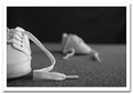
Critique By:
Kenneth Liang (K:290)
12/25/2002 2:19:39 PM
When i first saw the thumbnail, i thought there were another pair of feet at the other end. hahaha. i was wondering the other person might be submerge inthe water, waiting for this picture to be taken.
i guess not.
|
| Photo By: Tim Dinofa
(K:162)
|
|
|
Critique By:
Antonio Díaz (K:2710)
12/24/2002 3:39:40 PM
very interesting project tim, very creative! you must have lots of self portraits by now... keep ?em coming!
|
| Photo By: Tim Dinofa
(K:162)
|
|
|
Critique By:
Daniel Saaiman (K:1222)
12/20/2002 11:43:50 AM
You look terrified, Tim. I like the pic.
|
| Photo By: Tim Dinofa
(K:162)
|
|
|
Critique By:
Tim Dinofa (K:162)
12/18/2002 6:58:28 PM
Thanks Dario,
Though it might look like a photoshop trick, I didn't do any touch-ups with PS at all. It was just a really shallow depth of field and the back shoe was 12 inches or so behind the one in the front. But I can see why you might have thought that.
|
| Photo By: Tim Dinofa
(K:162)
|
|
|
Critique By:
Dario Diament (K:83)
12/18/2002 5:59:41 PM
Hi Tim! I'm a great fan of you site. I really like this picture, but what bother me is the line between the focused and the blured areas. It shows that has been touched with Photoshop. But without looking the details it's great.
|
| Photo By: Tim Dinofa
(K:162)
|
|
|
Critique By:
James Pratt (K:1567)
11/29/2002 7:40:45 AM
Nice idea beautifully executed. At second glance I wondered if the father's hand was a touch too large / dominant. My eye kept wandering back to that, rather than the childs feet which is what I felt I wanted. Quite how you could have persuaded the mother that she should have married a man with smaller hands I don't know. Or a man who doesn't bite his fingernails!
Anyway, stunning image and rather more imaginative than a 10 word announcement in the London Times.
|
| Photo By: Tim Dinofa
(K:162)
|
|
|
Critique By:
matt fruge (K:83)
11/28/2002 6:52:27 PM
I love this photo. It has a advertisement written all over it. I do agree with heather, maybe if the person was moved a little to the right and you a little to the left. That would eliminate the background distraction while still incorporating the persons leg as I think it adds something to the picture. I also think it would work if you completly cropped the leg out of the picture and just left the hand. either way I like this one alot. How did you get the blue light.
|
| Photo By: Tim Dinofa
(K:162)
|
|
|
Critique By:
heather martino (K:3648)
11/27/2002 10:28:50 PM
Pretty cool self portrait. I visited your website. Love it & added to my bookmarks. H
|
| Photo By: Tim Dinofa
(K:162)
|
|
|
Critique By:
Nathan Kennett (K:535)
11/27/2002 8:46:59 PM
Um... wow.
What film was used?
|
| Photo By: Tim Dinofa
(K:162)
|
|
|
Critique By:
Marc Gougenheim (K:5398)
11/27/2002 8:33:30 PM
Yes, this is not really new, though I have never seen it with father + mother's hand, and for sure it is indeed very, very nice. Regards.
|
| Photo By: Tim Dinofa
(K:162)
|
|
|
Critique By:
Sue O'S (K:12878)
11/27/2002 8:25:11 PM
I've always liked this image. It's great that you got an EC for this work. Congrats!
|
| Photo By: Tim Dinofa
(K:162)
|
|
|
Critique By:
al shaikh (K:15790)

11/27/2002 8:22:10 PM
Terrific
|
| Photo By: Tim Dinofa
(K:162)
|
|
|
Critique By:
al shaikh (K:15790)
11/27/2002 8:21:18 PM
Tim,
I think this is a wonderful illustration of parenthood. Well Done.
|
| Photo By: Tim Dinofa
(K:162)
|
|
|
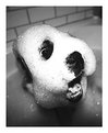
Critique By:
Jennifer Nail (K:451)
11/27/2002 7:52:29 AM
this made me laugh. very funny! i have a dog that turns into a rat when she takes a bath. yours turned into a sudsy monster!
|
| Photo By: Tim Dinofa
(K:162)
|
|
|
Critique By:
Elizabeth van Hulst (K:283)
11/16/2002 1:20:41 PM
Awesome! I can't help but laugh!
|
| Photo By: Tim Dinofa
(K:162)
|
|
|
Critique By:
Bruno Espadana (K:326)
11/13/2002 11:26:29 PM
:-DDDD
very very funny! )
|
| Photo By: Tim Dinofa
(K:162)
|
|
|
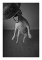
Critique By:
heather martino (K:3648)
10/17/2002 6:48:47 AM
hi Tim, I like your photos. This one needs the left bit chopped off. H
|
| Photo By: Tim Dinofa
(K:162)
|
|
|
Critique By:
Koen B (K:3279)
10/17/2002 1:44:00 AM
Not much to say: a compelling photo !
|
| Photo By: Tim Dinofa
(K:162)
|
|
|
Critique By:
meprivacynet@meprivacy.net meprivacynet@meprivacy.net (K:3974)
10/15/2002 7:42:39 AM
Tim,
I like many aspects of it - simplicity, softness, background, focus and composition. Left a little empty, but I can totally respect it
|
| Photo By: Tim Dinofa
(K:162)
|
|
|
Critique By:
Tarjei E. Krogh (K:6)
10/12/2002 5:44:44 PM
nice composition
|
| Photo By: Tim Dinofa
(K:162)
|
|
|
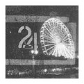
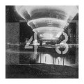
Critique By:
T M (K:-183)
10/12/2002 11:30:34 AM
Hi Tim.
I?ve had a look at your series and this is the one I like best - it?s the one most puzzling and the one with the broadest possible range of interpretation (the whirling thing in the top right corner can be seen as everything between a cone of ice-cream an a flying saucer...). Plus: The placing of the cone?s tip between the four and the three is well seen. Keep up the good work.
|
| Photo By: Tim Dinofa
(K:162)
|
|
|
Critique By:
Alex Harris (K:17)
10/10/2002 1:38:53 AM
This photograph is so beautiful. The array of detail in this image is brilliant and the contrast from
man to child is a fantastic idea.
The strong and abrupt tones of colour you have got from this is really a credit to you.
|
| Photo By: Tim Dinofa
(K:162)
|
|
|
Critique By:
Alex Harris (K:17)
10/10/2002 1:36:15 AM
|
| Photo By: Tim Dinofa
(K:162)
|
|
|
Critique By:
novy (K:25)
10/9/2002 11:26:40 PM
This is very cool!
|
| Photo By: Tim Dinofa
(K:162)
|
|
|
Critique By:
novy (K:25)
10/9/2002 11:25:15 PM
very nice!
|
| Photo By: Tim Dinofa
(K:162)
|
|
|
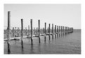
Critique By:
Marc Robin (K:3385)
10/9/2002 6:58:17 PM
A nice perspective on these posts, however I feel there needs to be something to break the pattern. Like a broken post, or something on a post. As is, there's nothing to keep my eyes from going off the right side of the page, and to the next photo.
Cheers,
Marc
|
| Photo By: Tim Dinofa
(K:162)
|
|