|
|
Critique By:
Betsy Hern (K:12872)
5/15/2004 3:32:35 AM
Perfect subject for a Holga shot, I'm surprised you got this clear at such a close distance (plastically speaking), but those Holgas always amaze. I don't profess a love of Blue Grass but the Beastie Boys rule (just kidding, who are the Beastie Boys?)!
|
| Photo By: Melisa Taylor
(K:89)
|
|
|
Critique By:
Betsy Hern (K:12872)
5/1/2004 4:26:57 AM
Comment 1 and 2 didn't show up. Email me, if you can.
|
| Photo By: Beverly Gustafson
(K:1572)
|
|
|
Critique By:
Betsy Hern (K:12872)
5/1/2004 4:24:52 AM
Well, I can't seem to get the hang of this new commenting setup. Seems the comments go into some kind of waiting area and take some time to show up. I commented twice because the first one didn't show up. Now you'll probably get 2, or maybe even 3 comments from me. Anyway, I still really like this.
|
| Photo By: Beverly Gustafson
(K:1572)
|
|
|
Critique By:
Betsy Hern (K:12872)
5/1/2004 3:49:36 AM
After looking at this for some time I finally realized that the flower's (sunflower?) center is off to the right, very nice. Abstract but also a great floral.
Are you familiar with the photographers out there who specialize in "dewdrop" photography?
Here's a spectacular one:
http://www.betterphoto.com/gallery/dynoGallDetail.asp?photo ID=161062
I have some others I will look up and send you if you email me at betsyhern@yahoo.com
I also have something else I'd like to run by you.
|
| Photo By: Beverly Gustafson
(K:1572)
|
|
|
Critique By:
Betsy Hern (K:12872)
5/1/2004 3:20:11 AM
Lovely. Are you familar with this photographer's photos within dewdrops?
http://www.positively-phototropic.com/NoCalif/closeups/D35. htm
There are a number of photographers out there who specialize in dewdrop photography, I find it fascinating. If you have a minute, email me at betsyhern@yahoo.com, I'd like to run something by you.
|
| Photo By: Beverly Gustafson
(K:1572)
|
|
|
Critique By:
Betsy Hern (K:12872)
4/21/2004 6:09:32 PM
Su hija es muy hermosa y esto es una foto maravillosamente vista de ella. Su amigo, Betsy
|
| Photo By: Hildalyd Rivera
(K:162)
|
|
|
Critique By:
Betsy Hern (K:12872)
4/19/2004 6:08:16 PM
This is really nice, very delicate. I think it might help to have a little more contrast but maybe not. HP + is a great b/w film, it is wonderful in a Holga. You know, the more I look at this the more I think you have it right, it has an oriental feel and if you up the contrast it might make it too harsh. the little flowers are super but I especially like the leaf between the 2 sets of flowers, and the branch. That's it, I think it just needs more cropping to focus in on the main areas of interest. Crop some of the left side off to place the flowers slightly off-center, that would give the comp more tension and more interest.
|
| Photo By: stuart kennedy
(K:172)
|
|
|
Critique By:
Betsy Hern (K:12872)
4/19/2004 6:01:50 PM
There are so many wonderful lines, diagonals and reflections of reflections in this one and the horizontal crop is a plus. I like the results I get using an Adjustment Layer to convert color to b/w. Layer - New Adjustment Layer - Gradient Map - OK - (then choose the black to white gradient in the default pull down choices). Give it a try, it's a nice way of putting a b/w layer on top of the background color layer and you can get some nice effects changing the transparency of the top b/w layer to let just some of the original color show through, much richer than a duotone.
|
Photo By: Verena Rentrop
(K:15233)

|
|
|
Critique By:
Betsy Hern (K:12872)
4/4/2004 6:15:01 PM
I never leave one word comments but this is...
amazing!
|
| Photo By: Studio East
(K:3349)
|
|
|
Critique By:
Betsy Hern (K:12872)
4/3/2004 6:42:10 AM
Yes, I like your abstract stuff, you have a good eye. To me, this is more interesting than a shot from further away. There's enough there to get the idea that this is some kind of window on some kind of building, but that isn't important. The colors are great, the diagonal lines give a good flow. I'm pleased that you left this soft, the temptation is to heighten the saturation to make the colors brighter.This could be a painting, but I like it as a photo.
|
| Photo By: ali fish
(K:316)
|
|
|
Critique By:
Betsy Hern (K:12872)
4/3/2004 6:36:08 AM
Yes, circles are a wonderful image device. They are often used in advertising to direct the readers eye to an important aspect of the message. If designed well they can be subliminal and you have achieved that here. Your circles frame the wonderfully detailed spoon. So smart to add water droplets to add a dimension other than the soft smooth swirls. And, there's just a hint of color to warm it up and to give it a boost. The choice of a textured background was good, too. I think it works better than a solid black or white one, although that might be a great experiment. In that case I would convert it to b/w. All in all a great capture with all the right elements to make it a winner. I'm going to have to go see your other stuff!
|
| Photo By: ali fish
(K:316)
|
|
|
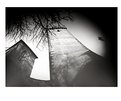
Critique By:
Betsy Hern (K:12872)
3/19/2004 12:05:07 PM
Love it! It was just a matter of time before I found a cellphone pic here. There may be others but this one caught my eye because it portrays the mystique/essence that can only be captured by those cheap, plastic-lensed toy cameras - but this one is in digital format! Perfect subject. This would be a great illustration for one of those cheesy detective stories. I envision the private eye parking here on a stake-out, smoking and falling asleep.
|
| Photo By: Seven E.
(K:600)
|
|
|
Critique By:
Betsy Hern (K:12872)
3/14/2004 7:20:44 AM
Like all the others, I couldn't pass this one up. I'm glad it showed up on the front page - there are so many wonderful photographers here I miss because of the volume of shots. Just like your other commenters, this makes me smile. I especially like the curls in your hair, they are placed perfectly. Even though this looks like it could have been a chance set-up, I think you put great care into the arrangement of the items - with great success. Set this up again and put a flower in that fabulously curly hair. Oh - I can see a whole series with just slight additions! I am marking this one a favorite, too and will come back to it anytime I need a pick-me-up. Very clever.
|
| Photo By: Marusnik Bela
(K:11611)
|
|
|
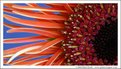
Critique By:
Betsy Hern (K:12872)
3/13/2004 3:20:54 PM
The format of this beautiful flower composition is a nice change form the usual, it's almost a panorama. Wouldn't this make a wonderful large poster?! Maybe on the side of a bus advertising an upcoming flower and garden show. Or, better yet, in the entryway of a botanical garden. I can picture it there. The different textures and colors are stunning and because of the angle you shot this at almost everything is in focus. The bits that aren't help to soften the left edge, a nice counterpoint. Nice job.
|
| Photo By: Stuart Boyle
(K:1505)
|
|
|
Critique By:
Betsy Hern (K:12872)
3/13/2004 2:43:38 PM
Beautifully done. The blue background is a wonderful color to help accent the yellow of the petals, that whole blue is the opposite of yellow thing on the color wheel. I especially like the soft green of the stem. You sure can't beat natural light, Mother Nature is the best source of fill flash.
|
| Photo By: Diana Cornelissen
(K:26437)
|
|
|
Critique By:
Betsy Hern (K:12872)
2/27/2004 8:14:39 PM
This is my favorite of the three, I don't know if it's the colors or the sense of motion in the composition. The three you've created so far would make a wonderful tryptich, or would look great matted and in simple frames hung next to each other, or really, really huge! If you haven't already, print them out on watercolor paper, that adds so much to the watercolor effect. I went to a talk once where Jack Davis (he writes the Photoshop WOW! Books) demonstrated digital painting techniques using Photoshop and Painter that were so watercolor-like you could see where one color puddled into another. He even created drips. If you don't have any of his books pick one up, he is a great author and very innovative.
|
| Photo By: Beverly Gustafson
(K:1572)
|
|
|
Critique By:
Betsy Hern (K:12872)
2/25/2004 8:33:20 PM
Yes, Barry is a wonderful inspiration, he's so creative. You've taken a page from his book and done it justice. Wouldn't this make a great pattern for a scarf or tie or a shower curtain?! I like your choice of colors and I foresee other experiments on the 'ole light box. I might have to drag mine out of the closet to see what magic it holds. There are so many inspiring people here on usefilm I don't know where to start.
|
| Photo By: Beverly Gustafson
(K:1572)
|
|
|
Critique By:
Betsy Hern (K:12872)
2/19/2004 8:15:07 AM
This will open up a whole new series for you, I can tell already. How about some fruit/vegetables in water -- strawberries, lemon or lime slices (I must be thinking about frozen Margaritas), olives, broccoli, or your heretofore famous eggs? I like how you think and especially like to see the results.
|
| Photo By: Barry Walthall
(K:5312)
|
|
|
Critique By:
Betsy Hern (K:12872)
2/17/2004 8:16:34 PM
Pinhole images are not frozen in time, they wander for a few moments before becoming fixed in your mind. Kind of like a dream, on paper. I think you will be good at this. I've read about these coffee can pinhole cameras and they are on my list of things to make, when I get time. Until then, I think I will just enjoy your work.
|
| Photo By: Andreas Wolkerstorfer
(K:5090)
|
|
|
Critique By:
Betsy Hern (K:12872)
2/14/2004 5:22:15 PM
It's nice to meet new friends, thanks for your notice of my sunflowers. I'm going to have to try this on a self portrait, it might soften my wrinkles, er I mean laugh lines (I laugh a lot). I noticed your comment about going digital. I've gone in reverse, from digital to film. But I always pull the digital out again when I want to have fun or am going for a special effect that is easier to capture in Photoshop. Very creative touch here, I like it.
|
| Photo By: Lori Stitt
(K:75282)
|
|
|
Critique By:
Betsy Hern (K:12872)
2/13/2004 6:13:43 AM
Whoa, another new idea gleaned from the folks at usefilm! I have sunprint paper -- which requires only a light source and water to process. My light source can now be my lightbox! I'm set! It is so dreary here and I was going to wait for a sunny Summer day to try this out but you've inspired me. I only hope my results turn out as well. I'm so glad you posted this, I wish more experiments were shown, I learn so much more from those than the slick, over-processed, tack-sharp images. Alternative processing rules!
|
| Photo By: Stefan Engström
(K:24473)
|
|
|
Critique By:
Betsy Hern (K:12872)
2/10/2004 6:27:58 AM
Love it, love it, love it. Wonderful title and the sepia treatment gives the image both a vintage look and a sense of someone dear going far away. Glad you used an "old-time' suitcase. The DOF adds to the dreamy look and the photo becomes a vision rather than a tangible entity. Love it, love it, love it.
|
| Photo By: Jean-François Dupuis
(K:70)
|
|
|
Critique By:
Betsy Hern (K:12872)
2/10/2004 5:55:29 AM
They grow up too fast, don't they? For some reason (maybe because I have a grown daughter) this photo is bittersweet to me. It represents the longing of a mom to get her daughter back, a little girl now grown up and seen behind a dream because you can't really get into her mind anymore, something poetic like that. It's sad and beautiful at the same time. Nice treatment with emotional appeal on many levels. Feeling nostalgic at the moment, not sad but I really like this.
|
| Photo By: kita mcintosh
(K:18594)
|
|
|
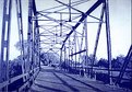
Critique By:
Betsy Hern (K:12872)
2/5/2004 11:14:02 AM
I saw your comment in the forums about blueprints and had to take a look, what a great idea! I'm going to have to do some research on this. I imagine you need a neg the same size as the blueprint, so large format here? I used to run hand-drawn pencil ad layouts through a blueprint processing machine (I can still smell the ammonia) in the 70's - whoa! am I that old?! I worked as a layout artist for a retail chain and everything was done with a pencil, no computers. We made blueprints, or ozalids of the layouts as a quick method of duplication, the layouts were very large and this was the cheapest way to get large copies. Now that I think about it, why not negs? You should write an article for this site, I'd love to read it and I imagine many others would, too. Thanks so much for the new idea. Oh, and this image is great, very cyanotypish. I like the way your eye is drawn through the bridge and off into the far horizon. You got a great range of blue tones through this so I imagine it was a sharp neg.
|
| Photo By: Reagen Ward
(K:79)
|
|
|
Critique By:
Betsy Hern (K:12872)
2/4/2004 5:21:01 PM
What a refreshingly simple, yet different composition. You are very clever. I believe that this would be just as effective with a blue, purple, red or any other color sky. However, this is a nice choice. One gets the feeling of a wonderfully sunny, very hot day -- something many of us who are currently experiencing the bitter cold of winter could really use. I too, like the figures anchored at the very bottom of the image. Nicely done.
|
| Photo By: Luigi Piccirillo
(K:142)
|
|
|
Critique By:
Betsy Hern (K:12872)
1/31/2004 7:22:00 PM
Boy I need some of this. I went to work yesterday in -11 degree weather and came home in 6+ gloom (fahrenheit). No sunshine for days. It's so nice to be able to log onto a site like this and get some sun rays when needed. There are a number of wonderful Ausie photogs here and I'm so glad they post warm images like this when it is winter in the US. This is a visually exciting image of colors and more colors. I love it! You made great use of natural light, the best lighting is that provided by Mother Nature. Color from top to bottom and everything in focus. Good job.
|
| Photo By: Lorinda Millar
(K:2580)
|
|
|
Critique By:
Betsy Hern (K:12872)
1/30/2004 8:53:04 PM
This reminds me of one of those old botanical illustrations found in science books because the detail is amazing. I took a look at your portfolio and was surprised to find that there weren't more florals, this one gave me the impression that you were an old hand at this sort of photography. I think you should explore this softer side more often. In addition to the detail and clever lighting, the composition/crop is what makes this so successful in my estimation. Nothing important is missing, there is just a bit of air all around the amaryllis and that wonderful strong green stem is both an anchor and a bright spot of color to give the image vibrancy. Green and red - I think this would make a terrific Christmas card. I grew a red amaryllis on my window sill once but it grew so fast and got so tall it fell over. I like this a lot!
|
| Photo By: David Yates
(K:4698)
|
|
|
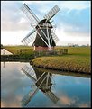
Critique By:
Betsy Hern (K:12872)
1/30/2004 8:42:15 PM
Your windmill shots are stunning, as are your tulips. And what else would I expect from a Netherlander? I have a dear friend who lives in Aalmsmeerderbrug, is that far from you? Someday I hope to visit and will be disappointed if I don't see the same wonderful sites you depict in your photos. The reflection in this one is super, you must have waited until just the right time of day. It is so nice to see a sunny day, it is cold and dark here in the Midwest, US.You have a very discerning eye and your portfolio of images is very soothing and artistic.
|
| Photo By: Teunis Haveman
(K:37426)
|
|
|
Critique By:
Betsy Hern (K:12872)
1/30/2004 5:09:43 PM
Ah yes, Glenbogle! I can see Molly, Killwillie, Archie, Lexie, Golly and Duncan (that's probably the one your daughter is mad about, he is the cutie who runs around in a kilt) traipsing around the estate in your photo, they're just behind that tree on the left. We are not current here with the series, Archie and Lexie just got married. Don't you dare tell me how it ends. I love the show for the scenery, which you've captured so beautifully here.
|
| Photo By: kita mcintosh
(K:18594)
|
|
|
Critique By:
Betsy Hern (K:12872)
1/28/2004 10:05:20 PM
Kita, what an eclectic mix of photos you have, I've looked at many in so many different styles. You're not afraid to try anything. I get so much energy just trolling around your portfolio. I'm not sure why I landed on this one but it's been a hectic day and this is sooooo soothing. We get Monarch of the Glen here on public tv and the beautiful scenery calls to me from the tv screen. I've been to Ireland, but there are not as many hills there. Is there really a Glenbogle castle? I imagine it somewhere in this wonderful photo.
|
| Photo By: kita mcintosh
(K:18594)
|
|