|
|
Critique By:
Kim Culbert (K:37070)
8/1/2004 12:03:27 AM
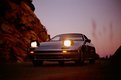
I know what you mean about cheap table scanners... I have one as well and the scans off of it are horrible. There is just a little grain in the sky from the scan, but the colours are very nice.
I find that there is too much black at the bottom of the frame... it's so heavy on the eye. Not that rules should always be followed, but I think here that the rule of thirds would help the composition.
|
| Photo By: Matthew Funk
(K:17)
|
|
|
Critique By:
Jocelyn Fong (K:1380)
7/30/2004 8:58:12 AM
I like the tight crop, it focus just on Mickey and his blanket. Great eye contact, looks very comfortable and at ease with being comfortable. Wonderful photo and thanks for sharing.
|
| Photo By: Matthew Funk
(K:17)
|
|
|
Critique By:
Marusnik Bela (K:11611)
7/30/2004 6:43:26 AM
Lovely kitty portrait, perfect technique, nice details.Congrats!
|
| Photo By: Matthew Funk
(K:17)
|
|
|
Critique By:
Carmem A. Busko (K:48785)
7/30/2004 1:30:15 AM
Cutie!
There?s another Mickey in UF:
http://www.usefilm.com/browse.php?mode=category&category_id =13&uid=28843
Thank you for sharing!
Carmem
|
| Photo By: Matthew Funk
(K:17)
|
|
|
Critique By:
Trish McCoy (K:15897)
7/30/2004 1:11:02 AM
oh my gosh!!!!!! this looks like my cat. the makings are alike.
look at my pic at
http://www.usefilm.com/image/506688.html
you would swear it is the same cat.  well ok enough on that. this is a beautiful photo of your cat. I love the blanket over him such a sweet shot. your colors are beautiful here too. well ok enough on that. this is a beautiful photo of your cat. I love the blanket over him such a sweet shot. your colors are beautiful here too.
|
| Photo By: Matthew Funk
(K:17)
|
|
|
Critique By:
Sally A. (K:4601)
7/30/2004 1:07:00 AM
OH Cute. He looks like my cat.
|
| Photo By: Matthew Funk
(K:17)
|
|
|
Critique By:
John Myers (K:4308)
7/30/2004 12:42:12 AM
i like the cropping you chose. the colors are very warm and pleasing. and, of course, little mikey is as adorable as ever.
|
| Photo By: Matthew Funk
(K:17)
|
|
|
Critique By:
Dubravko Grakalic (K:25235)
3/18/2004 11:49:14 PM
nice!
looks like paradise!!
|
| Photo By: Matthew Funk
(K:17)
|
|
|
Critique By:
Mal Zecevic (K:142)
6/30/2003 8:56:31 PM
nice picture. somewhat questionable composition though. reminds me a great deal of a car commerical or ad
|
| Photo By: Matthew Funk
(K:17)
|
|
|
Critique By:
Renee Robinson (K:2112)
3/12/2003 11:12:01 AM
Matt:
I really like this photo of your cat and though I don't yet understand a lot about photography I think you have done a very nice job with capturing a moment and the DOF. I love how the cat is holding the blanket in his mouth and I'm not really sure that the background is as distracting to me as it was to Deb. In fact, the background seems okay to me. Igave the photo an "8"
|
| Photo By: Matthew Funk
(K:17)
|
|
|
Critique By:
Deb Mayes (K:19605)
3/12/2003 4:02:24 AM
This is a good early effort, Matthew; Mikey's expression is priceless. The background clutter detracts somewhat, although the limited depth of field helps greatly. You could possibly crop the sides to get rid of even more of the distraction.
|
| Photo By: Matthew Funk
(K:17)
|
|
|
Critique By:
John Myers (K:4308)
3/8/2003 7:04:42 PM
matt, you need to post more. THE END.
|
| Photo By: Matthew Funk
(K:17)
|
|
|
Critique By:
Matthew Funk (K:17)
7/26/2002 5:31:09 PM
About the weed, I'm still getting used to the camera. Being split glass, I'm finding it hard knowing how the picture will come out. Basically there is a circle in the center that is in focus, but the rest is fuzzy. The depth of field preview always ends up too dark for me to tell so I rarely use it.
|
| Photo By: Matthew Funk
(K:17)
|
|
|
Critique By:
Kim Culbert (K:37070)
7/26/2002 11:26:11 AM
Love the colour and the lines but wish that the weeds on the right side of frame were not there. Everything about this screams advertisment, except those weeds. They kind of look like blemishes.
Other than that I think you've captured this car very well!
|
| Photo By: Matthew Funk
(K:17)
|
|
|
Critique By:
Terrence Kent (K:7023)
7/26/2002 8:36:46 AM
Great shot, doesn't look that grainy to me here even, this one is headed straight to a car ad in a magazine from 1986 hehe, quite a trip~
|
| Photo By: Matthew Funk
(K:17)
|
|
|
Critique By:
John Myers (K:4308)
7/26/2002 2:39:01 AM
matt, i love the colors in this shot. i wish my scanner didn't give it so much grain (though i see you got rid of quite a bit of it)...we're going to have to try this scan again...
|
| Photo By: Matthew Funk
(K:17)
|
|