|
|
Critique By:
Ahmet Bayrak (K:184)
1/30/2009 9:45:40 PM
Thank you Gianluca :)
|
| Photo By: Ahmet Bayrak
(K:184)
|
|
|
Critique By:
Ahmet Bayrak (K:184)
1/30/2009 9:45:06 PM
Thank you Dubravko :)
|
| Photo By: Ahmet Bayrak
(K:184)
|
|
|
Critique By:
Ahmet Bayrak (K:184)
1/30/2009 9:22:32 PM
Thank you very much for your interest Nick. I have also used some sharpening and contrast but this way seems to me better. But also the one you have done seems good although only you and me have looked at it :) Thnaks again, regards.
|
| Photo By: Ahmet Bayrak
(K:184)
|
|
|
Critique By:
Ahmet Bayrak (K:184)
1/30/2009 8:44:46 PM
Thank you very much for your interest Nick. I have also used some sharpening and contrast but this way seems to me better. But also the one you have done seems good although only you and me have looked at it :) Thnaks again, regards.
|
| Photo By: Ahmet Bayrak
(K:184)
|
|
|
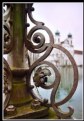
Critique By:
Ahmet Bayrak (K:184)
1/30/2009 8:35:55 PM
I mean the iron figure and the building apeared at the backside doesn't have any relation. e.g. if they both have circular figures it will be more interesting.
|
Photo By: Nick Karagiaouroglou
(K:127263)

|
|
|
Critique By:
Ahmet Bayrak (K:184)
12/26/2008 10:11:12 PM
if you can find some relational things aranged in such anorder i think it will more fascinating. For this picture it can be better to wait for a shiny day:)
|
| Photo By: Nick Karagiaouroglou
(K:127263)
|
|
|
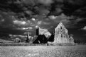
Critique By:
Ahmet Bayrak (K:184)
12/26/2008 9:47:26 PM
Good work, good use of infrared...:)
|
| Photo By: Abdulghani Alzahrani
(K:176)
|
|
|
Critique By:
Ahmet Bayrak (K:184)
12/26/2008 9:33:39 PM
Very creative :)
Difference of photographers, someones look and someones see :)
|
| Photo By: Riza Turak
(K:192)
|
|
|
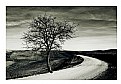
Critique By:
Ahmet Bayrak (K:184)
12/26/2008 9:30:53 PM
Really a good work. I liked your pictures' plainness. You have located tree and the road on to the right places :) And also B&W is another true choice I think.
|
| Photo By: Luciano Caturegli
(K:6609)
|
|
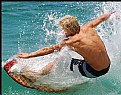
|
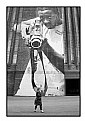
Critique By:
Ahmet Bayrak (K:184)
12/23/2008 8:15:46 PM
I liked the depth on the picture, in the people. Good shot.
|
| Photo By: Cristi Matei
(K:57)
|
|
|
Critique By:
Ahmet Bayrak (K:184)
9/25/2008 9:50:03 PM
A nice portrait and we should thank to the model also :)
|
| Photo By: Alvin Riesbeck
(K:2751)
|
|
|
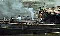
Critique By:
Ahmet Bayrak (K:184)
9/23/2008 12:04:08 PM
Hello Indranil, probably you are not using a SLR. Because there is a cloud towards the boat. And dissisipating it is easer with the SLRs. But i think nice composition.
Regards...
|
| Photo By: Indranil Ray
(K:2035)
|
|
|
Critique By:
Ahmet Bayrak (K:184)
9/23/2008 11:56:29 AM
Good idea, nice shot. But i wish i could see the whole cigarette.
I should say:
NO SMOKING!
:)
|
| Photo By: debasish nandy
(K:99)
|
|
|
Critique By:
Ahmet Bayrak (K:184)
9/23/2008 11:49:19 AM
Very nice composition i think. Maybe you can use a bit more contrast.
Congratulations...:)
|
| Photo By: john conway
(K:1751)
|
|
|
Critique By:
Ahmet Bayrak (K:184)
9/19/2008 4:11:31 PM
Urbanization is a big problem!
Nice shot :)
|
| Photo By: Lukasz Rzepinski (Łukasz Rzepiński)
(K:1211)
|
|
|
Critique By:
Ahmet Bayrak (K:184)
9/19/2008 4:07:42 PM
Nice and different composition
|
| Photo By: Agnieszka Borkowska
(K:1427)
|
|
|
Critique By:
Ahmet Bayrak (K:184)
8/27/2007 8:39:42 PM
Thanks Bartosz :)
|
| Photo By: Ahmet Bayrak
(K:184)
|
|
|
Critique By:
Ahmet Bayrak (K:184)
8/26/2007 6:55:52 PM
A common view has turned to a very nice photograph. Congratulations Rick :)
|
| Photo By: Rick Page
(K:5242)
|
|
|
Critique By:
Ahmet Bayrak (K:184)
8/26/2007 6:28:42 PM
Enough to give the emotion. Very good shoot for journalism category.
Regards Sandra:)
|
| Photo By: Sandra Berry
(K:8352)
|
|
|
Critique By:
Ahmet Bayrak (K:184)
8/11/2007 10:25:08 PM
Your photo is like the ones used in photography books to teach people the basic rules of composition. You know 1/3 rule. But the column, I wish you wouldn't take it to the view.
Regards :)
|
| Photo By: Miladin Mareš
(K:3384)
|
|
|
Critique By:
Ahmet Bayrak (K:184)
8/11/2007 10:21:15 PM
Not only looks :) Also you are very successful at using the aperture. Besides the frame is also going well with your photo but a bit thin is maybe better.
Regards...:)
|
| Photo By: Atish Sen
(K:6346)
|
|
|
Critique By:
Ahmet Bayrak (K:184)
8/11/2007 10:10:05 PM
İlk görüşte tanıdım :) "malum" açı dışında daha değişik bir bakış açısı kullanmanız daha başarılı bir fotoğraf çıkarabilirdi diye düşünüyorum.
Elinize sağlık...:)
|
| Photo By: K. Gokhan TERCAN
(K:187)
|
|
|
Critique By:
Ahmet Bayrak (K:184)
8/9/2007 11:02:27 PM
Using the reflection is successful; however, the things between the real and reflected building is not understandable. This is of course not a rule but I think it would be much better to let them appear. So it would be easier to understand what is going on around.
Regards, Ahmet :)
|
| Photo By: Momento Eterno (Carmen Spitznagel)
(K:1177)
|
|
|
Critique By:
Ahmet Bayrak (K:184)
8/9/2007 10:56:54 PM
Looking is not like the common similing ones. And makes your work different and I think it much better to be different to take interest.
Regards, Ahmet :)
|
| Photo By: Pawel Chrzanowski
(K:453)
|
|
|
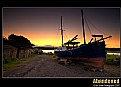
Critique By:
Ahmet Bayrak (K:184)
8/9/2007 10:51:15 PM
Amazing Hore. Probably the witches has just leave there. And B&W is also makes your photo more interesting. Good work :)
|
| Photo By: Valdis Dannenbergs
(K:71)
|
|
|
Critique By:
Ahmet Bayrak (K:184)
8/9/2007 10:48:13 PM
Good work Paul. Nice colours, nice composition.
Regards :)
|
| Photo By: Paul Schofield
(K:5970)
|
|
|
Critique By:
Ahmet Bayrak (K:184)
8/9/2007 10:32:57 PM
Nice composition Ian. The frame is ok but I tihnk it would be much better to write the name of your phot inanother way. The writing takes interest much more than the photo.
Regards...:)
|
| Photo By: Ian Sweet
(K:474)
|
|
|
Critique By:
Ahmet Bayrak (K:184)
8/9/2007 10:18:13 PM
Enough to feel fresh water :)
A bit more large angle view will make your work better I think
Regards Ed.
|
| Photo By: Ed Krebs
(K:958)
|
|
|
Critique By:
Ahmet Bayrak (K:184)
8/8/2007 9:54:38 PM
Sağol Marcelo.
|
| Photo By: Ahmet Bayrak
(K:184)
|
|
|
Critique By:
Ahmet Bayrak (K:184)
8/8/2007 5:11:16 PM
This is the difference of looking and seeing.
Congratulations Jacek
|
| Photo By: Jacek Komorowski
(K:79)
|
|