|
|
Critique By:
meprivacynet@meprivacy.net meprivacynet@meprivacy.net (K:3974)
11/15/2002 12:04:23 PM
Just let it be - it is good !
|
| Photo By: Jennifer Sablan
(K:79)
|
|
|
Critique By:
Anne E. M. Zang (K:4135)
11/15/2002 5:23:23 AM
Hello again. Now I think I like your original better. I guess that just goes to show how much my comments are worth...you now know you can ignore them. Keep posting!
|
| Photo By: Jennifer Sablan
(K:79)
|
|
|
Critique By:
Jennifer Sablan (K:79)
11/14/2002 2:41:54 PM
Thanks for the comments, Deb and Anne. How is this crop?
|
| Photo By: Jennifer Sablan
(K:79)
|
|
|
Critique By:
Anne E. M. Zang (K:4135)
11/14/2002 1:10:18 PM
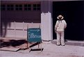
I like it. I think it might be effective to crop the left about to the sign and a bit of the right. The way I look at it, the space to the left of the sign isn't really contributing a whole lot to the overall pic...Cutting some of that out might bring more focus to the lady and her funny little pose right next to the sign. Interesting photo opp!
|
| Photo By: Jennifer Sablan
(K:79)
|
|
|
Critique By:
Deb Mayes (K:19605)
11/14/2002 12:55:18 PM
This is too funny, Jennifer - neat shot!
|
| Photo By: Jennifer Sablan
(K:79)
|
|
|
Critique By:
Jennifer Sablan (K:79)
11/13/2002 2:07:02 PM
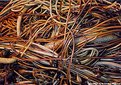
Thanks, Dawna. Yes, the confusion was what I was going for - so I'm glad you were confused. I did try to put some sort of order in the composition -- I see it as cut into fourths - the big seaweed stalk is the horizontal division and then the vertical division is several small strands all going up/down. But I could be completely wrong -- probably am... I'm still learning (and not very quickly since I don't have a lot of time for picture taking these days.)
I appreciate any and all comments.... so those of you who rated my pic - can you come back and make a comment? Tell me what you think should be changed or if the subject is just wrong or what? Thanks!
|
| Photo By: Jennifer Sablan
(K:79)
|
|
|
Critique By:
Dawna G. (K:7709)
11/13/2002 9:56:21 AM
excellent sharpness and tones to this Jennifer. I find the image a little confusing to the eye, but that is the point afterall, isnt it? hence the title! well seen.
|
| Photo By: Jennifer Sablan
(K:79)
|
|
|
Critique By:
Jennifer Sablan (K:79)
10/14/2002 1:13:01 PM
Good point! It does look that way - but the bath was in the garage and to the left. =) Maybe I'll change the title if possible. Thanks!
|
| Photo By: Jennifer Sablan
(K:79)
|
|
|
Critique By:
Les Anderson (K:555)
10/14/2002 1:09:44 PM
Just curious, if that lady did indeed turn left, where would she be, not in the bathroom, which seems to be to the right, according to the arrow
on the sign!
Hope you post some more pictures soon. And good luck with cropping my shots. I am always open to opinions and critique. It would also be nice if people would comment on
a shot if they think it is "bang on" That way the amateur (Me!) would know if he/she is doing a good job eh!
|
| Photo By: Jennifer Sablan
(K:79)
|
|
|
Critique By:
Jennifer Sablan (K:79)
10/14/2002 10:34:46 AM
Thanks, Les --
I agree the color on the board is a bit faded, but I think that's a scanner issue, because the colors seem much brighter on the actual print.
I run into the same problem with 100 v 400 v 800... I try to match the ASA # to my goal for the pictures, but I can't afford to "waste" film by switching from 100 to 800, for example, half-way through the roll if lighting or what have you changes. But I will keep experimenting!
|
| Photo By: Jennifer Sablan
(K:79)
|
|
|
Critique By:
Les Anderson (K:555)
10/11/2002 10:20:10 AM
Okay, I showed you mine, now I am looking at yours!
I am not criticizing this as I am far from being a critic, being relatively novice.
The color is good on the holder but the board itself is faded.(in my eye)
I am goingto use asa 100 on outdoor pictures as one of my critics suggested it.
I have been using 800 because sometimes I am out all day and lighting does change as the day wears on.
I also have a book of pictures that shows abstract topics. i am going to play with objects and keep experimenting
Have fun!
|
| Photo By: Jennifer Sablan
(K:79)
|
|