|
|
Critique By:
Jennifer Sablan (K:79)
11/14/2002 2:41:54 PM
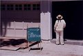
Thanks for the comments, Deb and Anne. How is this crop?
|
| Photo By: Jennifer Sablan
(K:79)
|
|
|
Critique By:
Jennifer Sablan (K:79)
11/13/2002 2:07:02 PM
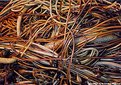
Thanks, Dawna. Yes, the confusion was what I was going for - so I'm glad you were confused. I did try to put some sort of order in the composition -- I see it as cut into fourths - the big seaweed stalk is the horizontal division and then the vertical division is several small strands all going up/down. But I could be completely wrong -- probably am... I'm still learning (and not very quickly since I don't have a lot of time for picture taking these days.)
I appreciate any and all comments.... so those of you who rated my pic - can you come back and make a comment? Tell me what you think should be changed or if the subject is just wrong or what? Thanks!
|
| Photo By: Jennifer Sablan
(K:79)
|
|
|
Critique By:
Jennifer Sablan (K:79)
10/14/2002 1:13:01 PM
Good point! It does look that way - but the bath was in the garage and to the left. =) Maybe I'll change the title if possible. Thanks!
|
| Photo By: Jennifer Sablan
(K:79)
|
|
|
Critique By:
Jennifer Sablan (K:79)
10/14/2002 12:27:04 PM
I'm hesitant to add constructive criticism comments to most of the photos on this site, simply because there are so many good photographers that know a lot more than I do. And in this case, I can't find anything wrong with it.
Just wanted to say: I love this shot. I like the semi-symmetrical jagged lines above the table, the particular color red of the shot, and the way the table reflects on the cue ball and ends just above the top of the cue stick, so that there is a pattern of horizontal stripes.
Just looking at all these great pictures is inspiring!
|
| Photo By: Mark Warmus
(K:17)
|
|
|
Critique By:
Jennifer Sablan (K:79)
10/14/2002 10:45:34 AM
Les - I'm trying again 'cause my crop suggestion came out looking exactly like your photo... if this doesn't work, I'm just giving up. =)
|
| Photo By: Les Anderson
(K:555)
|
|
|
Critique By:
Jennifer Sablan (K:79)
10/14/2002 10:44:09 AM
Les -- I like the composition except for the blue-green rectangle in the lower left corner. And maybe consider cropping some of the space above her head? What do you think?
|
| Photo By: Les Anderson
(K:555)
|
|
|
Critique By:
Jennifer Sablan (K:79)
10/14/2002 10:37:34 AM
Looks like a fun sport - I think I'd like the picture better if 1) the lead horse could be fully seen and 2) the background wasn't so cluttered. Maybe a higher angle could have gotten a view of the horses with the dirt as the background? I don't know, just suggesting.
Jen
|
| Photo By: Les Anderson
(K:555)
|
|
|
Critique By:
Jennifer Sablan (K:79)
10/14/2002 10:34:46 AM
Thanks, Les --
I agree the color on the board is a bit faded, but I think that's a scanner issue, because the colors seem much brighter on the actual print.
I run into the same problem with 100 v 400 v 800... I try to match the ASA # to my goal for the pictures, but I can't afford to "waste" film by switching from 100 to 800, for example, half-way through the roll if lighting or what have you changes. But I will keep experimenting!
|
| Photo By: Jennifer Sablan
(K:79)
|
|
|
Critique By:
Jennifer Sablan (K:79)
10/11/2002 8:49:46 AM
Take my comment with a grain of salt, 'cause I'm just a beginner (and this is my first comment on usefilm! -- lucky you ;-) ). But as a viewer of the photo, I would have liked the bee to be either sharper or in greater contrast with the plant behind it.
|
| Photo By: Kim Barke
(K:278)
|
|