|
|
Critique By:
Barry Tipping (K:959)
11/10/2002 6:36:12 AM
Elegant...nice work...
|
| Photo By: Misty Woodward
(K:18)
|
|
|
Critique By:
Barry Tipping (K:959)
11/10/2002 6:34:37 AM
Pretty...nice composition and expression...forehead is a tad hot...if anyone complains about the hair in her eye...ignore them... 
|
| Photo By: Rob James
(K:210)
|
|
|
Critique By:
Barry Tipping (K:959)
11/9/2002 5:13:03 AM
Mark,
Pretty girl...pose is nice and casual, but the background is a little distracting. Did you do any closeups of her?
|
| Photo By: Mark Warmus
(K:17)
|
|
|
Critique By:
Barry Tipping (K:959)
11/8/2002 4:25:29 PM
Pretty...how was the background accomplished?
|
| Photo By: Ariane Drefke
(K:0)
|
|
|
Critique By:
Barry Tipping (K:959)
11/8/2002 6:41:53 AM
Pretty. The shadow across your mouth doesn't compliment the picture though...
|
| Photo By: Emily Enderes
(K:192)
|
|
|
Critique By:
Barry Tipping (K:959)
11/3/2002 5:50:27 PM
You are adorable Emily. Try to get a little more light on your face, or change the digital camera's exposure. Keep shooting!
|
| Photo By: Emily Enderes
(K:192)
|
|
|
Critique By:
Barry Tipping (K:959)
11/3/2002 6:46:57 AM
Nice to meet you Jackie...nice eyes...the lock of hair in your face is a nice touch...keep 'em coming!
|
| Photo By: Jackie Card
(K:52)
|
|
|
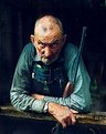
Critique By:
Barry Tipping (K:959)
11/2/2002 4:25:14 AM
Time to work for National Geographic Don. Great exposure and expression!
|
| Photo By: Don Martel
(K:551)
|
|
|
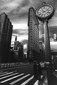
Critique By:
Barry Tipping (K:959)
10/31/2002 5:49:07 AM
This is an amazing structure...too bad the trees kind of pull you back to reality. It has a kind of Rendezvous with Rama vibe to it...nice work!
|
| Photo By: chris meyer
(K:597)
|
|
|
Critique By:
Barry Tipping (K:959)
10/31/2002 5:47:39 AM
William, if I've said it once, I've said it a thousand times,
don't drop acid and play with Kai's Photo Soap...
|
| Photo By: William R Eastman III
(K:2141)
|
|
|
Critique By:
Barry Tipping (K:959)
10/30/2002 1:33:18 PM
Nice work Emily...try putting your camera on a tripod and shooting a straight-on self portrait (example attached).
|
| Photo By: Emily Enderes
(K:192)
|
|
|
Critique By:
Barry Tipping (K:959)
10/30/2002 1:16:38 PM
Mark, I think what you are observing is a widely-held, though unspoken hatred of mimes...
|
| Photo By: Michael Busselle
(K:221)
|
|
|
Critique By:
Barry Tipping (K:959)
10/26/2002 4:07:44 AM
Florian,
Nice composition. I don't know if the scan softened the scan, but in the attachment, I increased the catchlight size...
|
| Photo By: Florian Scheiblbrandner
(K:49)
|
|
|
Critique By:
Barry Tipping (K:959)
10/22/2002 5:06:04 PM
Brilliant, as usual. I love the texture on the lattice and the Dali-esque waviness of the fork. Bravo!
|
| Photo By: Andrew Polushkin
(K:311)
|
|
|
Critique By:
Barry Tipping (K:959)
10/21/2002 8:28:14 PM
Disturbing on so many levels...
|
| Photo By: Susan Hartman
(K:17)
|
|
|
Critique By:
Barry Tipping (K:959)
10/20/2002 4:55:34 PM
Daniel,
Your light source at camera left is so broad as diminish the catchlights in her eyes. While still a good portrait, her eyes could stand to "pop out" a little. You might also black-out the reflection off her earring. See attachment...
|
| Photo By: Daniel Flynn
(K:586)
|
|
|
Critique By:
Barry Tipping (K:959)
10/20/2002 3:19:39 PM
I don't usually comment on nature photography, but this combination of colors and composition is very good! Congrats!
|
Photo By: Mary Sue Hayward
(K:17558)

|
|
|
Critique By:
Barry Tipping (K:959)
10/15/2002 1:00:44 PM
Pretty. I like the pastel lighting...
|
| Photo By: Jimmy Estimada
(K:-7)
|
|
|
Critique By:
Barry Tipping (K:959)
10/12/2002 4:21:37 PM
A nice relaxed portrait. You're eyes hint at a mischevious side! Here it is with a solid background...
|
| Photo By: Emily Enderes
(K:192)
|
|
|
Critique By:
Barry Tipping (K:959)
10/11/2002 4:34:26 PM
Cool...surreal...
|
| Photo By: Aurore Lynch
(K:1687)
|
|
|
Critique By:
Barry Tipping (K:959)
10/10/2002 1:17:12 PM
Manuel,
Nice concept. That light in the corner kind of distracts from the "pain" message...cropping?
|
| Photo By: manuel valgode lopes vall
(K:0)
|
|
|
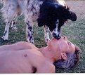
Critique By:
Barry Tipping (K:959)
10/6/2002 5:58:53 PM
Well at least they're wearing protection...
|
| Photo By: Jon Rank
(K:683)
|
|
|
Critique By:
Barry Tipping (K:959)
10/3/2002 5:35:32 PM
This is very striking...
I disagree with Arthur, this angle diminishes her nose and focuses attention on her eyes, mouth, and bone structure...superb work!
|
| Photo By: Rene Asmussen
(K:138)
|
|
|
Critique By:
Barry Tipping (K:959)
10/3/2002 5:32:00 PM
I like the composition of this...its even got "Polushkin-tone"...
|
| Photo By: Jason Bennett
(K:213)
|
|
|
Critique By:
Barry Tipping (K:959)
9/22/2002 5:24:21 AM
Nathan, you are really exploring a lot of neat figure studies. Keep it up!
|
| Photo By: nathan combs
(K:2242)
|
|
|
Critique By:
Barry Tipping (K:959)
9/22/2002 5:17:09 AM
Great self-portrait Samantha... I'm perplexed as to how you can have a shadow on the right side of your nose...
|
| Photo By: samantha marie
(K:378)
|
|
|
Critique By:
Barry Tipping (K:959)
9/20/2002 4:00:32 AM
Great shot!
|
| Photo By: Preston Heller
(K:15)
|
|
|
Critique By:
Barry Tipping (K:959)
9/15/2002 3:36:45 PM
Just when I was about to go to sleep...
Nice pic!
|
| Photo By: Terrence Kent
(K:7023)
|
|
|
Critique By:
Barry Tipping (K:959)
9/14/2002 2:11:37 PM
Neat pic Nathan...Are we looking at the top of a shoulder, down the arm with a slight bulge of bicep?
|
| Photo By: nathan combs
(K:2242)
|
|
|
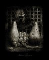
Critique By:
Barry Tipping (K:959)
9/8/2002 5:55:55 AM
Another brilliant and disturbing piece Andrew. I think the theme of decay is fascinating with the fruit and the flower. Where people now associate a certain tone with Sepia, in the future the tone represented by your work should simply be referred to as "Polushkin"...
|
| Photo By: Andrew Polushkin
(K:311)
|
|