|
|
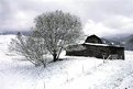
Critique By:
kennard (K:106)
3/22/2005 1:46:10 AM
Nice composition and B&W look. very nicely done.
|
| Photo By: Angela Lynn
(K:1483)
|
|
|
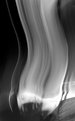
Critique By:
kennard (K:106)
3/20/2005 3:30:03 PM
Very interesting! How did you do this?
|
| Photo By: Qasem Shukran
(K:303)
|
|
|
Critique By:
kennard (K:106)
7/25/2004 4:39:18 PM
Very interesting filtering. Nice composition.
|
| Photo By: Jose Ignacio (Nacho) Garcia Barcia
(K:96391)
|
|
|
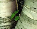
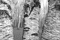
Critique By:
kennard (K:106)
10/31/2003 12:38:41 PM
Is there any better tree to shoot than a birch? I think not. Nice work!
|
| Photo By: Luke Luther
(K:14693)
|
|
|
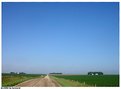
Critique By:
kennard (K:106)
10/31/2003 12:35:31 PM
I enjoy the depth of perspection you evoke in many of your photos. For some reason I long to see a small child standing on the road in the foreground, wearing a black hat. But then, I'm strange.
|
| Photo By: Teunis Haveman
(K:37426)
|
|
|
Critique By:
kennard (K:106)
8/13/2002 10:22:44 PM
Thank you, Kenneth. I take your comments as high compliment. Your landscapes are simply amazing.
|
| Photo By: kennard
(K:106)
|
|
|
Critique By:
kennard (K:106)
6/27/2002 11:14:13 AM
It's a nice landscape, but it shouldn't be listed in the "Pictures of Our Members" category. At least I don't see you in the shot.
|
| Photo By: peter de haan
(K:38)
|
|
|
Critique By:
kennard (K:106)
6/27/2002 11:08:40 AM
I have to agree that the composition on this doesn't give the feeling of climbing. (I am a climber, BTW.) For all we know, the person could simply standing next to a rock wall. If you would have taken the shot from an extemely low angle, you might have been able to include his feet off the ground without being off the ground youself.
|
| Photo By: Damon Marcus Lewis
(K:59)
|
|
|
Critique By:
kennard (K:106)
4/14/2002 8:52:08 PM
I looked at this and thought, "looks like something a geocacher would shoot." Then I looked at your portfolio and sure enough... a geocacher! Even though it's not the classic time of year to shoot landscapes, it's a challenge to achieve good the right balance and composition, and you did it nicely here.
|
| Photo By: Lisa Brainard
(K:743)
|
|
|
Critique By:
kennard (K:106)
4/14/2002 8:47:20 PM
I like this image a lot. You may want to fade out the stars that are lower in the sky as they approach the atmosphere. They seem a little too bright down there. Otherwise, a very compelling image.
|
| Photo By: Frank Hettick
(K:119)
|
|
|
Critique By:
kennard (K:106)
4/7/2002 10:08:08 PM
Nice job of straigtening the vertical lines. How did you accomplish this?
|
| Photo By: Brett Whitehead
(K:0)
|
|
|
Critique By:
kennard (K:106)
4/1/2002 4:10:34 PM
Kim, thanks for the constructive comments. I hadn't thought about having a focal point to catch the eye, but that's an interesting idea.
|
| Photo By: kennard
(K:106)
|
|
|
Critique By:
kennard (K:106)
4/1/2002 3:49:35 PM
It breaks basic photography rules? Great!
The reason for the name is that we were searching for a geocache called "Owl Hunt" when I took this shot. I agree that I could have chosen a better name.
|
| Photo By: kennard
(K:106)
|
|
|
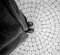
Critique By:
kennard (K:106)
3/31/2002 3:21:34 PM
Very nice. I love the simplicity of the shot and the way the feet seem to violate the circle.
|
| Photo By: David Chang-Sang
(K:680)
|
|
|
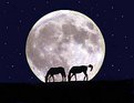
Critique By:
kennard (K:106)
3/31/2002 3:18:23 PM
I have to agree that the stars don't look right. When you expose for a full moon you don't capture images of stars. The composition is nice, though somewhat formal.
|
| Photo By: dennis fowler
(K:58)
|
|
|
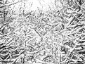
Critique By:
kennard (K:106)
3/27/2002 3:00:38 PM
Nice composition. I like the close-ups to show texture. I would like to see more contrast in the image. It looks as though you and I favor similar subject matters for our photos. Keep up the good work.
|
| Photo By: Mia
(K:188)
|
|
|
Critique By:
kennard (K:106)
3/27/2002 7:40:11 AM
Here's an exterior view of the same trees.
|
| Photo By: kennard
(K:106)
|
|
|
Critique By:
kennard (K:106)
3/21/2002 8:49:07 AM
Here's the original shot before enhancement
|
| Photo By: kennard
(K:106)
|
|
|
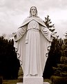
Critique By:
kennard (K:106)
3/20/2002 7:26:43 AM
The background is rather contrasty to the point of distraction. Would like to see more emphasis on the statue -- perhaps closer to the face and more of an angle?
|
| Photo By: David Chang-Sang
(K:680)
|
|
|
Critique By:
kennard (K:106)
3/20/2002 7:23:08 AM
Nice use of PS to add an unusual twist to lines we usually see as straight and rigid. Your photo title ties it together nicely.
|
| Photo By: Antonio napoli
(K:0)
|
|
|
Critique By:
kennard (K:106)
3/19/2002 8:34:17 PM
I like the starkness of the silhouette against the vibrant sky. However, the color of the light coming through the windows doesn't seem to match up correctly. It seems too bright against the sunset. Maybe the windows could be more subdued. Nice composition.
|
| Photo By: dennis fowler
(K:58)
|
|
|
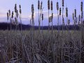
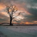
Critique By:
kennard (K:106)
3/19/2002 8:28:55 PM
I was immediately attracted to this shot because I have an oak tree that I have also claimed for the same type of four-seasons shots. Interesting to see you're using a GPS to mark the location, because that's what I'm doing too. I'll upload a shot of it tomorrow. I like how you positioned the tree at the gap in the clouds, as if it's reaching up through them, or maybe the branches are creating the gap. Nice job.
|
| Photo By: Joe Shupienis
(K:19)
|
|
|
Critique By:
kennard (K:106)
3/19/2002 8:19:33 PM
Thanks for the comments. This is my first submission here after discovering this site today. I didn't have to do much with this photo in PS. All I did was desaturate, bumpe up the contrast on the trees in the foreground, and add a blue in the duotone.
|
| Photo By: kennard
(K:106)
|
|