|
|
Critique By:
Moayad H (K:252)
8/1/2004 8:31:07 PM
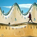
Penang is a beautiful island in the westren part of malaysia. I'll post some of the best photos that I took there in the next few days 
|
| Photo By: Moayad H
(K:252)
|
|
|
Critique By:
[[dead account]] (K:6692)
8/1/2004 8:11:00 PM
This shot is very cool and it's even more evocative because it's in black and white.
Where in Malaysia is Benang?
|
| Photo By: Moayad H
(K:252)
|
|
|
Critique By:
Moayad H (K:252)
7/31/2004 4:48:45 AM
The dark area in the top left is not a shadow, it's the seiling.
Thank you Travis for the comment.
|
| Photo By: Moayad H
(K:252)
|
|
|
Critique By:
Moayad H (K:252)
7/31/2004 3:19:59 AM
Thank u Ameed for ur comment
Hope to see u in Kuwait soon 
|
| Photo By: Moayad H
(K:252)
|
|
|
Critique By:
Ameed El-Ghoul (K:42215)
7/30/2004 1:50:10 AM
Ohh yeah, my bloved old kuwait, thanks for bringing nice memories to me  cheers, cheers,
|
| Photo By: Moayad H
(K:252)
|
|
|
Critique By:
Adelino Barreto (K:12661)
1/25/2004 2:28:44 PM
Good photo,Moayad!
Regards.
|
| Photo By: Moayad H
(K:252)
|
|
|
Critique By:
Hanna Segal (K:13469)
12/22/2003 9:30:55 AM
Excellent idea. The framing is very cool, too.
|
| Photo By: Moayad H
(K:252)
|
|
|
Critique By:
karen barnett (K:4237)

6/23/2003 4:04:01 AM
This is a strong photograph, and one with tremendous solitary appeal.
Ths shadows-diaginal, and the structure-verticle and the repetition all fit to make this an excellent photograph
|
| Photo By: Moayad H
(K:252)
|
|
|
Critique By:
Abeer Al Jarsh (K:10209)
6/20/2003 10:42:33 PM
nice shot
|
| Photo By: Moayad H
(K:252)
|
|
|
Critique By:
Athoob Abdullah (K:18)
6/20/2003 2:43:49 PM
sorry for the sha5abeet elli foog :P
anyway, the picture is beautiful and i think its taken in spring time of kuwait
its nice cuz u took it 
|
| Photo By: Moayad H
(K:252)
|
|
|
Critique By:
Athoob Abdullah (K:18)
6/20/2003 2:38:56 PM
ÇáÕæÑÉ ÍáæÉ æ ÇáãßÇä åWÇ ÇÊÕæÑ Çäå Êã ÊÕæíÑå Ýí ÇáÑÈíÚ
ÈÓ áæ ßÇäÊ ÇáÇÖÇÁÉ Ôæí ÇYæì ßÇäÊ ÇÝÖá 
ÊÓáã ÇáÇíÏ Çááí ÕæÑÊ
|
| Photo By: Moayad H
(K:252)
|
|
|
Critique By:
Jose Ignacio (Nacho) Garcia Barcia (K:96391)
6/20/2003 2:10:18 PM
bucolic.beautiful landscape.
|
| Photo By: Moayad H
(K:252)
|
|
|
Critique By:
Aiman Nassar (K:11961)
4/3/2003 2:04:11 PM
simple and strong Mo2yad...still think it could be sharper.
|
| Photo By: Moayad H
(K:252)
|
|
|
Critique By:
Suhaila SAHMARANI (K:213)
1/7/2003 12:48:07 PM
Hy there, this is not a necklace its a shaplest, its more used by arabes yes....it looks nice shaplest my freind, and good idea to hv the shoot...keep going...wish you luck..
Suhaila
|
| Photo By: Moayad H
(K:252)
|
|
|
Critique By:
Travis Donovan (K:259)
11/15/2002 5:48:43 PM
I really like the texture and tone of this picture. It's an interesting subject and perspective; however, the one thing that bothers me would have to be that dark shadow in the top left. It just seems so unnatural and out of place. Otherwise, it's a nice shot.
|
| Photo By: Moayad H
(K:252)
|
|
|
Critique By:
Moayad H (K:252)
11/12/2002 11:05:45 AM
Thanks all for your Comments. I will add more pics from the same location soon.
|
| Photo By: Moayad H
(K:252)
|
|
|
Critique By:
Jun Ma (K:511)
11/12/2002 5:11:11 AM
Do you think a wider lens will make it more dramatic?
|
| Photo By: Moayad H
(K:252)
|
|
|
Critique By:
Aiman Nassar (K:11961)
11/12/2002 4:32:32 AM
Beautiful composition, lead on prespective, ends up at the horizon of the sea... wish if it was 2/3 stop down... I think a little more contrast would have added more beauty to the picture.
a
|
| Photo By: Moayad H
(K:252)
|
|
|
Critique By:
Athoob Abdullah (K:18)
11/12/2002 2:58:54 AM
excellent 
|
| Photo By: Moayad H
(K:252)
|
|
|
Critique By:
dimitris theocharis (K:-276)
8/31/2002 11:09:29 AM
Such a simple but yet effective image. I love the colour.
|
| Photo By: Moayad H
(K:252)
|
|
|
Critique By:
Moayad H (K:252)
8/7/2002 5:25:44 PM
The proplem is not with the focus, the noise/grain you see is coming from converting the pic from color to B&W
|
| Photo By: Moayad H
(K:252)
|
|
|
Critique By:
Athoob Abdullah (K:18)
8/7/2002 4:51:43 PM
Hi, its shapely nice but it would look much better if its focused.

|
| Photo By: Moayad H
(K:252)
|
|
|
Critique By:
Moayad H (K:252)
7/29/2002 11:07:26 AM
I almost forgot about this one 
Thank you Bill.
|
| Photo By: Moayad H
(K:252)
|
|
|
Critique By:
Moayad H (K:252)
7/25/2002 6:16:01 PM
First of all .. thank you for your comment.
I don't want to defend myself but.. take another look at the pic and read the following:
1)I AM low ! I think you was cheated by prespective of the ground. If you ever been to the beach when the tide is low you would notice that the land it self is makes a slope . look at the attached illistration. and that lead us to no.2
2) Maybe I dont WANT to get lower that this. because if i got any lower the horizon line would show, and I want my subject to be "floating" in sandy space without the HL.
3) Who said that MUST lower the camera and get down on your knees to shoot kids?
|
| Photo By: Moayad H
(K:252)
|
|
|
Critique By:
Jun Ma (K:511)
7/15/2002 12:03:09 AM
Another example of kids in the eye of adults. Whenever I see a picture like this, I always think what it would look like if we get down on our knees and lower the camera... then we might catch more details of the kids' faces...
|
| Photo By: Moayad H
(K:252)
|
|
|
Critique By:
Moayad H (K:252)
6/29/2002 6:13:23 AM
Ok.. let me share some secrets 
first of all, yes, I devoloped this picture. In reality it's a normal BW photo.. the green tone you see came from bad scaning :/ . I tried to desature it in PS to get rid of the greenesh look but I liked it more with the incorrect color 
I took this pic on my way to college about 7:45 am. I don't know what the shutter speed was but the f-stop was kind of wide  I really didn't have much time to set these things I really didn't have much time to set these things 
|
| Photo By: Moayad H
(K:252)
|
|
|
Critique By:
Katia Cutrone (K:12940)
6/28/2002 5:21:36 AM
WOW!
This is a great shot, really. I like the gray tonality (did you devolop by your self?) and I'm also courios to know which "time" did you choose for a movement-picture from your auto.
Great work.
Katia
|
| Photo By: Moayad H
(K:252)
|
|
|
Critique By:
Moayad H (K:252)
5/30/2002 4:57:24 PM
thanks Mary ..
as for the focus.. it's not from the picture, it's from scaning 
I have many B&W pirnts that I can't post because of the lack of a good scanner. I'm using my digital camera to copystand the prints.
I have many more pics of my dummy friend  .. I'll post them as soon as I can. .. I'll post them as soon as I can.
|
| Photo By: Moayad H
(K:252)
|
|
|
Critique By:
Mary Sue Hayward (K:17558)

5/29/2002 4:46:15 PM
Moayad, you captured a nice rim light on the edge of the figure, but the bright light across the top of the image cuts into the rim light on the head, which is distracting. I'd love to see the same shot with the dummy more in focus and the background brightness more even. I have wondered about playing with on of these figure models, and am glad you are doing it.
|
| Photo By: Moayad H
(K:252)
|
|
|
Critique By:
Moayad H (K:252)
5/11/2002 6:37:21 AM
First of all ... thank you for your comment, and don't worry.. I won't shoot you :-)
Second, I don't know what this thing is called either ;-) we call it Mesbah (Arabic).
I will post more pictures from the same bed, maybe some one can tell us what this Necklace is called in English :-\
|
| Photo By: Moayad H
(K:252)
|
|


