|
|
Critique By:
Kim Culbert (K:37070)
9/15/2005 2:28:29 AM
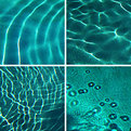
I love how all the lines in each image seem to pull me to the centre and into the rest of the shots. It's like a cycle...
And I love water, so this is great to me! Nice matching tones, especially in the top right and lower left... gives it a nice sense of balance!
Creative and unique... of course it's Stefan's!
|
| Photo By: Stefan Engström
(K:24473)
|
|
|
Critique By:
Kim Culbert (K:37070)
9/15/2005 2:15:19 AM
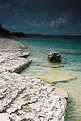
hahahha, I thought that this was like those cardboard cut-outs that you can stick your face through and take pictures, only this one you can stick your legs through and it looks like you are leaning against a car!!!! No more sugar for me tonight!
Anyways, it is a very cool effect!
|
| Photo By: sonny saenz
(K:2423)
|
|
|
Critique By:
Kim Culbert (K:37070)
9/15/2005 2:12:09 AM
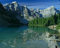
I think that the ND is too dark... that's why there is such a difference between the foreground and the sky.
If you have a 1 stop and 2 stop grad ND try bracketing your shots... do one with the 1 stop, one with the 2 stop and maybe even 1 with both filters (only if there is a major extreme light condition going on though...)
It looks as though it's maybe a little bit too far down as well... it should sit as close to the horizon as possible so that the line is unrecognizable from the image... you want the nice effects but not to state that you've used a ND grad filter. Try googling the difference of ND grad filters and read more about them.. and bracket, bracket, bracket.
Looks like an amazing location... hopefully you can get back there soon! I like the way the foreground edge of shore leads my eye up and into the image, and the colour of the water is spectacular.
|
| Photo By: Marc Robin
(K:3385)
|
|
|
Critique By:
Kim Culbert (K:37070)
9/15/2005 2:05:42 AM
I love these shafts of light... truly a beautiful capture of light, and to have the sailboat out at that minute as well... it's really nice!
Perhaps the only thing to change is to burn the top right corner as it's super bright.
|
| Photo By: Brent Powell
(K:213)
|
|
|
Critique By:
Kim Culbert (K:37070)
9/15/2005 1:47:45 AM
Hi Stefan,
Thanks for the comment... the P173 is the blue/yellow polarising filter... I love how it works with sunsets... depending on which way you rotate it.
|
| Photo By: Kim Culbert
(K:37070)
|
|
|
Critique By:
Kim Culbert (K:37070)
9/14/2005 4:05:46 AM
I can't believe I lived in Calgary and never went to Morraine Lake... it's so stunning!
This image really shows how beautiful it can be... bold blue skies, rich green trees, crystal clear lake water... the exposure is perfect and I like the inclusion of the foreground blowdown... really makes me feel like I am there.
(the top right I would clone out the tree branch that is peeking in... just something that I noticed that keeps pulling my eye up there)
|
| Photo By: B Hawkins
(K:1529)
|
|
|
Critique By:
Kim Culbert (K:37070)
9/14/2005 4:02:52 AM
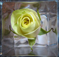
I like the use of the natural framing with the vase... creates a very pleasing effect. I wish that the rose was sharper... a detailed and sharp rose in contrast with the soft glow of the vase would really make this powerful.
|
| Photo By: Kathy Hillard
(K:25721)
|
|
|
Critique By:
Kim Culbert (K:37070)
9/14/2005 4:01:04 AM
Surprisingly I like the sepia toned one... usually I always favour the colour, but in this instance I think the colour distracts from the great lines and hidden mystery.
I like how the foreground in the sepia toned one is so strong and really commands focus... I love these overgrown shacks... this one sure has character!
|
| Photo By: Kathy Hillard
(K:25721)
|
|
|
Critique By:
Kim Culbert (K:37070)
9/14/2005 3:55:29 AM
Thanks so much for your input... if anything I would like to have put the horizon off centre by even more... this is a crop as the original had more sky, but that made it feel way too centered. Perhaps I should post it to see what people like better. I'm usually not one for putting the horizon in the middle though... feels too balanced. Anyways thanks for the crit!
|
| Photo By: Kim Culbert
(K:37070)
|
|
|
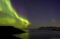
Critique By:
Kim Culbert (K:37070)
9/14/2005 1:14:58 AM
I love aurora captures... they are so magical and beautiful. You've really captured the spirit and flow of this one nicely. I really like the use of foreground, and of course the inclusion of water. Gorgeous colour, composition and style.
|
| Photo By: Nick Russill
(K:929)
|
|
|
Critique By:
Kim Culbert (K:37070)
9/14/2005 1:08:43 AM
Very cool texture in the background... it really adds to the atmosphere of the image and gives more to the story about where this was, the feeling...
I like the motion blur of the hands and the body, swaying to the music, but I wish her face was just a little sharper.
|
| Photo By: Mandana B. Fard
(K:65)
|
|
|
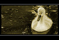
Critique By:
Kim Culbert (K:37070)
9/14/2005 1:05:19 AM
It's so cute! Love the toning and the way you captured both the fluffiness of the duckling and the darkness/ depth to the water. Great exposure! Nice tight framing, too!
I think less black on the frame would look nicer as well... puts more focus on the "little fella".
|
| Photo By: Chris Spracklen
(K:32552)
|
|
|
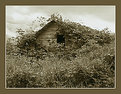
Critique By:
Kim Culbert (K:37070)
9/14/2005 1:02:41 AM
A very interesting landscape because it is a sight that most of us will never get to see with our own eyes! Made even more interesting by the great DOF and sharpness in this image and the subtle tones of colour. I almost missed the house/cottage on the left... nice scale and splash of reds.
|
| Photo By: Nick Russill
(K:929)
|
|
|
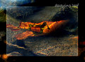
Critique By:
Kim Culbert (K:37070)
9/14/2005 12:55:43 AM
The colour in this is fantastic... so bright and vibrant. I love the fact that this was taken through the water... it adds a really cool element to an otherwise over-shot image.
Perhaps think about toning down the orange spot in the bottom left though... it keeps pulling my eye down there.
|
| Photo By: alle khan
(K:1032)
|
|
|
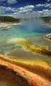
Critique By:
Kim Culbert (K:37070)
9/11/2005 8:08:49 PM
What makes this so interesting for me is that it's like nothing I have ever seen with my own eyes. It's such a beautiful, but bizarre scene... I need to go to Yellowstone! Looking at your pictures remind me how much beauty there is in the world!
Wonderful gradiation in the water, captured well with the sharpness throughout and the lovely foreground tones.
|
| Photo By: Michael Kanemoto
(K:22115)
|
|
|
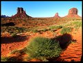
Critique By:
Kim Culbert (K:37070)
9/11/2005 8:04:35 PM
You may not have gotten an image like Pat's, but I really like the amount of colour and detail that your foreground has. The rich reds of the sand in the foreground is eye-catching and the slight motion blur of the greenery adds an unique element as well.
|
| Photo By: Michael Kanemoto
(K:22115)
|
|
|
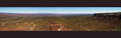
Critique By:
Kim Culbert (K:37070)
9/11/2005 8:01:22 PM
What a beautiful vista... it seems like you should be in an airplane with the vast view you have here. Congrats on climbing this, and then to take such awe-inspiring images on the way!!!
Love the sharpness and detail on the right hand side... makes me feel like I'm there too~!
|
| Photo By: Michael Kanemoto
(K:22115)
|
|
|
Critique By:
Kim Culbert (K:37070)
9/11/2005 6:36:30 AM
Wonderful capture of a moment in time... it looks like you pressed the shutter just as some secret was being passed along.
I like the bursts of colour in the B&W image as well... although I'm not sure about the touch of green at the top of their heads.
|
| Photo By: Kathy Hillard
(K:25721)
|
|
|
Critique By:
Kim Culbert (K:37070)
9/8/2005 3:59:13 AM
Stunning.
Nothing more to say.
|
| Photo By: Jim Goldstein
(K:21230)
|
|
|
Critique By:
Kim Culbert (K:37070)
9/5/2005 7:53:02 PM
It must have been raining again... *grin*
Nice warmth in the image.. and knowing that these are stove handles the warmth is two-fold.
Great DOF...
|
| Photo By: Steve Kaufman
(K:2748)
|
|
|
Critique By:
Kim Culbert (K:37070)
9/5/2005 7:51:29 PM
Houses must be built differently up there to compansate for the amount of snow!!! This is a great capture of "life in the north" that make some people wonder why anyone would want to live up there!
|
| Photo By: Steve Kaufman
(K:2748)
|
|
|
Critique By:
Kim Culbert (K:37070)
9/5/2005 7:45:22 PM
I don't think you've failed with your attempt, but I would also really like to see this with the clarity and sharpness of the original. It's got great lines, beautiful backlighting and excellent DOF.
|
| Photo By: Robert Stokes
(K:4509)
|
|
|
Critique By:
Kim Culbert (K:37070)
9/5/2005 9:42:42 AM
This is a very interesting series you've got going... it has the allure of the unknown with the people in costume and all the aspects of a great technical image. I like the desaturation and the splash of colour in the reflection as well.
|
| Photo By: Gerhard BuschEFIAP/AFIAP
(K:18382)
|
|
|
Critique By:
Kim Culbert (K:37070)
9/5/2005 9:40:52 AM
Interesting location and very interesting gentleman... it has a look to it from times long ago. I like the warm glow that the windows give off and the way the building seems to have a greenish glow. It's a mysterious image.
|
| Photo By: Gerhard BuschEFIAP/AFIAP
(K:18382)
|
|
|
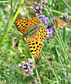
Critique By:
Kim Culbert (K:37070)
9/5/2005 9:38:03 AM
I am so sad to hear that these are moths! I'll attach a photo beneath of what I thought of as a nice butterfly capture... now you're telling me it's a moth! *grin*
|
| Photo By: Colin Cartwright
(K:15699)
|
|
|
Critique By:
Kim Culbert (K:37070)
9/5/2005 9:30:44 AM
Hi Keith,
Thanks for all your comments recently on my work... much appreciated!
I took your suggestion and played with this in photoshop to make it a B&W. I am a big fan of colour and I like the original, but I thought I would post the B&W as well to see what others thought. Thanks for the suggestion.
|
| Photo By: Kim Culbert
(K:37070)
|
|
|
Critique By:
Kim Culbert (K:37070)
9/5/2005 9:26:16 AM
The petals do look like flames, licking the centre of the sunflower... how did you light this? Or is it natural?
This is beautiful! I love sunflowers and you have stirred up emotions with this one!
|
| Photo By: Eric Simpson
(K:2348)
|
|
|
Critique By:
Kim Culbert (K:37070)
9/5/2005 9:24:27 AM
I think for your first attempt this is very well handled... where you have placed the three images in the frame works nicely with the larger image. My only nit (and it's a very small point) is that the lower image, the med. shot of your dog with the collar) stands out from the rest almost too much. First, it's the only picture with the collar, and the blue tag stands out a lot in the sunlight, and second, the background has more elements in it than the others... all the others have a solid colour, be it blue or black, and this one has grey with lines running throughout.
It's minor, but it's something that keeps pulling my eye away from the picture as a whole and makes me focus on that one shot.
You have a stunning dog!
|
| Photo By: Eric Simpson
(K:2348)
|
|
|
Critique By:
Kim Culbert (K:37070)
9/5/2005 9:20:14 AM
What a great sense of playfulness in this image... the low angle and the expression on the dog's face all make a wonderful shot!
I like the softness in the foreground as it puts more emphasis on the dog.
|
Photo By: Roberto Arcari Farinetti
(K:209486)

|
|
|
Critique By:
Kim Culbert (K:37070)
9/5/2005 9:17:59 AM
The title says it all... this is truly beautiful in its simplicity... the echoing greens and yellows in the background to the one stalk of grass curving into the image...
I like the use of negative space around the stalk as well... gives a feeling of open spaces and makes me think of the prairies.
Just a tad more DOF to keep the whole stalk in focus would have made this even better.
|
| Photo By: Eric Simpson
(K:2348)
|
|