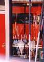
|
|
Critique By:
Francesca May (K:6877)
2/12/2004 12:35:21 PM
very beautiful colors!
|
| Photo By: Melony Lewis
(K:79)
|
|
|
Critique By:
Surajit Mukerji (K:3889)
4/16/2003 1:20:15 PM
Well done
|
| Photo By: Melony Lewis
(K:79)
|
|
|
Critique By:
Samuel Downs (K:7290)
2/13/2002 7:02:43 PM
Melony, nice pattern and recessing line. The texture and tones are wonderful.
|
| Photo By: Melony Lewis
(K:79)
|
|
|
Critique By:
k m (K:324)
1/23/2002 8:20:02 AM
exposure is spot on. You really bring out the color in a fantastic sky. I don't mind the negative space much, though if you have any other versions, i'd love to see them.
cheers,
K
|
| Photo By: Melony Lewis
(K:79)
|
|
|
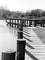
Critique By:
Melony Lewis (K:79)
1/22/2002 3:54:47 PM
Debbie,
What you see here is what I shot. I used PH only to get it ready for the Web. This is Ilford pf4 shot at the standard 125 ISO. I guess I held my mouth right on this one!
|
| Photo By: Melony Lewis
(K:79)
|
|
|
Critique By:
Debbie Groff (K:9569)
1/22/2002 2:07:36 PM
I love the texture in the boards. Did you use any PS to add that grainy effect... texture...? Or is the kind of film you used what needs to be used to get this effect so beautifully? Did you use any kind of filters?
|
| Photo By: Melony Lewis
(K:79)
|
|
|
Critique By:
al shaikh (K:15790)

1/22/2002 11:11:33 AM
Good start on this project Melony. I think you will love the holga as you shoot more with it. Keep doing the project I'm sure there will be great ones in it.
|
| Photo By: Melony Lewis
(K:79)
|
|
|
Critique By:
Melony Lewis (K:79)
1/21/2002 12:51:45 PM
Steve, I just got these prints back. Not quite the same image but another way of looking at it.
|
| Photo By: Melony Lewis
(K:79)
|
|
|
Critique By:
David Goldfarb (K:7611)
1/18/2002 11:31:44 AM
Well seen, indeed. I think I'd make the line where the boards join go right down the middle. When I first saw the thumbnail, I thought it was a vertical structure, maybe a pile of overlapping boards. More symmetry might enhance that illusion, with I think is a good one.
|
| Photo By: Melony Lewis
(K:79)
|
|
|
Critique By:
Petros Stamatakos (K:12101)
1/18/2002 11:13:42 AM
Melony, love the repetition. I think you've "seen" this well :-)
|
| Photo By: Melony Lewis
(K:79)
|
|
|
Critique By:
Jamie (K:530)
1/18/2002 9:45:27 AM
Melony -- I like this in B&W... I just wanted to see it in color to compare... not that I expected you to have or want one in color. LOL. Did I say how much I like this image? --Jamie
|
| Photo By: Melony Lewis
(K:79)
|
|
|
Critique By:
Steve Kompier (K:4629)
1/18/2002 8:04:06 AM
Very nice, Melony. I like it this way.
|
| Photo By: Melony Lewis
(K:79)
|
|
|
Critique By:
Melony Lewis (K:79)
1/18/2002 7:13:03 AM
Jamie, Since the boards are gray and the grass is dormant, brownish, I'm not sure it would have been a good color picture. I took it as a b&w.
|
| Photo By: Melony Lewis
(K:79)
|
|
|
Critique By:
Jamie (K:530)
1/18/2002 6:58:32 AM
Melony -- Very nice abstract and idea... I love the zigzag and rough feel of this image. Makes me wonder what it looked like in color! --Jamie
|
| Photo By: Melony Lewis
(K:79)
|
|
|
Critique By:
Steve Kompier (K:4629)
1/16/2002 12:28:32 PM
Humm..I like the idea here, but I think the balance is off.
The centered pilings lead your eye to the center, but I wonder what would happen if the walk was centered instead?
I don't know if the water on the left, really adds to the photo. A lower sun angle would be interesting also.
|
| Photo By: Melony Lewis
(K:79)
|
|
|
Critique By:
Jamie (K:530)
1/16/2002 7:20:59 AM
Melony -- RED! At first I thought I would find this image too busy, but after looking at it, I love it. Welcome to Usefilm! --Jamie
|
| Photo By: Melony Lewis
(K:79)
|
|
|
Critique By:
Steve Kompier (K:4629)
1/15/2002 7:56:33 PM
Gotta love red! Very vibant and there's so much to look at. My eyes are all over this.
The only thing that doesn't fit, is the blurry white at the bottom.
|
| Photo By: Melony Lewis
(K:79)
|
|