|
|
Critique By:
Steven B. Poitinger (K:1757)
11/12/2002 4:43:00 PM
Quite a compliment Max. Thanks to you and the others for taking the time to comment.
|
| Photo By: Steven B. Poitinger
(K:1757)
|
|
|
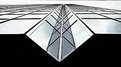
Critique By:
Steven B. Poitinger (K:1757)
11/12/2002 4:41:23 PM
Thanks for your comments. Tim, I did use a polarizer for this shot which helped with the color contrast, but I must admit I increased the saturation a little in PS before posting. Sue, it's interesting you should comment on the perspective. I can't help but wonder why the horizontal lines look natural and yet the vertical on the lower right of the building looks a bit skewed. Don't know why and don't know how to correct it in PS. Anyhow, thanks for the encouraging comment.
|
| Photo By: Steven B. Poitinger
(K:1757)
|
|
|
Critique By:
Eric Goldwasser (K:4294)

11/11/2002 8:06:53 PM
Steven, this is a beautiful capture. Your light and DOF are both excellent!
|
| Photo By: Steven B. Poitinger
(K:1757)
|
|
|
Critique By:
Sue O'S (K:12878)
11/11/2002 7:31:05 AM
I'm told by a lighthouse nut that this lightstation is affectionately known as "Big Red" and is the backdrop for many wedding photos.
Really nice image, Steven. I know from my own personal "project" of pictures of a lighthouse that getting an acceptable perspective on tall skinny buildings is very difficult. Yours looks good!
Glad you contribute to this site; I'm learning lots from your images.
|
| Photo By: Steven B. Poitinger
(K:1757)
|
|
|
Critique By:
Wayne Allen (K:39)
11/10/2002 4:13:01 PM
that is a really good photo
|
| Photo By: Steven B. Poitinger
(K:1757)
|
|
|
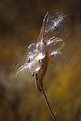
Critique By:
Max Hill (K:185)
11/10/2002 1:33:19 PM
Beautfil detail and with only subject as main focus gave this print my vote for best Nature this year.
|
| Photo By: Steven B. Poitinger
(K:1757)
|
|
|
Critique By:
R. Tim Hay (K:181)
11/10/2002 12:37:04 PM
Steven -- did you use a polarizer? The contrast between the blue sky and the pink/red lighthouse is outstanding!
|
| Photo By: Steven B. Poitinger
(K:1757)
|
|
|
Critique By:
Steven B. Poitinger (K:1757)
11/8/2002 12:50:16 PM
Becky, no the lights were the sickly flourescent green you might expect to see, so I changed them in PS.
|
| Photo By: Steven B. Poitinger
(K:1757)
|
|
|
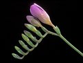
Critique By:
Becky V (K:9699)
11/7/2002 9:12:30 PM
This is a great example how a spontaneous, experimental shot can turn into something really beautiful. I love the blue - are they really that colour in the tunnel?
|
| Photo By: Steven B. Poitinger
(K:1757)
|
|
|
Critique By:
Becky V (K:9699)
11/7/2002 9:08:33 PM
What a great choice for a subject - you can see the entire process of blooming in one shot - really cool! The light on the topmost bloom is wonderful. It's just soft enough to create a subtle glow. Methinks I'm going to have to visit the local fabric store for some black velvet!
|
| Photo By: Steven B. Poitinger
(K:1757)
|
|
|
Critique By:
Tim Dinofa (K:162)
11/6/2002 8:34:13 PM
Hey Steven,
The "7" was what made this photo interesting to me. You could very well do a series of abstract photos that incorporate different numbers of this style. I don't think you should remove it.
|
| Photo By: Steven B. Poitinger
(K:1757)
|
|
|
Critique By:
Steven B. Poitinger (K:1757)
11/5/2002 5:14:44 PM
Michaelle:
Thanks for looking and commenting, I enjoy getting others suggestions/perspectives. I've attached the edit you suggested and I think it does give a better balanced composititon.
|
| Photo By: Steven B. Poitinger
(K:1757)
|
|
|
Critique By:
Steven B. Poitinger (K:1757)
11/5/2002 5:05:50 PM
I swore I checked that attachment box.
|
| Photo By: Steven B. Poitinger
(K:1757)
|
|
|
Critique By:
Steven B. Poitinger (K:1757)
11/5/2002 5:04:50 PM
Thanks for the comments. Tom, I've attached an edit with the seven cloned out. I think it does give it a more abstract feel. E.S., seven is not the subject, I'm just a little weak in inventing creative titles. However, picking a number and working it might make an interesting project. Thanks again everyone.
|
| Photo By: Steven B. Poitinger
(K:1757)
|
|
|
Critique By:
michaelle . (K:3807)
11/3/2002 11:15:33 PM
The colors are fabulous! And the DOF is spot on... Try cropping just above the tree and just to to the right of the first window... this will move the solid red line created by the edge of the barn off to the right a little bit more and help to not have the frame cut so in half by the vivid colors. I think this is just a gorgeous place... wonderful!
|
| Photo By: Steven B. Poitinger
(K:1757)
|
|
|
Critique By:
Elangovan S (K:10675)
11/3/2002 7:21:50 PM
I like this a lot. The shadow and stairs join together to make an visual illusion. Very well seen and executed. BTW, Is "7" the subject? ...
|
| Photo By: Steven B. Poitinger
(K:1757)
|
|
|
Critique By:
Beverly Gustafson (K:1572)
11/3/2002 7:19:36 PM
WOW, I love the color of the water and the warmth of the light on the rocks. This is wonderful.
|
| Photo By: Steven B. Poitinger
(K:1757)
|
|
|
Critique By:
Beverly Gustafson (K:1572)
11/3/2002 7:08:45 PM
I love the shadow. Well seen.
|
| Photo By: Steven B. Poitinger
(K:1757)
|
|
|
Critique By:
T M (K:-183)
11/3/2002 11:50:25 AM
Really nice. It has a strong feeling of geometry to it that attracted my attention. I especially like the pattern at the "bottom" of the shadow-staircase. Have you tried clone-stamping / removing the 7? In my opinion this might strenghten the abstract feeling. But either way - a really good one.
|
| Photo By: Steven B. Poitinger
(K:1757)
|
|
|
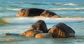
Critique By:
Adam Kimmerly (K:382)
11/2/2002 10:12:43 PM
The colors in this one are just awesome, Steven. And the slow shutter speed softening the water contrasted with the sharpness of the rocks really makes them stand out. Sometimes all it takes is that one shot. From your other posts, I'm guessing the ones of the sunset were just as spectacular. As perfect as the shot is, I'm sure you're like the rest of us, always trying to find a way to make it better. For next time, it might be nice to see one of the waves rushing around the base of the rocks rather than dividing the two as Vince mentioned although I don't think it detracts from the image at all. Keep 'em coming.
~Adam
|
| Photo By: Steven B. Poitinger
(K:1757)
|
|
|
Critique By:
Toni Martin (K:5092)
11/2/2002 8:49:07 PM
Cool experiment, Steven. Nice color too.
|
| Photo By: Steven B. Poitinger
(K:1757)
|
|
|
Critique By:
Chris Whaley (K:3847)
11/2/2002 7:41:58 PM
cool effect!...does have that flying feeling.
|
| Photo By: Steven B. Poitinger
(K:1757)
|
|
|
Critique By:
Steven B. Poitinger (K:1757)
11/2/2002 2:35:05 PM
Thanks for the comments everyone. This was the only shot taken of these rocks that evening. I was anxious to get set up for the oncoming sunset. Vince, I think if I would have spent some time here I could've gotten a variety of wave formations to frame the rocks. Live and learn I guess.
|
| Photo By: Steven B. Poitinger
(K:1757)
|
|
|
Critique By:
Vincent K. Tylor (K:7863)
11/2/2002 12:43:55 PM
I do enjoy your posts Steve! I like your use of late afternoon lighting here as well as the longer exposure. Clarity is sharp and you even have good color out of that Michigan lake. In my own little opinion, I believe that if one of the waves was in front of the first set of rocks, it would balance the enire image even better. As it is, it almost looks like two different images put together because of the separation in the middle....(two very nice images I might add)! Nice one.
|
| Photo By: Steven B. Poitinger
(K:1757)
|
|
|
Critique By:
R. Tim Hay (K:181)
11/2/2002 8:10:32 AM
Great shot! Warm tones and the exposure looks perfect to me. Also, a nice contrast between the soft, flowing water and the crisply focused rocks.
|
| Photo By: Steven B. Poitinger
(K:1757)
|
|
|
Critique By:
Deb Mayes (K:19605)
11/2/2002 7:09:13 AM
Marvelous! This is a favorite for sure 
|
| Photo By: Steven B. Poitinger
(K:1757)
|
|
|
Critique By:
Mary Sue Hayward (K:17558)
11/2/2002 7:05:11 AM
Nice light and great color in the water. I'm not sure what shutter speed you used but I like how you captured the water movement.
|
| Photo By: Steven B. Poitinger
(K:1757)
|
|
|
Critique By:
Howard M. Parsons (K:3496)
10/30/2002 9:03:08 AM
I like the uncropped version best.
|
| Photo By: Steven B. Poitinger
(K:1757)
|
|
|
Critique By:
Howard M. Parsons (K:3496)
10/30/2002 9:00:50 AM
I think I like this the best of your recent postings.
Super job!
(Enter this in MCCC sometime as a monochrome print)
|
| Photo By: Steven B. Poitinger
(K:1757)
|
|
|
Critique By:
Kame Kame (K:92)
10/29/2002 10:36:59 PM
Nice composition and contrast. I agree about the sky but also like it the way it is.
|
| Photo By: Steven B. Poitinger
(K:1757)
|
|